GETTING STARTED
Process Apps Overview
Concepts and Terminology
Quick Start Guide
Exploring the Process Apps Store
Building a Process Apps from Scratch
What's New
Current Version
Previous Versions

CONCEPTS
Flow Builder
Triggers
Logic
Introduction
Split
Merge
GoTo
End
Tasks
Introduction
Human Task
Script Task
Integrations
Introduction
Connect to Data Table
Connect to API
Events
Call a Subflow
Notify
Delay
Forms
Form Creation
Form Components
Form Actions
Simulate
Publish
Self-Service Portal
Dashboard

SETTINGS
General Settings
Members and Roles
Versioning
Channels
Bot Permissions
Alerts
Import & Export
Change Logs
Delete App

HOW TOs
Creating a Process App
Importing and Exporting a Process App
Sharing a Process App with Co-Developers
Configuring a Process App
Defining a Digital Form
Defining a Flow for a Process App
Defining Triggers for a Process App
Using Stencil to Define a Logic for a Process App
Using Events for a Process App
Adding Access Controls to a Digital Form
Calling a Subflow from Process App
Deploying a Process App
Configuring Channels to a Process App
Publishing a Process App
Analyzing a Process App
Stimulating a Process Instance
Creating and Publishing a Process App
Viewing a Process App Errors
Viewing Change Logs Made to Process App Definition
Creating or Restoring a Version of Process App
Adding Bot Permissions to let Bot Trigger the Process App

ADMINISTRATION
Introduction
Assistant Admin Console
Administration Dashboard
User Management
Add Users
Manage Groups
Assistant Management
Enrollment
Invite Users
Send Bulk Invites
Import User Data
Synchronize Users from AD
Security & Compliance
Using Single-Sign On
Security Settings
Cloud Connector
Billing

コンポーネントを追加してそのプロパティを構成することにより、デジタルフォームを定義できます。

  • 左側のペインで使用可能なコンポーネントをキャンバスにドラッグアンドドロップし、それらのプロパティを構成してフォームを作成できます。コンポーネントとそのプロパティの詳細については、以下を参照してください。
  • リストをスクロールして、指定のコンポーネントを検索します。
  • グリッドフォーマットで表示します。

基本および高度なコンポーネント

以下は、使用可能なコンポーネントとそのプロパティのリストです。

コンポーネント 説明 サンプル
基本
テキストフィールド―単一行入力に使用されます。
テキスト領域―複数行入力に使用されます。
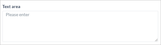
数値―数値入力に使用されます。
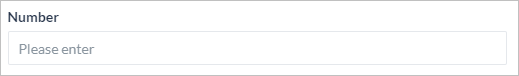
ラジオボタン―指定されたリストからの選択オプションとして使用されます。
ドロップダウン―指定されたリストからの選択オプションとして使用されます。複数選択することができます。
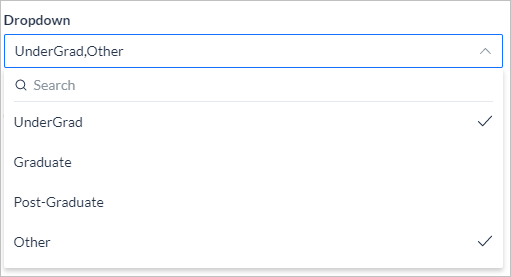
チェックボックス―指定されたリストからの複数選択オプションとして使用されます。
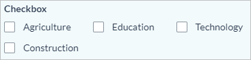
日付―日付エントリに使用され、ユーザーが日付を選択するための日付ピッカーを提供します。
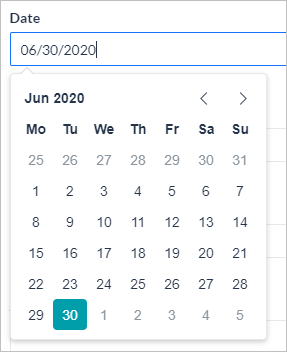
日付と時刻―日付と時刻エントリに使用され、ユーザーが日付と時刻を選択するための日付と時刻ピッカーを提供します。日付コンポーネントを使用し、時刻オプションをはいに設定します。 12時間または24時間フォーマットから選択します。
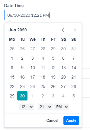
電話番号―電話番号の入力に使用され、ユーザーが国コードを選択できるようにします。
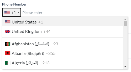
メール―メールアドレスの入力に使用され、xxx@uuu.comフォーマットで検証されます。
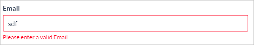
トグル―2つの値を切り替えるために使用され、yes / noタイプの入力に最適です。
アドレス―アドレス入力に使用されます。
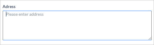
URL―web URLの入力に使用され、xxx.comフォーマットで検証されます。
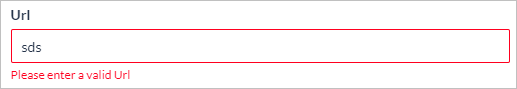
レンジスライダー―指定された最小値と最大値の間の値の選択。パーセンテージで表すことができます。
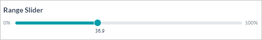
詳細
ボタン―フォームで外部URLを送信、リセット、または開くためのクリック可能なコンポーネントとして使用されます。プライマリセカンダリターシャリゴースト、または危険から選択します。
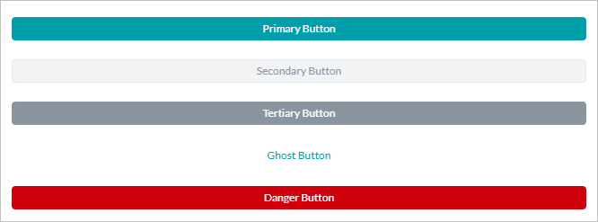
ラベル―静的テキストボックスを表示するために使用され、ユーザーによるアクションは不要です。
Protip―エンドユーザーにとって重要な情報をマークするために使用され、ユーザーの操作は不要です。
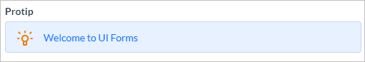
メモ―エンドユーザーのための情報をマークするために使用され、ユーザーの操作は不要です。
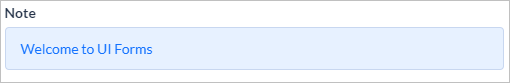
GETTING STARTED
Process Apps Overview
Concepts and Terminology
Quick Start Guide
Exploring the Process Apps Store
Building a Process Apps from Scratch
What's New
Current Version
Previous Versions

CONCEPTS
Flow Builder
Triggers
Logic
Introduction
Split
Merge
GoTo
End
Tasks
Introduction
Human Task
Script Task
Integrations
Introduction
Connect to Data Table
Connect to API
Events
Call a Subflow
Notify
Delay
Forms
Form Creation
Form Components
Form Actions
Simulate
Publish
Self-Service Portal
Dashboard

SETTINGS
General Settings
Members and Roles
Versioning
Channels
Bot Permissions
Alerts
Import & Export
Change Logs
Delete App

HOW TOs
Creating a Process App
Importing and Exporting a Process App
Sharing a Process App with Co-Developers
Configuring a Process App
Defining a Digital Form
Defining a Flow for a Process App
Defining Triggers for a Process App
Using Stencil to Define a Logic for a Process App
Using Events for a Process App
Adding Access Controls to a Digital Form
Calling a Subflow from Process App
Deploying a Process App
Configuring Channels to a Process App
Publishing a Process App
Analyzing a Process App
Stimulating a Process Instance
Creating and Publishing a Process App
Viewing a Process App Errors
Viewing Change Logs Made to Process App Definition
Creating or Restoring a Version of Process App
Adding Bot Permissions to let Bot Trigger the Process App

ADMINISTRATION
Introduction
Assistant Admin Console
Administration Dashboard
User Management
Add Users
Manage Groups
Assistant Management
Enrollment
Invite Users
Send Bulk Invites
Import User Data
Synchronize Users from AD
Security & Compliance
Using Single-Sign On
Security Settings
Cloud Connector
Billing

구성 요소를 추가하고 속성을 설정하여 디지털 양식을 정의할 수 있습니다.

  • 왼쪽 창에서 사용 가능한 구성 요소를 캔버스로 끌어다 놓고 해당 속성을 설정하여 양식을 작성할 수 있습니다. 구성 요소 및 해당 속성에 대한 자세한 내용은 아래를 참조하세요.
  • 목록을 스크롤 하여 해당 구성 요소를 검색합니다.
  • 그리드 형식으로 봅니다.

기본 및 고급 구성 요소

다음은 사용할 수 있는 구성 요소와 속성 목록입니다:

구성 요소 설명 샘플
기본
텍스트 필드 – 한 줄 입력에 사용됩니다.
텍스트 영역 – 여러 줄 입력에 사용됩니다.
숫자 – 숫자 입력에 사용됩니다.
라디오 버튼 – 주어진 목록에서 선택 옵션으로 사용됩니다.
드롭다운 – 주어진 목록에서 선택 옵션으로 사용되며, 다중 선택이 가능합니다.
체크박스 – 주어진 목록에서 다중 선택 옵션에 사용됩니다.
날짜 – 날짜 입력에 사용되며, 사용자가 날짜를 선택할 수 있는 날짜 선택기를 제공합니다.
날짜 및 시간 – 날짜 및 시간 입력에 사용되며, 사용자가 날짜와 시간을 선택할 수 있는 날짜 및 시간 선택기를 제공합니다.
날짜 구성 요소를 사용하고 시간 옵션을 ‘예’로 설정하며, 12시간 또는 24시간 형식 중에서 선택합니다.
전화번호 – 전화번호 입력에 사용되며, 사용자가 국가 코드를 선택할 수 있습니다.
이메일 – 이메일 주소 입력에 사용되며, xxx@uuu.com 형식을 검증합니다.
토글 – 두 값 사이를 전환하는 데 사용되며, 예/아니요 유형의 입력에 이상적입니다.
주소 – 주소 입력에 사용됩니다.
URL – 웹 URL 입력에 사용되며 xxx.com 형식을 검증합니다.
범위 슬라이더 – 지정된 최솟값과 최댓값 사이의 값 선택이며, 백분율로 나타낼 수 있습니다.
고급
버튼 – 클릭할 수 있는 구성 요소로써 제출 또는 재설정하거나 양식에서 외부 URL을 여는 데 사용됩니다. 1차, 2차, 3차, 고스트 또는 위험 중에서 선택합니다.
레이블 – 정적 텍스트 상자를 표시하는 데 사용하며, 사용자 작업이 필요하지 않습니다.
유용한 팁 – 최종 사용자에게 중요한 정보를 표시하는 데 사용하며, 사용자 작업이 필요하지 않습니다.
참고 사항 – 최종 사용자에게 정보를 표시하는 데 사용하며, 사용자 작업이 필요하지 않습니다.

GETTING STARTED
Process Apps Overview
Concepts and Terminology
Quick Start Guide
Exploring the Process Apps Store
Building a Process Apps from Scratch
What's New
Current Version
Previous Versions

CONCEPTS
Flow Builder
Triggers
Logic
Introduction
Split
Merge
GoTo
End
Tasks
Introduction
Human Task
Script Task
Integrations
Introduction
Connect to Data Table
Connect to API
Events
Call a Subflow
Notify
Delay
Forms
Form Creation
Form Components
Form Actions
Simulate
Publish
Self-Service Portal
Dashboard

SETTINGS
General Settings
Members and Roles
Versioning
Channels
Bot Permissions
Alerts
Import & Export
Change Logs
Delete App

HOW TOs
Creating a Process App
Importing and Exporting a Process App
Sharing a Process App with Co-Developers
Configuring a Process App
Defining a Digital Form
Defining a Flow for a Process App
Defining Triggers for a Process App
Using Stencil to Define a Logic for a Process App
Using Events for a Process App
Adding Access Controls to a Digital Form
Calling a Subflow from Process App
Deploying a Process App
Configuring Channels to a Process App
Publishing a Process App
Analyzing a Process App
Stimulating a Process Instance
Creating and Publishing a Process App
Viewing a Process App Errors
Viewing Change Logs Made to Process App Definition
Creating or Restoring a Version of Process App
Adding Bot Permissions to let Bot Trigger the Process App

ADMINISTRATION
Introduction
Assistant Admin Console
Administration Dashboard
User Management
Add Users
Manage Groups
Assistant Management
Enrollment
Invite Users
Send Bulk Invites
Import User Data
Synchronize Users from AD
Security & Compliance
Using Single-Sign On
Security Settings
Cloud Connector
Billing

You can define a Digital Form by adding components and configuring their properties.

  • You can drag and drop the components available on the left pane to the canvas and configure their properties to build the form. For details of the components & their properties, see below.
  • Scroll through the list to search for a given component.
  • View in a grid format.

Basic & Advanced Components

The following is a list of available components and their properties:

Component Description Sample
Basic
Text Field – Used for single-line input.
Text Area – Used for multi-line entry.
Number – Used for numerical entries.
Radio Button – Used as a selection option from a given list.
Drop-down – Used as a selection option from a given list; can be multi-select.
Checkbox – Used for multi-select option from a given list.
Date – Used for date entries, gives a date picker for the user to choose the date.
Date & Time – Used for date and time entries, give a date and time picker for the user to choose the date and time.
Use the Date component and set the Time option to yes; choose from 12- or 24-hour format.
Phone Number – Used for phone number entries, allows the user to choose the country code.
Email – Used for email address entries, validates for xxx@uuu.com format.
Toggle – Used for switching between two values, ideal for yes/no type of inputs.
Address – Used for address entries.
URL – Used for web URL entries, validates for xxx.com format.
Range Slider – Value selection between specified min and max values; can be represented as a percentage.
Advanced
Button – Used as a clickable component to submit, or reset, or open an external URL on the form. Choose from Primary, Secondary, Tertiary, Ghost, or Danger.
Label – Used to display a static text box, no action is required from the user.
Protip – Used to mark important information for the end-user, no user action required.
Note – Used to mark information for the end-user, no user action required.