이 사용 방법에서는 봇 성능 분석을 위해 다양한 메트릭이 사용될 봇 성능을 분석하고 비즈니스 니즈에 대한 트렌드를 추적하는 뱅킹 봇 시나리오를 살펴보겠습니다. 사용자 정의 대시보드의 정의와 Kore.ai 봇 플랫폼에서 사용자 정의 대시보드가 어떻게 구현되는지에 대한 자세한 내용은 여기를 참조하세요.
문제 설명
뱅킹 봇 클라이언트가 다음과 같은 메트릭을 추적하고자 합니다:
- 고객 유형에 따른 사용 통계
- 트랜잭션값 분류
- 일상적인 작업 성공과 실패 트렌드 비교
- 채널 관련 사용 세부 정보
- 실패한 상위 작업.
본 문서에서는 사용자 정의 대시보드를 사용하여 위에서 언급한 모든 시나리오를 달성하기 위한 자세한 단계별 접근 방법을 제공합니다. 구축할 대시보드는 다음과 같습니다. 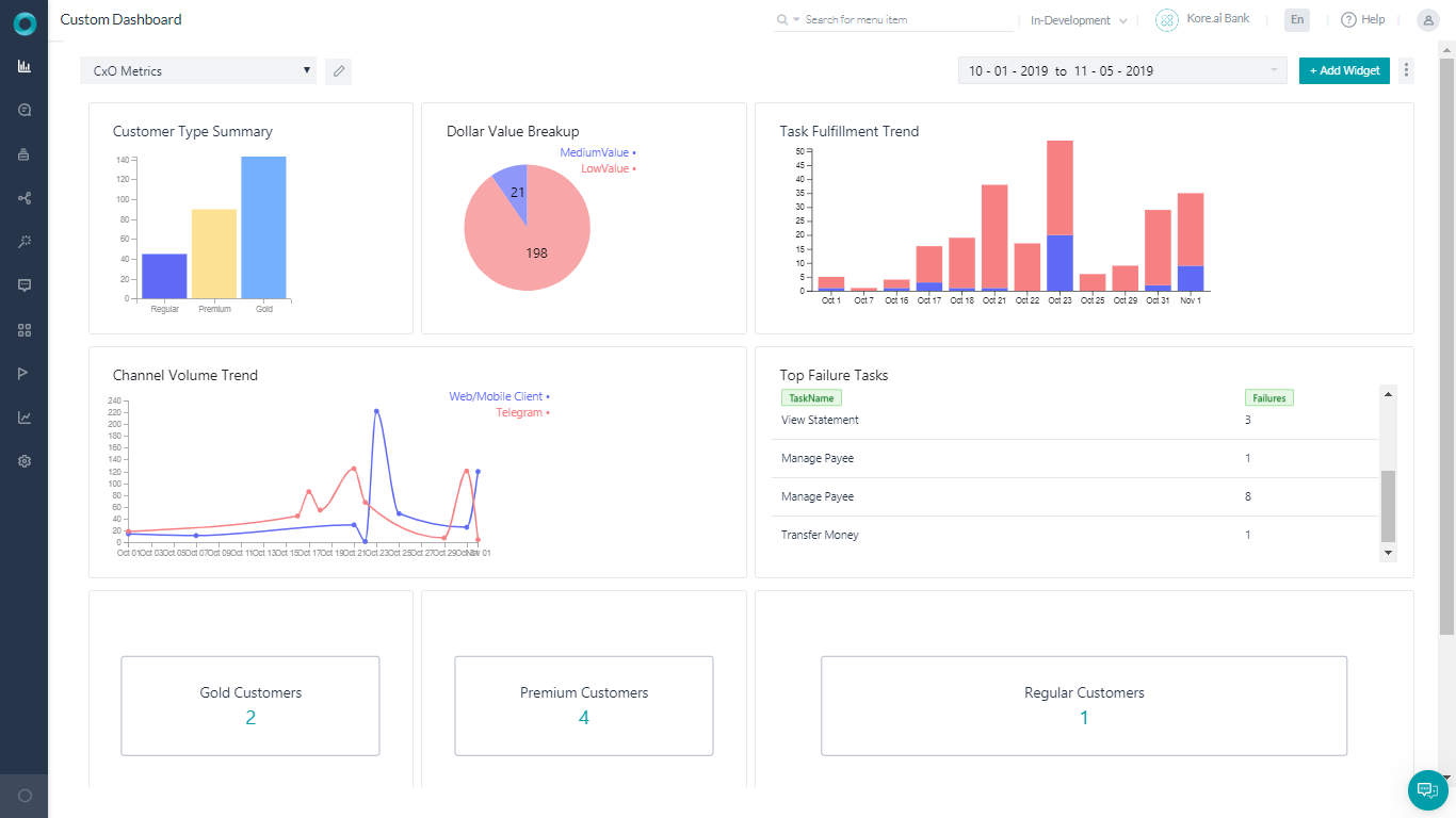
전제 조건
- 봇 구축 지식
- 맞춤형 메타 태그 사용. 자세한 내용은 여기를 참조하세요.
- 아래 언급된 것과 같은 대화 상자가 있는 뱅킹 봇:
- 자금 이체 – 송금하는 단계를 사용자에게 설명하는 대화 작업.
 이 대화에는 송금량에 따라 커스텀 메타 태그인 TransferValue를 추가하기 위한 스크립트 노드가 포함되어 있습니다. 다음 스크립트가 사용되었습니다:
if(context.entities.TransferAmount[0].amount > 50000){
   tags.addSessionLevelTag("TransferValue","HighValue");
}

if(context.entities.TransferAmount[0].amount > 10000)
tags.addSessionLevelTag("TransferValue","MediumValue");

if(context.entities.TransferAmount[0].amount > 0)
tags.addSessionLevelTag("TransferValue","LowValue");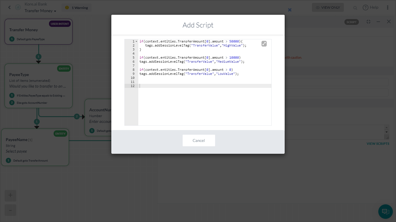
- 수취인 관리 – 사용자가 수취인 목록을 관리하도록 합니다.
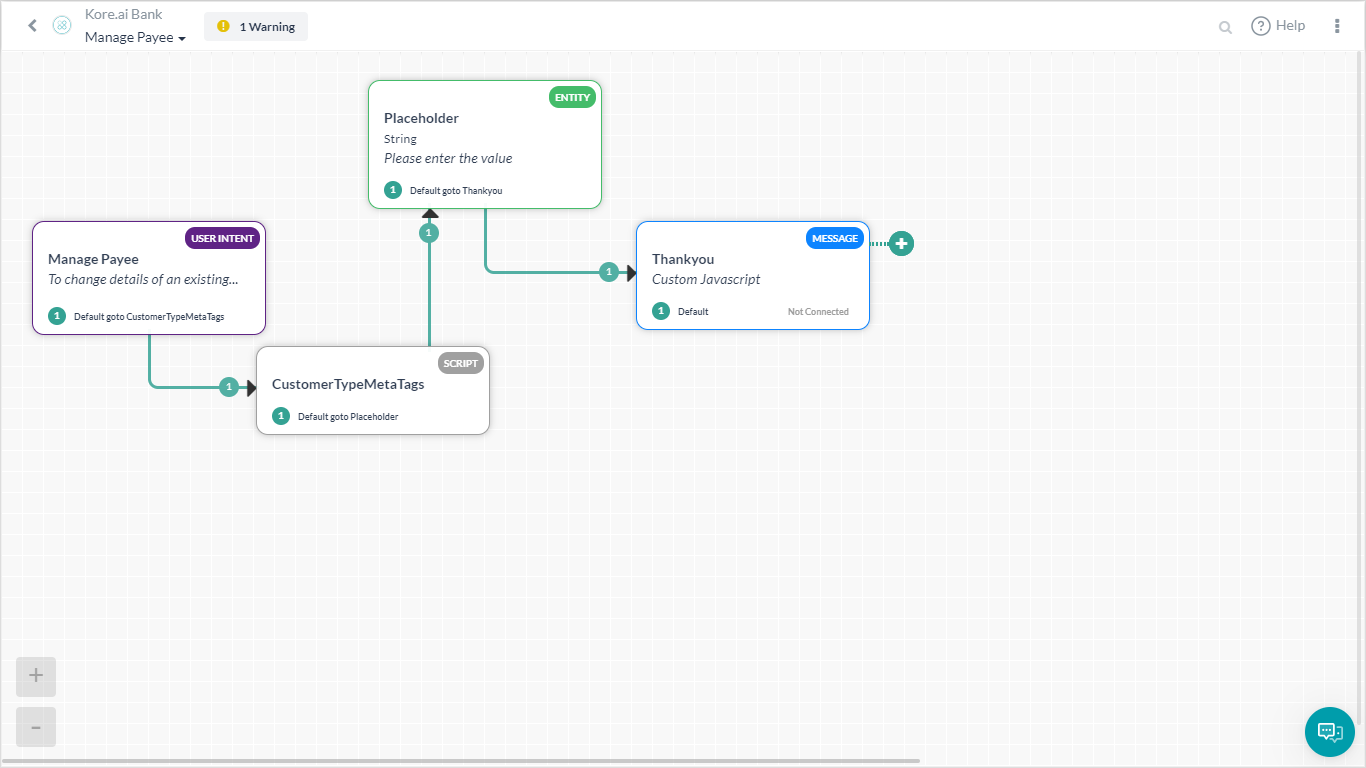 여기에 customerType 메타 태그를 할당하는 스크립트가 있습니다:
if(context.custType == 3){
   tags.addUserLevelTag("CustomerType","Premium");
}
if(context.custType == 2){
   tags.addUserLevelTag("CustomerType","Gold");
};
if(context.custType == 1){
   tags.addUserLevelTag("CustomerType","Regular");
};
- 자금 이체 – 송금하는 단계를 사용자에게 설명하는 대화 작업.
구현
문제 설명에 언급된 각 메트릭이 사용자 정의 대시보드의 위젯을 사용하여 어떻게 구현될 수 있는지 살펴보겠습니다.
- 왼쪽 탐색 패널의 대시보드 아래에서 사용자 정의 대시보드를 클릭합니다.
- 새 대시보드 생성.

- 위젯 추가 버튼을 사용하여 위의 각 시나리오에 대한 위젯을 추가합니다.
- 다음 섹션에서는 각 위젯에 대한 세부 정보를 제공합니다.
달러 가치 하락
- 위젯 추가
- 쿼리 설정:
- 데이터 세트 – 분석
- 선택 –sessionTag.TransferValue를 TransferValue, count(taskName)로 이렇게 하면 플랫폼에 가져올 데이터가 표시됩니다. 여기에서는 실행된 총작업 수에 대해 전송 금액 작업에 추가된 세션 태그값을 사용합니다.
- 그룹 기준 – sessionTag.TransferValue
- 실행하여 위 쿼리의 결과를 확인합니다.
- 위젯 설정
- 원형 차트 선택
- 크기를 TransferValue로 설정
- 메트릭을 카운트로 설정(taskName)
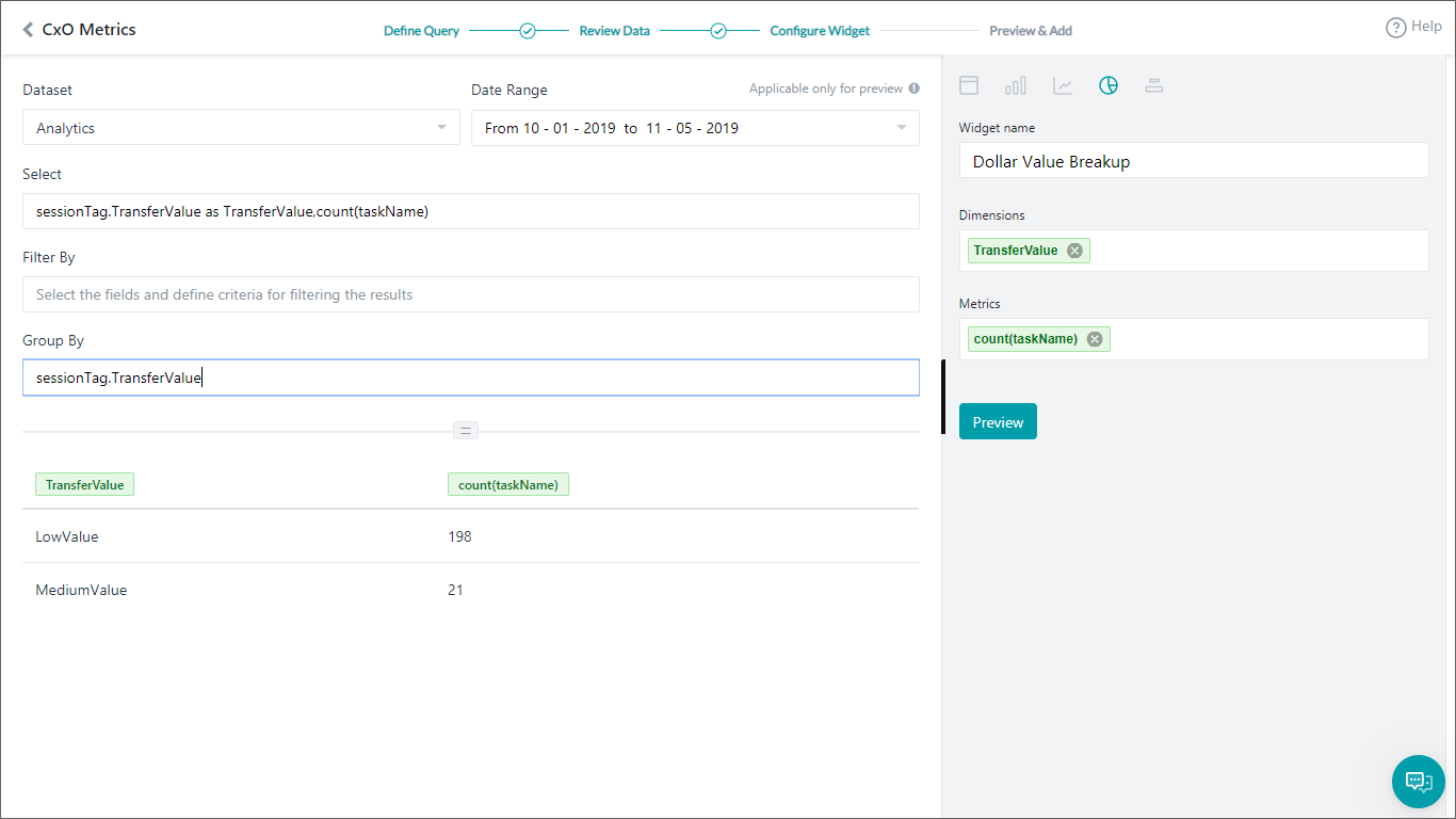
- 미리 보기를 확인하고 모두 문제가 없다면 대시보드에 업데이트

고객 유형 요약
다음 세부 정보를 사용하여 위의 단계를 반복합니다:
- 위젯 추가
- 쿼리 설정:
- 데이터 세트 – 분석
- 선택 – userTag.CustomerType을 CustomerCategory, count(taskName)로
- 그룹 기준 – userTag.CustomerType
- 실행하여 위 쿼리의 결과를 확인합니다.
- 위젯 설정
- 막대 차트 선택
- 크기를 CustomerCategory로 설정
- 메트릭을 카운트로(taskName) 설정
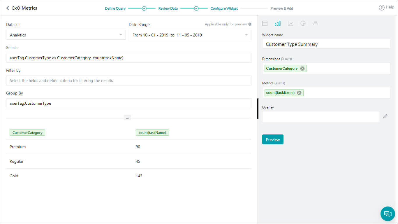
- 미리 보기를 확인하고 대시보드에 업데이트
작업 처리 트렌드
다음 세부 정보를 사용하여 위의 단계를 반복합니다:
- 위젯 추가
- 쿼리 설정:
- 데이터 세트 – 분석
- 선택 – date,metricType,count(metricType)를 TotalTasks로
- 필터 기준 – metricType = 'successtasks' 또는 metricType = 'failedtasks' 성공 또는 실패한 작업만 보려고 합니다.
- 그룹 기준 – 날짜, metricType
- 실행하여 위 쿼리의 결과를 확인합니다.
- 위젯 설정
- 막대 차트 선택
- 크기를 날짜로 설정
- 메트릭을 TotalTasks로 설정
- 오버레이를 metricType으로 설정

- 미리 보기를 확인하고 대시보드에 업데이트
상위 실패 작업
다음 세부 정보를 사용하여 위의 단계를 반복합니다:
- 위젯 추가
- 쿼리 설정:
- 데이터 세트 – 분석
- 선택 – 실패로 taskName을TaskName,count(taskName)로
- 필터 기준 – metricType='failedtasks' 실패한 작업만 표시하려고 합니다
- 그룹 기준 – taskName
- 실행하여 위 쿼리의 결과를 확인합니다.
- 위젯 설정
- 표 차트 선택
- 크기를 TaskName 및 실패로 설정

- 미리 보기를 확인하고 대시보드에 업데이트
채널 볼륨 트렌드
다음 세부 정보를 사용하여 위의 단계를 반복합니다:
- 위젯 추가
- 쿼리 설정:
- 데이터 세트 – 메시지
- 선택 – 날짜, 채널, 카운트(messageId)
- 그룹 기준 – 날짜, 채널
- 실행하여 위 쿼리의 결과를 확인합니다.
- 위젯 설정
- 선형 차트 선택
- 크기를 날짜로 설정
- 메트릭을 카운트(messageId)로 설정
- 오버레이를 채널로 설정
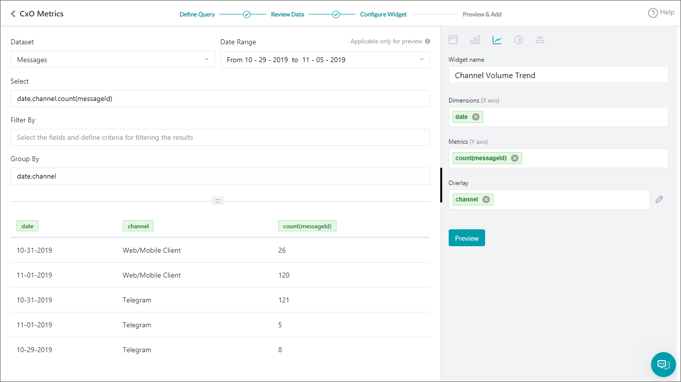
- 미리 보기를 확인하고 대시보드에 업데이트
사용자 정의 대시보드가 준비되었습니다. 날짜 범위를 설정하면 비즈니스 시나리오에 필요한 메트릭이 제공됩니다.
このハウツーでは、さまざまな測定を使用してBotパフォーマンスを分析、およびビジネスニーズのトレンドを追跡するバンキングBotのシナリオを調査します。カスタムダッシュボードとは何か、およびKore.ai Botプラットフォームへの実装方法の詳細については、こちらを参照してください。
例題
バンキングBot顧客が、以下の測定の追跡をしたいと考えています。
- 顧客タイプに基づく使用統計
- 取引額分割
- 日ごとのタスクの成功対失敗のトレンド
- チャネルごとの使用詳細
- 失敗する上位タスク
この文書では、カスタムダッシュボードを使用して上記のすべてのシナリオを達成するステップバイステップの詳細を説明します。これが構築するダッシュボードです。
Pre-requisites
- Botビルドナレッジ。
- カスタムメタタグの使用についての、 詳細はこちらを参照してください。
- 以下で述べるダイアログ付きバンキングBot。
- 資金の移動 – ユーザーに資金移動ステップを一通り説明するダイアログタスク。このダイアログには、振替額に基づきカスタムメタタグ、TransferValueを追加するスクリプトノードを含めました。以下のスクリプトが使用されました。
if(context.entities.TransferAmount[0].amount > 50000){ tags.addSessionLevelTag("TransferValue","HighValue"); } if(context.entities.TransferAmount[0].amount > 10000) tags.addSessionLevelTag("TransferValue","MediumValue"); if(context.entities.TransferAmount[0].amount > 0) tags.addSessionLevelTag("TransferValue","LowValue"); - 支払先管理 – 支払先リストを管理するユーザー用。 以下は、customerTypeメタ タグを割り当てるスクリプトです。
if(context.custType == 3){ tags.addUserLevelTag("CustomerType","Premium"); } if(context.custType == 2){ tags.addUserLevelTag("CustomerType","Gold"); }; if(context.custType == 1){ tags.addUserLevelTag("CustomerType","Regular"); };
- 資金の移動 – ユーザーに資金移動ステップを一通り説明するダイアログタスク。
導入
例題で述べた各測定を、カスタムダッシュボードからのウィジェットを使用して実装できる方法を考えてみましょう。
- 左のナビゲーション パネルから、ダッシュボードの カスタムダッシュボードをクリックします。
- 新しいダッシュボードを作成します。
- ウィジェットを追加ボタンを使用して、上記の各シナリオのウィジェットを追加します。
- 以下のセクションでは、各ウィジェットの詳細を説明します。
ドル価値分割
- ウィジェットを追加
- クエリのセットアップ:
- データセット – Analytics
- 選択 – sessionTag.TransferValue as TransferValue,count(taskName)これでプラットフォームにフェッチするデータを知らせます。ここでは、実行したタスクの合計数に対して送金金額タスクに追加したセッションタグ値を使用しています。
- グループ別 – sessionTag.TransferValue
- 実行して、上のクエリから結果を表示します。
- ウィジェットのセットアップ
- 円グラフを選択
- ディメンジョンをTransferValueに設定
- 測定 をcount(taskName)に設定
- プレビューおよびダッシュボードを更新を参照してください。
顧客タイプのサマリ
上記のステップを、以下の詳細で繰り返します。
- ウィジェットを追加
- クエリのセットアップ:
- データセット – Analytics
- 選択 – userTag.CustomerType as CustomerCategory, count(taskName)
- グループ別 – userTag.CustomerType
- 実行して、上のクエリから結果を表示します。
- ウィジェットのセットアップ
- 棒グラフを選択
- ディメンジョンを CustomerCategory に設定
- 測定を count(taskName) に設定
- プレビューおよびダッシュボードの更新を参照してください。
タスク履行トレンド
上記のステップを、以下の詳細で繰り返します。
- ウィジェットを追加
- クエリのセットアップ:
- データセット – Analytics
- 選択 – date,metricType, count(metricType) as TotalTasks
- フィルタ別 – metricType = 'successtasks' or metricType = 'failedtasks' 成功または失敗タスクのみを表示
- グループ別 – date、metricType
- 実行して、上のクエリから結果を表示します。
- ウィジェットのセットアップ
- 棒グラフを選択
- ディメンジョンをdateに設定
- 測定を TotalTasks に設定
- オーバーレイを metricType に設定
- プレビューおよびダッシュボードの更新を参照してください。
上位失敗タスク
上記のステップを、以下の詳細で繰り返します。
- ウィジェットを追加
- クエリのセットアップ:
- データセット – Analytics
- 選択 – taskName as TaskName,count(taskName) as Failures
- フィルタ別 – metricType = 'failedtasks’ 失敗タスクのみを表示
- グループ別 – taskName
- 実行して、上のクエリから結果を表示します。
- ウィジェットのセットアップ
- テーブルチャートを選択
- ディメンジョンをTaskNameおよびFailuresに設定
- プレビューおよびダッシュボードの更新を参照してください。
チャネルボリュームのトレンド
上記のステップを、以下の詳細で繰り返します。
- ウィジェットを追加
- クエリのセットアップ:
- データセット – Mesages
- 選択 – date,channel,count(messageId)
- グループ別 – date,channel
- 実行して、上のクエリから結果を表示します。
- ウィジェットのセットアップ
- 折れ線グラフを選択
- ディメンジョンをdateに設定
- 測定を count(messageId) に設定
- オーバーレイをchannelに設定
- プレビューおよびダッシュボードの更新を参照してください。
カスタムダッシュボードが準備できました。日付範囲を設定すると、ビジネスシナリオの必須測定が付与されます。
Leave a Reply
In this How-To, we will explore a scenario in a Banking Bot, where, various metrics will be used to analyze the bot performance and track some trends for business needs.
For details on what Custom Dashboards are and how they are implemented in the Kore.ai Bots platform, refer here.
Problem Statement
A Banking Bot client wants to track the following metrics:
- Usage Statistics based upon the customer type;
- Transaction value breakup;
- Day-wise task success vs failure trends;
- Channel-wise usage details;
- Top tasks that are failing.
This document gives a detailed step-by-step approach to achieving all the above-mentioned scenarios using Custom Dashboard.
This is the Dashboard we will be building:
Pre-requisites
- Bot building knowledge.
- Custom Meta Tags usage, refer here for more.
- A Banking Bot with the dialogs as mentioned below:
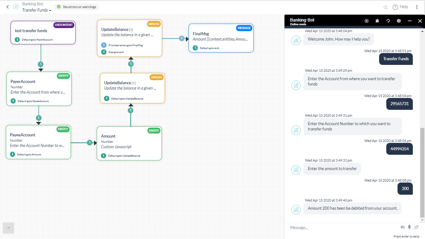
- Transfer Funds – Dialog task walking the user through the steps in transferring money.
In this diaog, we have included a Script node to add Custom Meta Tag, TransferValue, based upon the amount transferred. Following script was used:
if(context.entities.TransferAmount[0].amount > 50000){ tags.addSessionLevelTag("TransferValue","HighValue"); } if(context.entities.TransferAmount[0].amount > 10000) tags.addSessionLevelTag("TransferValue","MediumValue"); if(context.entities.TransferAmount[0].amount > 0) tags.addSessionLevelTag("TransferValue","LowValue"); - Manage Payee – For the user to manage their payee list.Here we have a Script assigning customerType meta tags:
if(context.custType == 3){ tags.addUserLevelTag("CustomerType","Premium"); } if(context.custType == 2){ tags.addUserLevelTag("CustomerType","Gold"); }; if(context.custType == 1){ tags.addUserLevelTag("CustomerType","Regular"); };
- Transfer Funds – Dialog task walking the user through the steps in transferring money.
Implementation
Let us consider how each of the metrics mentioned in the problem statement can be implemented using widgets from the Custom Dashboard.
- From the left navigation panel, under Dashboard click Custom Dashboard.
- Create New Dashboard.
- Use the Add Widget button to add widgets for each of the above scenarios.
- Following sections give the details for each widget.
Dollar Value Breakup
- Add Widget
- Query setup:
- Dataset – Analytics
- Select – sessionTag.TransferValue as TransferValue,count(taskName)
This will let the platform know what data to fetch. Here we are using the session tag values added to the Transfer Amount task against the total number of tasks executed. - Group By – sessionTag.TransferValue
- Run to see the results from the above query.
- Widget Setup
- Select Pie chart
- Set Dimension to TransferValue
- Set Metrics to count(taskName)
- See the Preview and if all is fine Update to Dashboard
Customer Type Summary
Repeat the above steps with the following details:
- Add Widget
- Query setup:
- Dataset – Analytics
- Select – userTag.CustomerType as CustomerCategory, count(taskName)
- Group By – userTag.CustomerType
- Run to see the results from the above query.
- Widget Setup
- Select Bar chart
- Set Dimension to CustomerCategory
- Set Metrics to count(taskName)
- See the Preview and Update to Dashboard
Task Fulfillment Trend
Repeat the above steps with the following details:
- Add Widget
- Query setup:
- Dataset – Analytics
- Select – date,metricType, count(metricType) as TotalTasks
- Filter By – metricType = ‘successtasks’ or metricType = ‘failedtasks’
We want to see only Success or Failed Tasks - Group By – date,metricType
- Run to see the results from the above query.
- Widget Setup
- Select Bar chart
- Set Dimension to date
- Set Metrics to TotalTasks
- Set Overlay to metricType
- See the Preview and Update to Dashboard.
Top Failure Tasks
Repeat the above steps with the following details:
- Add Widget
- Query setup:
- Dataset – Analytics
- Select – taskName as TaskName,count(taskName) as Failures
- Filter By – metricType = ‘failedtasks’
We want to see only Failed Tasks - Group By – taskName
- Run to see the results from the above query.
- Widget Setup
- Select Table chart
- Set Dimension to TaskName and Failures
- See the Preview and Update to Dashboard
Channel Volume Trend
Repeat the above steps with the following details:
- Add Widget
- Query setup:
- Dataset – Mesages
- Select – date,channel,count(messageId)
- Group By – date,channel
- Run to see the results from the above query.
- Widget Setup
- Select Line chart
- Set Dimension to date
- Set Metrics to count(messageId)
- Set Overlay to channel
- See the Preview and Update to Dashboard
You Custom Dashboard is ready. Setting the Date Range will give you the required metrics for the business scenarios.
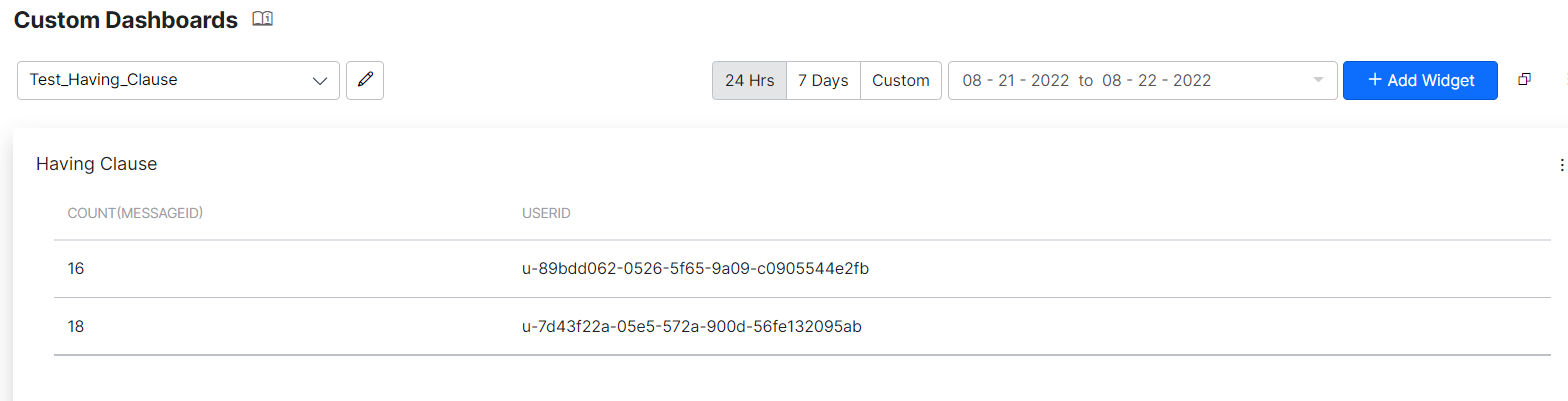
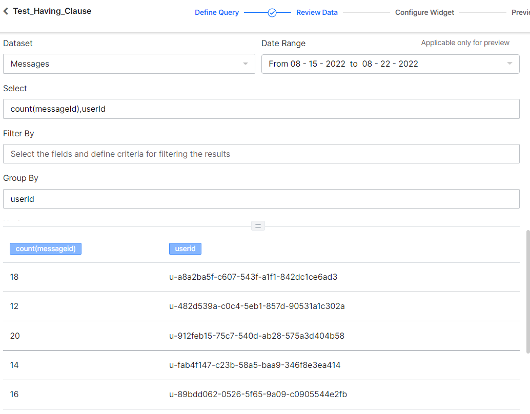
Filter the Messages using the Having Clause
This query uses a Having clause, to display the number of filtered messages for userIds, where the user has interacted with the virtual assistant more than 12 times. The query setup and result are described below.
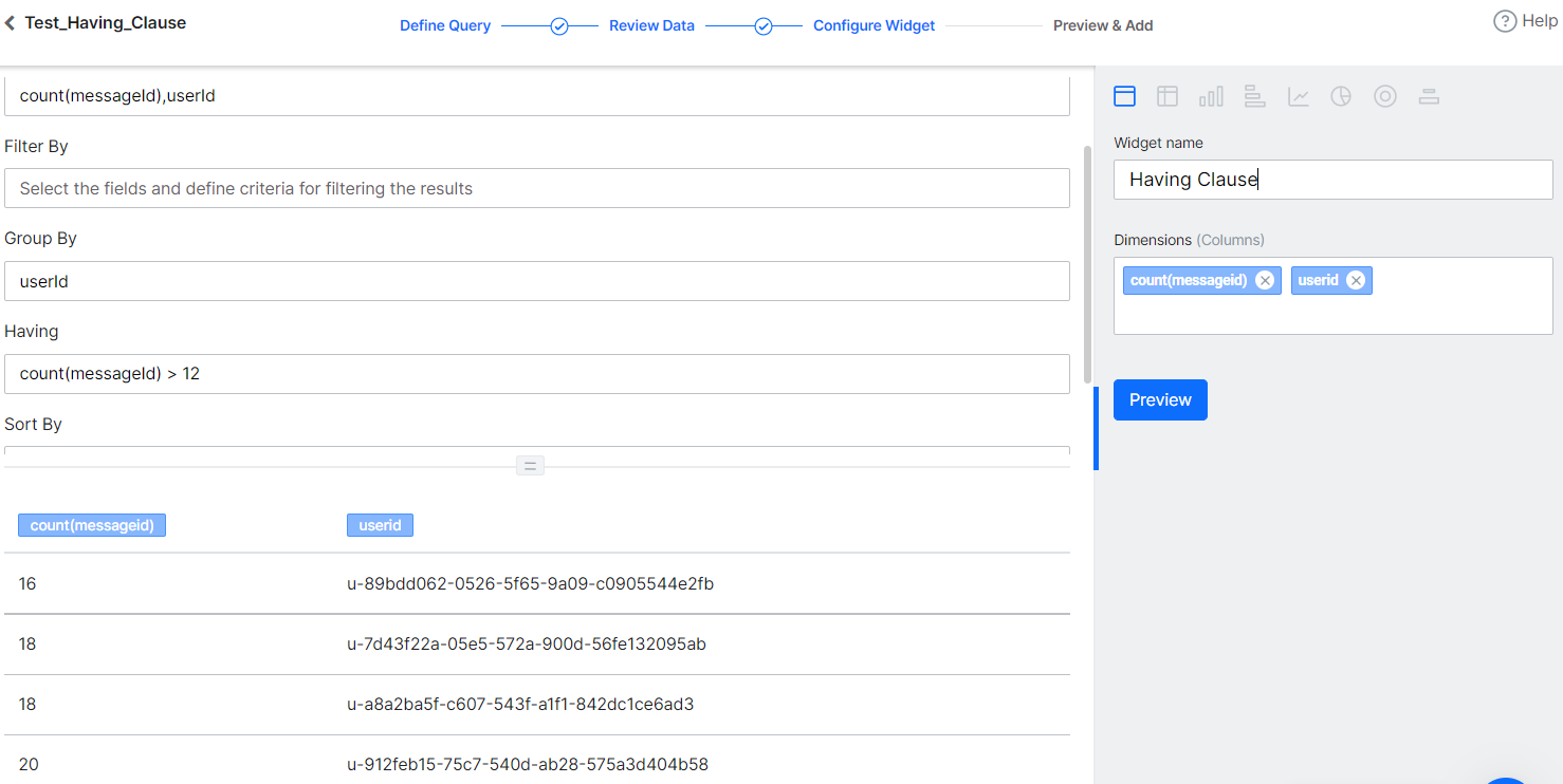
Repeat the steps listed in the previous section with the following details:
- Add Widget
- Query setup:
- Dataset – Mesages
- Select – count(messageId),userId
- Group By – userId
- Having – count(messageId) > 12
- Run to see the results from the above query.
- Widget Setup
- Select Table chart
- Set Dimension to count(messageId),userId
- The following is a result when you just retrieve the count of all messages, grouping by the userId.
- The following is a result when you retrieve the count of messages, grouping by the userId, using the Having clause.
- See the Preview and then click Add to Dashboard.
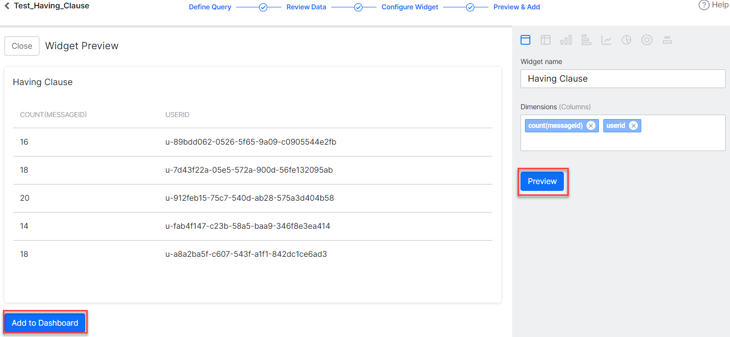
The Having clause widget is added to the dashboard as shown in the following screenshot.