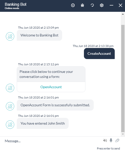
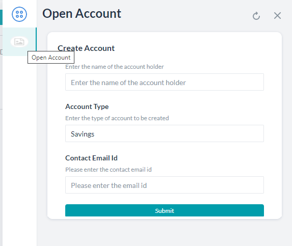
가상 상담사는 일반적으로 메시지 교환 등 대화형 인터페이스를 주로 사용하여 최종 사용자를 참여하도록 합니다. 그러나 계속 진행하려면 최종 사용자로부터 정보를 수집해야 하는 경우가 종종 있습니다. 예를 들어 전자 상거래 상담사와 상호 작용하는 동안 배달 주소, ITSM 상담사에게 보고하는 동안 문제의 세부 정보, CRM 기회를 생성하는 동안 기회의 세부 정보, 은행 계좌 생성을 위한 고객 세부 정보 캡처 등을 제공할 수 있습니다. 표준 대화 작업에서 연속으로 연결된 일련의 엔티티 노드를 배치하여 이 시나리오를 설계하였으며 이러한 각 엔티티 값을 사용자에게 순차적으로 요청합니다. 이는 상당히 지루하고 불만스러운 과정입니다. 이를 대신하여 사용자의 모든 정보를 쉽고 효율적으로 캡처할 수 있는 대화형 사용자 인터페이스가 이상적입니다. Kore.ai의 디지털 양식은 최종 사용자의 세부 정보를 캡처하기 위한 다양한 입력 필드를 제공하여 이러한 요구 사항을 충족합니다. 사용자가 양식을 완료한 후 해당 작업을 계속하기 위해 입력한 내용을 가상 상담사에게 제출하게 됩니다. 이 문서에서는 Kore.ai 봇 플랫폼에서 디지털 양식의 기능과 구현을 설명합니다. 디지털 양식을 단계별로 구현한 사례로 이동하려면 여기를 클릭하세요.

장점
- 입력 수집을 위한 단일 인터페이스로 사용자 경험 향상.
- 간단히 끌어서 놓는 작업을 통해 쉽게 양식을 생성.
- 모든 양식 요구 사항을 충족하는 방대한 구성 요소 라이브러리.
- 사례에 적합한 입력 유효성 검사 및 가시성에 대한 규칙 정의를 제공.
- 상호 작용 채널을 기반으로 양식 또는 대화형 경험 간 전환을 할 수 있는 양식에서 자동 대화 작업 생성.
설정
빌드 상단 메뉴에서 디지털 스킬 -> 디지털 양식을 통해 디지털 양식에 액세스할 수 있습니다. 다음은 디지털 양식을 설정하는 단계입니다.
- 양식 생성: 구성 요소를 추가하고 속성을 설정하여 디지털 양식을 정의합니다.
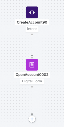
- 양식 호출: 작업 또는 프로세스 내부에서 양식을 호출합니다.
- 작업 정의를 정의하기 위한 작업 구성 요소로 양식을 포함합니다. 대화 작업은 상호 작용 채널을 기반으로 양식 경험 및 대화형 경험을 제공합니다.
- 디지털 뷰에서 양식을 제출할 때 트리거되는 대화 작업과 함께 디지털 양식을 디지털 뷰에 추가합니다.
- 양식 제출: 사용자가 제출할 때 구성 요솟값의 유효성을 검사하고 오류를 강조 표시합니다. 호출 모드에 따라 성공적인 유효성 검사를 한 후:
- 봇 실행은 대화 작업 호출의 경우 대화 흐름에 따라 진행됩니다.
- 선택한 작업이 창에서 트리거됩니다.

양식 생성
디지털 양식에는 사용자 입력을 캡처하기 위한 정의 및 다양한 구성 요소가 포함되어 있습니다. 양식을 만들려면 다음 단계를 따르세요.
- 빌드 상단 메뉴에서 디지털 스킬을 선택합니다.
- 디지털 양식 > 새로 만들기를 클릭합니다.
- 새 양식 페이지에서 다음을 입력합니다.
- 양식의 이름
- 양식의 표시 이름
- 양식의 설명
- 양식 보안 – 양식 데이터 보호를 활성화하여 봇 콘텍스트, 디버그 로그, 서비스 호출, 상담사 전환, Bot Kit에서 양식 데이터를 삭제합니다. 활성화되고 나면 플랫폼은 모든 모듈에서 사용자 입력을 시스템이 생성한 고유한 임의의 영숫자 값으로 대체합니다.
- 저장 및 진행을 클릭합니다.

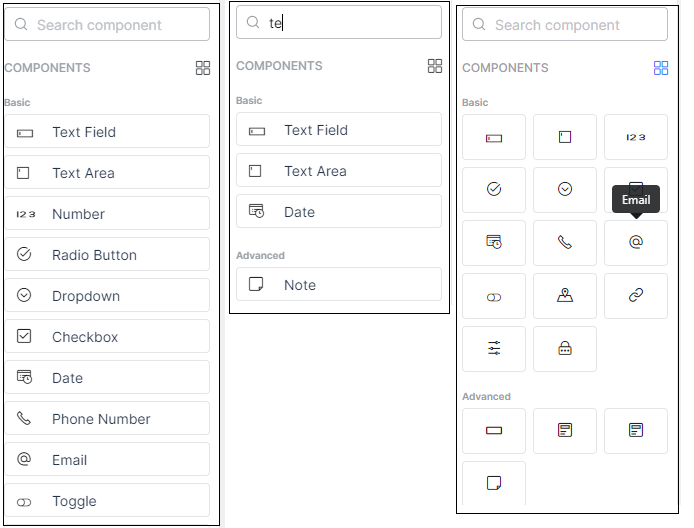
구성 요소 추가
- 왼쪽 창에서 사용 가능한 구성 요소를 캔버스로 끌어다 놓고 해당 속성을 설정하여 양식을 구축할 수 있습니다. 구성 요소 및 해당 속성에 대한 자세한 내용은 아래를 참조하세요.
- 주어진 구성 요소를 검색하고 목록을 스크롤 할 수 있습니다.
- 그리드 형식으로 보기.
양식 조치
양식 목록 페이지에서 다음을 수행할 수 있습니다. 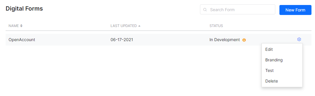
- 위에서 본 것과 같이 새 양식을 만듭니다.
- 양식 편집은 아래를 참조합니다.
- 브랜딩 옵션으로 양식을 커스터마이즈하며, 여기를 참조합니다.
- 양식 테스트는 여기를 참조합니다.
- 양식을 삭제합니다.
편집
양식 목록에서 편집 옵션을 사용하여 양식을 편집할 수 있습니다. 양식 편집 모드에서는 다음 작업이 수행됩니다. 
- 구성 요소 목록은 간단한 끌어서 놓기 동작으로 구성 요소를 선택하고 양식에 추가하는 데 사용됩니다.
- 뷰 전환기로 데스크톱 뷰와 모바일 뷰를 전환합니다.
- 간단한 끌어서 놓기 동작으로 위치를 변경하려면 각 구성 요소에 핸들 바를 사용하세요.
- 양식 작업을 사용하여 다음을 수행합니다.
- 양식을 테스트하여 봇 빌더에서 디지털 양식의 미리 보기를 확인합니다.
- 양식을 삭제합니다.
- 이름, 표시 이름 및 설명과 같은 양식 설정을 변경합니다.
- 구성 요소 작업을 사용하여 구성 요소 설정, 복제, 삭제에 액세스합니다.
- 구성 요소 설정 팝업에서 구성 요소의 속성을 변경할 수 있습니다.
- 구성 요소 도커를 사용하여 설정 창을 화면에 도킹/도킹 해제합니다.
- 구성 요소 선택기를 사용하여 양식의 구성 요소를 탐색합니다.
브랜딩
브랜딩 옵션을 사용하여 조직의 표준을 반영하도록 양식의 스타일과 느낌을 변경합니다. 인스턴트 프리뷰는 양식이 새 색상에서 어떻게 보일지 알려주며 기본 형태를 저장하거나 복원할 수 있는 옵션이 있습니다. 
테스트
미리 보기를 위해 양식을 테스트합니다. 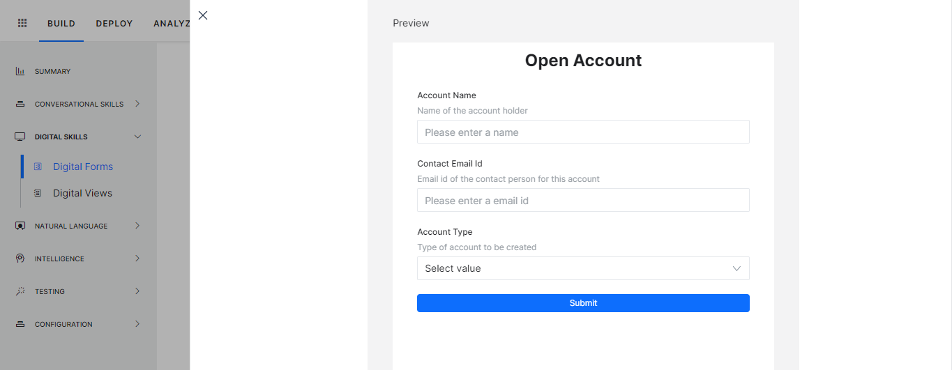
양식 호출
다음은 디지털 양식을 호출할 수 있는 방법입니다.
- 작업에서: 작업을 정의하는 대화에 구성 요소로 양식을 포함할 수 있습니다. 대화 작업은 양식 데이터를 채우기 위한 양식 경험 및 일반적인 대화형 경험을 제공합니다. 요구 사항에 따라 상호 작용 채널이나 기타 기준을 바탕으로 환경 설정을 선택할 수 있습니다.
- UI 흐름에서: 디지털 양식을 창에 추가하고 양식을 창에서 제출할 때 트리거할 대화 작업을 선택할 수 있습니다.
다음 섹션에서는 위의 호출 프로세스 각각을 설명합니다.
작업에서
양식 노드를 통해 사용자 입력을 캡처하는 대화 작업 내부에서 디지털 양식을 사용합니다. 대화 작업에서 양식을 호출하려면 다음 단계를 따르세요.
- 디지털 양식을 호출하려는 위치에서 대화를 생성하고 엽니다.
- 양식을 추가할 노드 옆에 있는 + 아이콘을 클릭합니다.
- 디지털 양식 옵션을 선택한 다음 목록에서 양식을 선택하세요. 디지털 양식을 직접 추가하거나 기존 양식 노드를 사용하도록 선택할 수 있습니다.
- 양식 경험을 선택하라는 메시지가 표시되는데 다음이 될 수 있습니다.

- 양식 UI만 – 양식 노드를 생성하여 선택한 디지털 양식과 연결합니다. 이 옵션은 기본 옵션입니다.
- 양식 UI 및 대화형 경험 모두 – 채널을 선택하라는 메시지가 나타납니다. 사용자가 선택한 채널 중 하나를 사용하면 양식 UI가 표시되고 나머지 채널 사용자는 대화형 경험을 하게 됩니다. 이 옵션은 다음을 생성합니다.
- 선택한 채널을 기반으로 양식 노드 및 하위 대화 노드로 전환하는 것을 결정하기 위한 논리 노드.
- 위의 양식 UI에서만 생성한 것과 같은 디지털 양식 노드입니다.
- 대화형 경험에 필요한 엔티티(구성 요소를 통해 디지털 양식에 정의된 대로)를 캡처하는 하위 대화 노드입니다. 매핑은 아래를 참조하세요. 다음 노드를 포함한 그룹(자세한 내용은 여기를 참조하세요). 이 그룹의 이름을 바꾸거나 이 그룹을 삭제할 수 있습니다.

- 양식 UI만 – 양식 노드를 생성하여 선택한 디지털 양식과 연결합니다. 이 옵션은 기본 옵션입니다.
- 추가된 각 노드의 속성을 설정할 수 있습니다.
- 양식 노드 (자세한 내용은 여기를 참조하세요). 특히 다음 구성 요소 속성이 중요합니다.
- 메시지 제출 – 양식이 성공적으로 제출되면 최종 사용자에게 표시되는 메시지
- 웹/모바일 SDK 양식 작업 – 이 옵션을 사용하면 양식을 대화 창에 인라인으로 표시하거나 전체 페이지로 열 수 있습니다.
- 대화형 흐름의 경우 논리 노드도 설정할 수 있습니다(자세한 내용은 여기를 참조하세요) 특히 다음 내용이 중요합니다.
- 콘텍스트 변수 관리는 콘텍스트 변숫값을 생성하고 설정하는 데 사용합니다. 키 필드에서 변수의 전체 경로를 사용하는 것을 잊지 마세요. 즉, context.BotUserSession.<variable_name>
- 봇 성능에 영향을 미치므로 연결 설정을 변경하지 않는 것이 좋습니다.
- 하위 대화 노드가 정상적으로 설정됩니다(자세한 내용은 여기를 참조하세요) 특히 다음 내용이 중요합니다.
- 엔티티 사후 할당으로 사용자 입력을 캡처합니다.
- 하위 대화나 소스 양식을 수정하는 경우 대화 재생성 옵션이 제공됩니다. 이렇게 하면 전체 작업을 재구축하지 않고도 변경 사항이 작업에 반영됩니다. 이 하위 대화가 사용되는 모든 위치에 변경 사항이 반영됩니다.

- 양식 노드 (자세한 내용은 여기를 참조하세요). 특히 다음 구성 요소 속성이 중요합니다.
- 다음과 같이 사용자 입력에 액세스할 수 있습니다.
- 다음을 사용하여 양식 구성 요솟값에 액세스합니다(자세한 내용은 여기를 참조하세요).
{{context.forms.<form_name>.<component_name>}} - 하위 대화의 경우 사후 할당 설정에 사용되는 변수는 다음과 같습니다.
{{context.<variable_name>}}
- 다음을 사용하여 양식 구성 요솟값에 액세스합니다(자세한 내용은 여기를 참조하세요).
- 비즈니스 요구 사항에 따라 대화 작업을 계속할 수 있습니다. 예를 들어 양식 구성 요솟값을 서비스 노드에 대한 입력으로 사용하여 데이터를 업데이트하거나 스크립트 노드를 사용하여 추가 처리할 수 있습니다. 대화형 경험도 사용하는 경우, 자동 생성된 하위 대화를 프로세스 흐름에 연결하는 것을 잊지 마세요.
양식 호출
다음은 디지털 양식을 호출할 수 있는 방법입니다.
- 작업에서: 작업을 정의하는 대화에 구성 요소로 양식을 포함할 수 있습니다. 대화 작업은 양식 데이터를 채우기 위한 양식 경험 및 일반적인 대화형 경험을 제공합니다. 요구 사항에 따라 상호 작용 채널이나 기타 기준을 바탕으로 환경 설정을 선택할 수 있습니다.
- UI 흐름에서: 디지털 양식을 창에 추가하고 양식을 창에서 제출할 때 트리거할 대화 작업을 선택할 수 있습니다.
다음 섹션에서는 위의 호출 프로세스 각각을 설명합니다.
작업에서
양식 노드를 통해 사용자 입력을 캡처하는 대화 작업 내부에서 디지털 양식을 사용합니다. 대화 작업에서 양식을 호출하려면 다음 단계를 따르세요.
- 디지털 양식을 호출하려는 위치에서 대화를 생성하고 엽니다.
- 양식을 추가할 노드 옆에 있는 + 아이콘을 클릭합니다.
- 디지털 양식 옵션을 선택한 다음 목록에서 양식을 선택하세요. 디지털 양식을 직접 추가하거나 기존 양식 노드를 사용하도록 선택할 수 있습니다.
- 양식 경험을 선택하라는 메시지가 표시되는데 다음이 될 수 있습니다.
- 양식 UI만 – 양식 노드를 생성하여 선택한 디지털 양식과 연결합니다. 이 옵션은 기본 옵션입니다.
- 양식 UI 및 대화형 경험 모두 – 채널을 선택하라는 메시지가 나타납니다. 사용자가 선택한 채널 중 하나를 사용하면 양식 UI가 표시되고 나머지 채널 사용자는 대화형 경험을 하게 됩니다. 이 옵션은 다음을 생성합니다.
- 선택한 채널을 기반으로 양식 노드 및 하위 대화 노드로 전환하는 것을 결정하기 위한 논리 노드.
- 위의 양식 UI에서만 생성한 것과 같은 디지털 양식 노드입니다.
- 대화형 경험에 필요한 엔티티(구성 요소를 통해 디지털 양식에 정의된 대로)를 캡처하는 하위 대화 노드입니다. 매핑은 아래를 참조하세요. 다음 노드를 포함한 그룹(자세한 내용은 여기를 참조하세요). 이 그룹의 이름을 바꾸거나 이 그룹을 삭제할 수 있습니다.
- 양식 UI만 – 양식 노드를 생성하여 선택한 디지털 양식과 연결합니다. 이 옵션은 기본 옵션입니다.
- 추가된 각 노드의 속성을 설정할 수 있습니다.
- 양식 노드 (자세한 내용은 여기를 참조하세요). 특히 다음 구성 요소 속성이 중요합니다.
- 메시지 제출 – 양식이 성공적으로 제출되면 최종 사용자에게 표시되는 메시지
- 웹/모바일 SDK 양식 작업 – 이 옵션을 사용하면 양식을 대화 창에 인라인으로 표시하거나 전체 페이지로 열 수 있습니다.
- 대화형 흐름의 경우 논리 노드도 설정할 수 있습니다(자세한 내용은 여기를 참조하세요) 특히 다음 내용이 중요합니다.
- 콘텍스트 변수 관리는 콘텍스트 변숫값을 생성하고 설정하는 데 사용합니다. 키 필드에서 변수의 전체 경로를 사용하는 것을 잊지 마세요. 즉, context.BotUserSession.<variable_name>
- 봇 성능에 영향을 미치므로 연결 설정을 변경하지 않는 것이 좋습니다.
- 하위 대화 노드가 정상적으로 설정됩니다(자세한 내용은 여기를 참조하세요) 특히 다음 내용이 중요합니다.
- 엔티티 사후 할당으로 사용자 입력을 캡처합니다.
- 하위 대화나 소스 양식을 수정하는 경우 대화 재생성 옵션이 제공됩니다. 이렇게 하면 전체 작업을 재구축하지 않고도 변경 사항이 작업에 반영됩니다. 이 하위 대화가 사용되는 모든 위치에 변경 사항이 반영됩니다.
- 양식 노드 (자세한 내용은 여기를 참조하세요). 특히 다음 구성 요소 속성이 중요합니다.
- 다음과 같이 사용자 입력에 액세스할 수 있습니다.
- 다음을 사용하여 양식 구성 요솟값에 액세스합니다(자세한 내용은 여기를 참조하세요).
{{context.forms.<form_name>.<component_name>}} - 하위 대화의 경우 사후 할당 설정에 사용되는 변수는 다음과 같습니다.
{{context.<variable_name>}}
- 다음을 사용하여 양식 구성 요솟값에 액세스합니다(자세한 내용은 여기를 참조하세요).
- 비즈니스 요구 사항에 따라 대화 작업을 계속할 수 있습니다. 예를 들어 양식 구성 요솟값을 서비스 노드에 대한 입력으로 사용하여 데이터를 업데이트하거나 스크립트 노드를 사용하여 추가 처리할 수 있습니다. 대화형 경험도 사용하는 경우, 자동 생성된 하위 대화를 프로세스 흐름에 연결하는 것을 잊지 마세요.
패널에서
디지털 양식은 위젯 및 패널을 설정하여 디지털 뷰에서 표현합니다. 디지털 뷰에 대한 자세한 내용은 여기를 참조하세요. 위젯 및 패널에서 양식을 호출하려면 다음 단계를 따르세요.
- 빌드 -> 디지털 스킬 -> 디지털 뷰 옵션에서 디지털 양식을 호출하는 위젯을 생성합니다.
- 이름 입력을 입력합니다.
- 소스로 디지털 양식을 선택합니다.
- 드롭다운 목록에서 선택하여 양식을 추가합니다.
- 드롭다운 목록에서 제출 시 호출할 대화를 선택합니다. 디지털 양식은 여러 위젯을 정의하고 여러 패널에 추가하는 데 사용되지만 모든 위젯 및 패널에서 단일 대화 작업과 연결됨을 참고하세요.
- 위젯을 저장합니다.

- 기존 패널에 위젯을 추가하거나 새 창을 만듭니다. 패널에 직접 양식을 추가할 수 있으며 기본적으로 위젯이 생성됩니다.
- 패널을 테스트할 수 있습니다.
- 여기에 제공된 단계에 따라 패널을 게시하고 호스팅합니다.
프로세스 흐름
최종 사용자가 대화를 시작하고 양식 노드에 연결하는 노드에 도달하면 다음과 같은 일이 일어납니다. 설계 시 선택한 경험과 호출 채널에 따라, 다음과 같은 흐름을 보입니다.
- 양식 경험:
- 사용자에게 양식 링크가 나타납니다 동기식 WebHook 채널의 경우 링크 대신 전체 양식 정의가 전송됨을 참고하세요. 자세한 내용을 보려면 여기를 클릭하세요.

- 링크를 클릭하면 선택에 따라 전체 화면 또는 인라인 모드에서 양식이 열립니다. 링크에 대한 특별 참고 사항:
- 링크는 일정 시간 동안만 활성화되며 그 이후에는 비활성화됩니다.
- 활성 기간 내에서도 제한된 횟수만큼만 사용할 수 있습니다.
- 최종 사용자는 구성 요소/필드의 값을 채울 수 있습니다.

- 모든 양식에는 기본 제출 버튼이 있습니다. 이렇게 하면 양식 엔티티가 검증되고 누락된 값이 있는지 묻는 메시지가 표시됩니다.

- 양식이 검증되고 제출되면 콘텍스트 변수에서 값을 사용할 수 있으며 다음 코드를 사용하여 액세스할 수 있습니다.
context.forms.<form_name>.<component_name>여기에서는 사용자 항목을 캡처하고 메시지 노드를 사용하여 표시합니다.
- 사용자에게 양식 링크가 나타납니다 동기식 WebHook 채널의 경우 링크 대신 전체 양식 정의가 전송됨을 참고하세요. 자세한 내용을 보려면 여기를 클릭하세요.
- 대화형 경험:
- 작업 채널에서 최종 사용자에게 양식의 모든 구성 요솟값을 입력하라는 메시지가 표시됩니다.
- 값은 하위 대화에서 사용할 수 있으며 위에서 언급한 대로 엔티티 사후 할당으로 캡처됩니다.
- 다음은 대화 모드의 사용자 경험입니다.

예외
양식 노드를 사용하여 대화를 실행하는 동안 예외가 발생하면 다음과 같이 처리됩니다.
| 예외 | 예외 동작 |
|---|---|
| 사용자가 양식 링크를 열지 않고 대화를 계속하려고 합니다. | 중단 설정 관리가 적용되며 사용자가 양식으로 돌아오면 새 양식 링크가 표시됩니다 |
| 사용자가 양식 응답을 제출하지 않고 대화를 계속하려고 합니다(채팅 창에서). | 중단 설정 관리가 적용되며 사용자가 양식으로 돌아오면 새 양식 링크가 표시됩니다 |
| 사용자가 응답을 제출하지 않고 양식이나 브라우저를 닫습니다. | 양식에 작업이 취소된다는 경고 메시지가 표시됩니다 사용자가 수락하면 양식이 닫히고 이전 작업이 취소되었다는 메시지가 표시됩니다 |
| 양식이 이미 열려 있는 동안 사용자가 양식을 다시 시작하려고 합니다. | 양식 링크로 양식이 열리지 않으며 양식 링크가 더 이상 유효하지 않다는 메시지가 표시됩니다. |
| 사용자가 대화를 진행한 후 양식을 다시 시작하려고 합니다. | 양식 링크로 양식이 열리지 않으며 양식 링크가 더 이상 유효하지 않다는 메시지가 표시됩니다. |
패널 흐름
사용자는 패널 및 위젯을 사용하여 양식에 액세스할 수 있습니다. 경험은 양식 경험 프로세스 흐름과 동일합니다. 양식이 검증되고 제출되면 콘텍스트 변수에서 값을 사용할 수 있으며 다음 코드를 사용하여 액세스할 수 있습니다. context.forms.<form_name>.<component_name> 다음은 경험입니다.
봇 관리
게시
디지털 양식 봇의 게시 흐름에는 다음과 같은 특수한 경우가 있습니다.
- 다른 봇과 마찬가지로 디지털 양식은 다음과 같은 상태로 존재합니다.
- 개발 중 양식이 생성될 때.
- 승인 대기 중 게시되도록 양식을 제출하고 그 요청을 관리자가 조치를 취하도록 기다리고 있을 때.
- 거부 관리자가 게시 요청을 거부할 때.
- 게시 관리자가 게시 요청을 승인할 때.
- 유보 관리자가 게시 양식을 유보할 때.
- 게시 요청이 처리되기 전에 다음 검사가 수행됩니다.
- 디지털 양식이 포함된 대화 작업은 다음과 같은 경우에만 게시할 수 있습니다.
- 해당 디지털 양식이 이미 게시되었거나
- 해당 디지털 양식도 게시를 위해 선택되었을 때.
- 대화 작업을 트리거하도록 설정된 디지털 양식은 다음과 같은 경우에만 게시됩니다.
- 해당 대화 작업이 이미 게시되었거나
- 해당 대화 작업도 게시를 위해 선택되었을 때.
- 종속성과 함께 게시하는 동안 다음과 같은 경우 실행 시간 동안 모든 종속성을 사용하지 못할 수 있습니다.
- 대화 작업은 게시된 상태지만 디지털 양식이 게시된 상태가 아닌 경우 다음이 트리거됩니다.
- 작업 실패 이벤트와 해당 동작 호출 혹은
- 관련 표준 응답이 표시되고
- 분석에 실패한 작업으로 기록됩니다.
- 디지털 양식이 게시된 상태이지만 대화 작업을 사용할 수 없는 경우 양식 제출 시 최종 사용자에게 양식의 오류 메시지가 표시됩니다.
- 대화 작업은 게시된 상태지만 디지털 양식이 게시된 상태가 아닌 경우 다음이 트리거됩니다.
- 디지털 양식이 포함된 대화 작업은 다음과 같은 경우에만 게시할 수 있습니다.
가져오기/내보내기
봇 내보내기
- 개발 중인, 게시된 사본의 디지털 양식을 내보내는 옵션을 사용할 수 있습니다.
- 봇 작업 카테고리의 봇 내보내기 페이지에서 디지털 양식을 선택/선택 취소할 수 있습니다.
- 위젯을 정의하기 위해 선택된 디지털 양식과 통합된 대화 작업을 내보내려면 종속 대화를 포함하는 이 옵션을 선택하세요. 디지털 양식을 사용하여 생성된 하위 대화 작업은 포함하지 않는다는 것을 참고하세요.
- 선택한 각 양식에 대한 전체 정보는 내보내기 파일에서 사용할 수 있으며 여기에는 다음이 포함됩니다.
- 필드
- 필드 속성
- 양식 통합
봇 가져오기
- 디지털 양식은 봇의 전체 및 증분 가져오기에 포함됩니다.
- 전체 가져오기의 경우:
- 다른 모든 봇 구성 요소와 마찬가지로 전체 가져오기는 봇의 전체 디지털 양식 및 양식 세부 정보를 대체합니다.
- 증분 가져오기:
- 가져오기에 디지털 양식을 포함/제외하도록 선택할 수 있습니다.
- 이 가져오기는 가져오기 파일과 봇에 공통적인 디지털 양식을 완전히 대체합니다.
- 파일의 추가 양식을 봇으로 가져옵니다.
- 봇의 추가 양식은 유지됩니다.
- 가져온 후 잘못된 디지털 양식 통합 세부 정보는 해당 양식과 연결 해제됩니다.
구성 요소 세부 정보
구성 요소 목록
다음은 사용 가능한 구성 요소 목록입니다. 각 구성 요소의 속성에 대한 자세한 내용은 아래를 참조하세요
| 구성 요소 | 설명 | 샘플 |
|---|---|---|
| 기본 | ||
 |
텍스트 필드 – 한 줄 입력에 사용됩니다. |  |
 |
텍스트 영역 – 여러 줄 입력에 사용됩니다. | 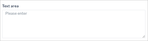 |
 |
숫자 – 숫자 입력에 사용됩니다 |  |
 |
라디오 버튼 – 주어진 목록에서 선택 옵션으로 사용됩니다 |  |
 |
드롭다운 – 주어진 목록에서 선택 옵션으로 사용됩니다. 개까지 다중 선택 가능 | 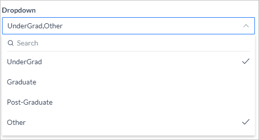 |
 |
체크박스 – 주어진 목록에서 다중 선택 옵션에 사용됩니다 | 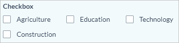 |
 |
날짜 – 날짜 입력에 사용되며 사용자가 날짜를 선택할 수 있는 날짜 선택기를 제공합니다. | 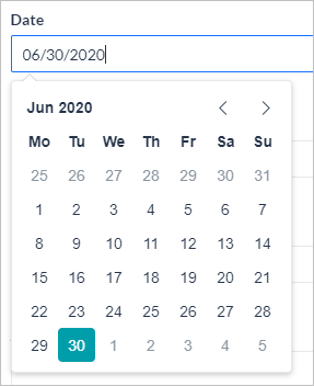 |
|
날짜 및 시간 – 날짜 및 시간 입력에 사용되며 사용자가 날짜와 시간을 선택할 수 있는 날짜 및 시간 선택기를 제공합니다. 날짜 구성 요소를 사용하고 시간 옵션을 ‘예’로 설정합니다. 12시간 또는 24시간 형식 중에서 선택 | 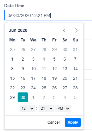 |
 |
전화번호 – 전화번호 입력에 사용되며 사용자가 국가 코드를 선택할 수 있습니다. | 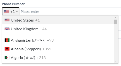 |
 |
이메일 – 이메일 주소 입력에 사용되며 xxx@uuu.com 형식을 검증합니다 | 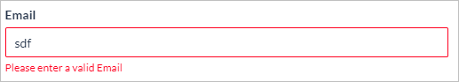 |
 |
토글 – 두 값 사이를 전환하는 데 사용되며 예/아니요 유형의 입력에 이상적입니다. |  |
 |
주소 – 주소 입력에 사용됩니다 | 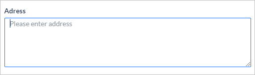 |
 |
URL – 웹 URL 입력에 사용되며 xxx.com 형식을 검증합니다 | 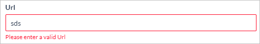 |
 |
범위 슬라이더 – 지정된 최솟값과 최댓값 사이의 값 선택이며 백분율로 나타낼 수 있습니다 | 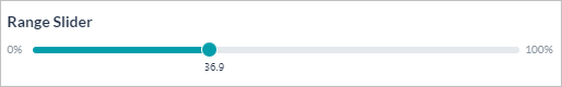 |
| 고급 | ||
 |
버튼 – 클릭할 수 있는 구성 요소로써 제출 또는 재설정하거나 외부 URL을 여는 데 사용됩니다. 1차, 2차, 3차, 고스트 또는 위험 중에서 선택합니다. | 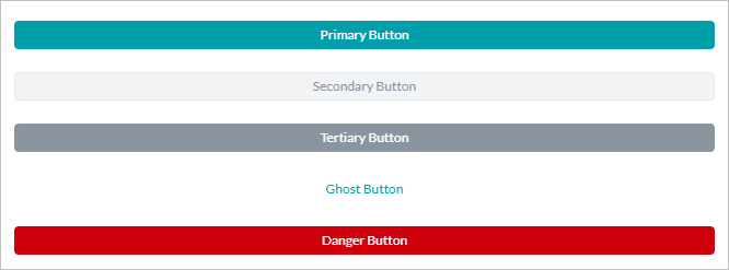 |
 |
레이블 – 정적 텍스트 상자를 표시하는 데 사용하며 사용자의 조치가 필요하지 않습니다. |  |
 |
유용한 팁 – 최종 사용자에게 중요한 정보를 표시하는 데 사용하며 사용자 작업이 필요하지 않습니다. | 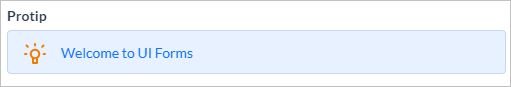 |
 |
참고 사항 – 최종 사용자에게 정보를 표시하는 데 사용하며 사용자 작업이 필요하지 않습니다. | 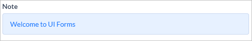 |
구성 요소 속성
다음은 각 구성 요소에 설정할 수 있는 속성입니다. 참고 사항: 모든 속성이 모든 구성 요소에 유효한 것은 아닙니다. 매핑 속성 매트릭스를 참조하세요.
| 속성 | 설명 |
|---|---|
| 표시 이름 | 최종 사용자를 위한 구성 요소에 표시되는 텍스트입니다. |
| 이름 | 양식 및 양식 수준 작업의 다른 구성 요소에서 구성 요소를 참조하는 데 사용할 수 있는 참조 이름입니다. |
| 설명 | 최종 사용자에게 표시될 필드에 대한 도움말 정보입니다. |
| 플레이스 홀더 텍스트 | 최종 사용자를 위한 프롬프트 메시지 |
| 버튼 스타일 |
버튼 구성 요소는 다음과 같을 수 있습니다.
|
| 버튼 동작 |
버튼 구성 요소는 다음과 같을 수 있습니다.
|
| 읽기 전용 | 구성 요솟값을 표시하려면 변경할 수 없습니다. |
| 필수 | 이 필드의 입력이 최종 사용자 항목에 필요한지 또는 선택 사항인지 정의합니다. |
| 툴팁 |
최종 사용자의 요구에 표시될 필드에 대한 추가적인 정보입니다. 세 가지 항목이 있습니다.
|
| 날짜 형식 |
최종 사용자에게 표시되는 시간 형식은 다음일 수 있습니다
|
| 시간 | 최종 사용자가 날짜와 함께 시간을 입력할 수 있도록 합니다 |
| 시간 형식 위의 시간 속성과 함께 사용됩니다 | 최종 사용자에게 표시되는 시간 형식은 12시간 또는 24시간일 수 있습니다. |
| 기본 국가 코드 | 최종 사용자에게 표시되어야 하는 원하는 기본 국가 코드를 선택합니다. 기본값은 미국 +1입니다 |
| 필드 데이터 보호 | 이 필드에서 수집한 사용자 정보를 보호합니다. |
| 마스킹 유형 보안 필드 데이터가 활성화된 경우에만 사용 가능함 |
봇 콘텍스트, 디버그 로그, 서비스 호출, 상담사 전환, Bot Kit에서 삭제된 데이터를 표시하는 방법을 선택합니다. 다음 작업을 사용할 수 있습니다.
|
| 마스킹 입력 보안 필드 데이터가 활성화된 경우에만 사용 가능함 | 대화 창에서 이 필드의 사용자 입력을 마스킹하려면 이 옵션을 활성화합니다. |
| 체크 박스 레이아웃 | 그리드 뷰에서 체크박스 값을 표시할 열 수를 선택합니다. 열을 최소 1개에서 최대 4개까지 선택할 수 있으며 4개 열이 기본 선택입니다. |
| 날짜 설정 | |
| 기본값 | 구성 요소를 기본값으로 미리 채워야 하는 경우 |
| 값 | 라디오 버튼, 드롭다운 및 체크박스의 경우 최종 사용자가 선택할 수 있도록 값을 추가합니다. 하나의 값을 기본값으로 표시할 수 있습니다. |
| 다중 선택 | 드롭다운의 경우 사용자가 여러 값을 선택할 수 있는지 여부입니다. |
| 검증 설정 | |
| 기본 오류 메시지 | 사용자 입력이 유효성 검사에 실패한 경우 표시됩니다 |
| 검증 |
필드에 대해 정의된 검증을 확인할 시기를 정의합니다. 옵션은 다음과 같습니다.
|
| 검증 규칙 |
다음 형식의 규칙이 추가될 수 있습니다.
기존 규칙에 추가된 여러 규칙은 AND 조건으로 간주되지만 새 규칙은 OR 조건이 됩니다. 단순 모드와 고급 모드 사이를 전환하여 여러 단순 규칙 또는 단일 고급 규칙을 추가할 수 있습니다. |
| 맞춤형 오류 메시지 | 특정 유효성 검사에 실패할 때 표시됩니다. |
| 가시성 설정 | |
| 가시성 여부 | 주어진 구성 요소가 최종 사용자에게 표시되는지 여부 |
| 가시성 규칙 |
특정 구성 요소를 표시하거나 숨길 조건을 정의할 수 있습니다.
기존 규칙에 추가된 여러 규칙은 AND 조건으로 간주되지만 새 규칙은 OR 조건이 됩니다. 단순 모드와 고급 모드 사이를 전환하여 여러 단순 규칙 또는 단일 고급 규칙을 추가할 수 있습니다. |
| 자동 채우기 | |
| 자동 채우기 | 주어진 구성 요소를 자동으로 채워야 하는지 여부 |
| 자동 채우기 규칙 |
|
구성 요소 매핑
속성
기본
| 속성 | 텍스트 필드 | 텍스트 영역 | 숫자 | 라디오 버튼 | 체크박스 | 드롭다운 | 날짜 | 전화번호 | 이메일 | 주소 | URL | 토글 | 범위 슬라이더 |
|---|---|---|---|---|---|---|---|---|---|---|---|---|---|
| 일반 설정 | |||||||||||||
| 표시 이름 | 예 | 예 | 예 | 예 | 예 | 예 | 예 | 예 | 예 | 예 | 예 | 예 | 예 |
| 이름 | 예 | 예 | 예 | 예 | 예 | 예 | 예 | 예 | 예 | 예 | 예 | 예 | 예 |
| 설명 | 예 | 예 | 예 | 예 | 예 | 예 | 예 | 예 | 예 | 예 | 예 | 예 | 예 |
| 플레이스 홀더 텍스트 | 예 | 예 | 예 | 아니요 | 아니요 | 예 | 예 | 예 | 예 | 예 | 예 | 아니요 | 예 |
| 읽기 전용 | 예 | 예 | 예 | 예 | 예 | 예 | 예 | 예 | 예 | 예 | 예 | 예 | 예 |
| 필수 | 예 | 예 | 예 | 예 | 예 | 예 | 예 | 예 | 예 | 예 | 예 | 예 | 예 |
| 툴팁 | |||||||||||||
| 팁 텍스트 | 예 | 예 | 예 | 예 | 예 | 예 | 예 | 예 | 예 | 예 | 예 | 예 | 예 |
| 툴팁 유형 | 예 | 예 | 예 | 예 | 예 | 예 | 예 | 예 | 예 | 예 | 예 | 예 | 예 |
| 툴팁 위치 | 예 | 예 | 예 | 예 | 예 | 예 | 예 | 예 | 예 | 예 | 예 | 예 | 예 |
| 날짜 형식 | 아니요 | 아니요 | 아니요 | 아니요 | 아니요 | 아니요 | 예 | 아니요 | 아니요 | 아니요 | 아니요 | 아니요 | 아니요 |
| 시간 및 시간 형식 | 아니요 | 아니요 | 아니요 | 아니요 | 아니요 | 아니요 | 예 | 아니요 | 아니요 | 아니요 | 아니요 | 아니요 | 아니요 |
| 기본 국가 코드 | 아니요 | 아니요 | 아니요 | 아니요 | 아니요 | 아니요 | 아니요 | 예 | 아니요 | 아니요 | 아니요 | 아니요 | 아니요 |
| 체크 박스 레이아웃 | 아니요 | 아니요 | 아니요 | 아니요 | 예 | 아니요 | 아니요 | 아니요 | 아니요 | 아니요 | 아니요 | 아니요 | 아니요 |
| 데이터 보호 | 예 | 예 | 예 | 예 | 예 | 예 | 예 | 예 | 예 | 예 | 예 | 예 | 예 |
| 마스킹 유형 | 예 | 예 | 예 | 예 | 예 | 예 | 예 | 예 | 예 | 예 | 예 | 예 | 예 |
| 입력 마스킹 | 예 | 아니요 | 예 | 아니요 | 아니요 | 아니요 | 아니요 | 아니요 | 아니요 | 아니요 | 아니요 | 아니요 | 아니요 |
| 날짜 설정 | |||||||||||||
| 데이터 원본 | 아니요 | 아니요 | 아니요 | 예 | 예 | 예 | 아니요 | 아니요 | 아니요 | 아니요 | 아니요 | 아니요 | 아니요 |
| 기본값 | 예 | 예 | 예 | 예 | 예 | 예 | 예 | 예 | 예 | 예 | 예 | 예 | 예 |
| 다중 선택 | 아니요 | 아니요 | 아니요 | 아니요 | 아니요 | 예 | 아니요 | 아니요 | 아니요 | 아니요 | 아니요 | 아니요 | 아니요 |
| 자동 채우기 | |||||||||||||
| 자동 채우기 | 예 | 예 | 예 | 예 | 예 | 예 | 예 | 예 | 예 | 예 | 예 | 예 | 예 |
| 자동 채우기 설정 | 예 | 예 | 예 | 예 | 예 | 예 | 예 | 예 | 예 | 예 | 예 | 예 | 예 |
| 가시성 설정 | |||||||||||||
| 가시성 여부 | 예 | 예 | 예 | 예 | 예 | 예 | 예 | 예 | 예 | 예 | 예 | 예 | 예 |
| 가시성 설정 | 예 | 예 | 예 | 예 | 예 | 예 | 예 | 예 | 예 | 예 | 예 | 예 | 예 |
| 검증 | |||||||||||||
| 기본 오류 메시지 | 예 | 예 | 예 | 예 | 예 | 예 | 예 | 예 | 예 | 예 | 예 | 예 | 예 |
| 검증 | 예 | 예 | 예 | 예 | 예 | 예 | 예 | 예 | 예 | 예 | 예 | 예 | 예 |
| 다음과 같음 | 예 | 예 | 예 | 예 | 예 | 예 | 예 | 예 | 예 | 미정 | 예 | 예 | 예 |
| 다음과 같지 않음 | 예 | 예 | 예 | 예 | 예 | 예 | 예 | 예 | 예 | 예 | 예 | 예 | |
| 포함 | 예 | 예 | 아니요 | 아니요 | 아니요 | 아니요 | 아니요 | 아니요 | 아니요 | 아니요 | 아니요 | 아니요 | 아니요 |
| 포함하지 않음 | 예 | 예 | 아니요 | 아니요 | 아니요 | 아니요 | 아니요 | 아니요 | 아니요 | 아니요 | 아니요 | 아니요 | |
| 정규식 | 예 | 아니요 | 아니요 | 아니요 | 아니요 | 아니요 | 아니요 | 아니요 | 아니요 | 아니요 | 아니요 | 아니요 | |
| 최대 길이 | 예 | 예 | 아니요 | 아니요 | 아니요 | 아니요 | 아니요 | 예 | 예 | 예 | 아니요 | 아니요 | |
| 최소 길이 | 예 | 예 | 아니요 | 아니요 | 아니요 | 아니요 | 아니요 | 예 | 예 | 예 | 아니요 | 아니요 | |
| 일부 | 예 | 아니요 | 아니요 | 아니요 | 아니요 | 아니요 | 아니요 | 아니요 | 아니요 | 아니요 | 아니요 | 아니요 | |
| 일부가 아닌 | 예 | 아니요 | 아니요 | 아니요 | 아니요 | 아니요 | 아니요 | 아니요 | 아니요 | 아니요 | 아니요 | 아니요 | |
| 보다 큰 | 아니요 | 아니요 | 예 | 아니요 | 아니요 | 아니요 | 예 | 아니요 | 아니요 | 아니요 | 아니요 | 예 | |
| 보다 작은 | 아니요 | 아니요 | 예 | 아니요 | 아니요 | 아니요 | 예 | 아니요 | 아니요 | 아니요 | 아니요 | 예 | |
| 크거나 같음 | 아니요 | 아니요 | 예 | 아니요 | 아니요 | 아니요 | 예 | 아니요 | 아니요 | 아니요 | 아니요 | 예 | |
| 작거나 같음 | 아니요 | 아니요 | 예 | 아니요 | 아니요 | 아니요 | 예 | 아니요 | 아니요 | 아니요 | 아니요 | 예 | |
고급
| 속성 | 버튼 | 리치 텍스트 | 유용한 팁 | ||||
|---|---|---|---|---|---|---|---|
| 일반 설정 | |||||||
| 표시 이름 | 예 | 예 | 예 | ||||
| 이름 | 예 | 예 | 예 | ||||
| 설명 | 예 | 아니요 | 예 | ||||
| 플레이스 홀더 텍스트 | 아니요 | 아니요 | 아니요 | ||||
| 툴팁 | 예 | 예 | 아니요 | ||||
| 오류 메시지 | 예 | 아니요 | 아니요 | ||||
| 필수 | 아니요 | 아니요 | 아니요 | ||||
| 검증 | 예 | 아니요 | 아니요 | ||||
| 읽기 전용 | 예 | 아니요 | 아니요 | ||||
| 조치 유형 (제출, 재설정, 지우기) | 예 | 아니요 | 아니요 | ||||
| 날짜 설정 | |||||||
| 데이터 원본 | 아니요 | 아니요 | 아니요 | ||||
| 기본값 | 아니요 | 아니요 | 아니요 | ||||
| 자동 채우기 | |||||||
| 자동 채우기 | 아니요 | 아니요 | 아니요 | ||||
| 자동 채우기 설정 | 아니요 | 아니요 | 아니요 | ||||
| 가시성 설정 | |||||||
| 가시성 여부 | 예 | 예 | 예 | ||||
| 가시성 설정 | 예 | 예 | 예 | ||||
대화 노드
다음 매핑은 디지털 양식에서 자동 생성될 때 하위 대화에 포함된 엔티티 유형을 제공합니다.
| 양식 구성 요소 속성 | 대화 작업 노드 속성 |
|---|---|
| 이름 | 이름 |
| 표시 이름 | 표시 이름 |
| 플레이스 홀더 텍스트 | 엔티티 프롬프트 |
| 오류 메시지 | 오류 프롬프트 |
| 디지털 양식 구성 요소 유형 | 대화 작업 노드 유형 |
|---|---|
| 텍스트 필드 | 문자열 |
| 텍스트 영역 | 설명 |
| 숫자 | 숫자 |
| 라디오 버튼 | 라디오 버튼 그룹의 각 옵션이 목록 항목으로 복사된 LoI(열거형) |
| 드롭다운 | 드롭다운 목록의 각 값이 목록 항목으로 복사된 LoI(열거형). 다중 선택은 양식 구성 요소의 'is multi-select' 옵션을 기반으로 활성화됩니다. |
| 체크박스 | 체크박스 그룹의 각 옵션이 목록 항목으로 복사된 LoI(열거형) 기본적으로 다중 선택이 활성화되어 있습니다. |
| 날짜 | 날짜 |
| 전화번호 | 전화번호 |
| 이메일 | 이메일 |
| 주소 | 주소 |
| URL | URL |
| 토글 | 목록 항목으로 복사된 토글의 각 옵션이 있는 LoI(열거형) |
| 범위 슬라이더 | |
| 고급 | |
| 버튼 | 해당 없음 |
| 레이블 | 해당 없음 |
| 유용한 팁 | 해당 없음 |
| 참고 사항 | 해당 없음 |
콘텍스트 개체
다음 매핑은 샘플 콘텍스트 개체와 함께 구성 요솟값을 캡처하는 콘텍스트 개체를 제공합니다.
| 콘텍스트 유형 | 콘텍스트 개체 |
|---|---|
| 텍스트 필드 | context.forms.<form_name>.<component_name> |
| 텍스트 영역 | context.forms.<form_name>.<component_name> |
| 숫자 | context.forms.<form_name>.<component_name> |
| 라디오 버튼 | context.forms.<form_name>.<component_name> |
| 드롭다운 | context.forms.<form_name>.<component_name>[<index>] |
| 체크박스 | context.forms.<form_name>.<component_name>[<index>] |
| 날짜 | context.forms.<form_name>.<component_name> 월/일/년 형식 |
| 날짜 & 시간 | context.forms.<form_name>.<component_name> 월/일/년 시:분 AM/PM 형식 |
| 전화번호 | context.forms.<form_name>.<component_name> 사용자가 선택한 국가의 지역 코드 접두사 |
| 이메일 | context.forms.<form_name>.<component_name> |
| 주소 | context.forms.<form_name>.<component_name> |
| URL | context.forms.<form_name>.<component_name> |
| 토글 | context.forms.<form_name>.<component_name> 예/아니요 값 |
| 범위 슬라이더 | context.forms.<form_name>.<component_name> |
| 샘플 콘텍스트 개체 |
|---|
"forms": {
    "basicpropertieslist": {
      "TextField": "text",
      "Textarea": "text area",
      "Number": 123,
      "Radio": "Male",
      "Dropbox": [
        "UnderGrad",
        "Other"
      ],
      "Checkbox": [
        "Education",
        "Technology"
      ],
      "Date": "07/08/2020",
      "Date&Time": "07/08/2020 19:00 PM",
      "PhoneNumber": "+919999999999",
      "Email": "test@gmail.com",
      "toggle": "Yes",
      "Adress": "Address",
      "Url": "test.com",
      "rangeSlider": 26.1
    }
  }
양식 미리 채우기
양식 필드를 미리 채우는 데 사용할 수 있는 데이터를 지정할 수 있습니다. 플랫폼은 양식을 실행하기 전에 양식 미리 채우기 정보를 사용할 수 있는지 확인합니다. 사용 가능한 정보가 있는 경우 양식에서 해당 필드가 미리 채워진 후 양식이 사용자에게 표시됩니다. 값은 정적이거나 콘텍스트 개체에서 가져올 수 있습니다.
다음 콘텍스트 개체를 사용하여 양식 미리 채우기 데이터를 지정할 수 있습니다. context.prefillForms. JavaScript에서 다음을 사용하여 위에서 언급한 콘텍스트 개체를 채울 수 있습니다.
context.prefillForms = {
<form_name>: {
fields: {
<form_field1>: "<value1>",
<form_field2>: <context.session.....>,
<form_array_field2>: [
<array_value1>,
<array_value2>,
],
},
},
};
한계
- 디지털 양식은 다음 채널에서 예상대로 작동하지 않습니다.
- Amazon Alexa
- Cisco Jabber
- Google Assistant
- IVR Voice
- Twilio Voice
이러한 채널에는 대화형 경험을 선택하는 것이 좋습니다.
- 부모 봇에서 생성된 디지털 양식은 스마트 봇으로 상속되지 않습니다.
- 디지털 양식 기능은 범용 봇에 적용할 수 없습니다.
バーチャルエージェントは、一般的に一連のメッセージ交換を含む会話形式インターフェースを主に使用して、エンドユーザーと関わります。しかし、その先に進むためには、エンドユーザーから情報を収集する必要があることも少なくありません。例としては、eコマースエージェントと対話しながら配信アドレスを提供したり、 ITSMエージェントに報告しながら問題の詳細を提供したり、 CRM案件を作成しながら、あるいは銀行口座を作成するために顧客情報をキャプチャしながら、案件の詳細を提供したりします。標準ダイアログタスクにおいては、このシナリオは一連のエンティティノードを連続的に接続し、ユーザーはこれらのエンティティごとに値を順番に入力する必要があり、これは非常に面倒で神経を使う作業となります。その代わりに、ユーザーからすべての情報を簡単かつ効率的にキャプチャできるインタラクティブなユーザーインターフェースは理想的なものになります。Kore.aiのデジタルフォームは、必要な情報をエンドユーザーからキャプチャするためにさまざまな入力フィールドを提供して、そのような要件に応えます。ユーザーがフォームに入力し終わると、その入力内容がバーチャルエージェントに送信され、タスクが続行します。このドキュメントにおいて、Kore.ai Botsプラットフォームのデジタルフォームの機能と実装についてお話しします。デジタルフォームを段階的に導入するユースケースの例にジャンプするには、 ここをクリックしてください。
ハイライト
- 入力収集用の単一のインターフェースで、ユーザー体験が向上。
- 簡単なドラッグアンドドロップ操作で、容易にフォームを作成。
- あらゆるフォーム要件に応える豊富なコンポーネントライブラリで。
- ユースケースに合わせて入力の検証や可視化のルールを定義できる規定。
- インタラクションのチャネルに基づいてフォームまたは会話体験を切り替えることができるフォーム からのダイアログタスク自動生成。
セットアップ
デジタルフォーム は、 デジタルスキル->デジタルフォームの構築トップメニューからアクセスできます。以下は、デジタルフォームを設定するステップです:
- フォームの作成:コンポーネントを追加してそのプロパティを設定することにより、デジタルフォームを定義します。
- フォームの呼び出し:フォームは、タスクやプロセスの中から呼び出します。
- フォームは、タスクを定義するために、タスクに一つのコンポーネントとして含まれています。ダイアログタスクは、インタラクションのチャネルに基づいたフォーム体験と会話体験を提供します。
- デジタルフォームは、フォームが送信されるとトリガーされるダイアログタスクによって、デジタルビューに追加されます。
- フォームの送信:ユーザーからの送信時に、コンポーネントの値が検証され、エラーがハイライト表示されます。呼び出しモードに基づいた正常な事後的検証:
- ボットの実行は、ダイアログタスクが呼び出された場合、ダイアログフローとおりに続行されます。
- 選択されたタスクは、ペインからトリガーされます。
フォームの作成
デジタルフォームには、ユーザー入力をキャプチャするための定義およびさまざまなコンポーネントが含まれています。フォーム作成するには、以下のステップに従います:
- 構築のトップメニューで、デジタルスキルを選択します。
- デジタルフォーム>新規作成をクリックします。
- 新しいフォームのページで、以下を入力します。
- フォームの名前
- フォームの表示名
- フォームの説明
- フォームセキュリティ – セキュアフォームデータによって、ボットコンテキスト、デバッグログ、サービスコール、エージェントへの転送、およびボットキットからフォームデータを編集することができます。プラットフォームは、有効になった後、あらゆるモジュールにおいて、ユーザー入力を、ランダムにシステム生成された固有の英数字に置き換えます。
- 保存して続行をクリックします。
コンポーネントの追加
- 左側ペインに用意されているコンポーネントをキャンバスにドラッグアンドドロップし、そのプロパティを設定してフォームを構築することができます。コンポーネントとそのプロパティの詳細については、 以下をご参照ください。
- 任意の指定されたコンポーネントを検索したり、リストをスクロールすることができます。
- グリッド形式で表示します。
フォームアクション
フォーム一覧ページから、以下のことができます。
- 新しいフォームは、上記をご参考に作成します。
- フォームの編集は、以下をご参照ください。
- ブランディングオプションを使用してフォームをカスタマイズするには、 こちらをご覧ください。
- フォームをテストするには こちらをご覧ください。
- フォームを削除します。
編集
編集オプションを使用して、フォームリストからフォームを編集することができます。編集モードのフォームにおいて、以下のアクションが実行されます。
- コンポーネントリスト は、簡単なドラッグアンドドロップの操作で、コンポーネントを選択してフォームに追加するために使用できます。
- ビュートグラーを使用して、デスクトップビューとモバイルビューを切り替えます。
- 各コンポーネントに対してハンドルバー を使用すると、簡単なドラッグドロップ操作でコンポーネントの位置を変更できます。
- フォームアクションを使用して、以下のことができます。
- ボットビルダーにおいてデジタルフォームのプレビューを見るために、フォームをテストする。
- フォームを削除します。
- 名前、表示名、説明などのフォーム設定 を変更する。
- コンポーネントアクションを使用して、設定、複製および削除にアクセスする。
- コンポーネントのプロパティは、コンポーネント設定ポップアップから変更できます。
- コンポーネントドッカー を使用して、[設定]ペインを画面にドッキング/アンドックする。
- コンポーネントセレクターを使用して、フォームのコンポーネント間を移動する。
ブランディング
ブランディングオプションを使用すると、組織の基準を反映させてフォームのルック&フィールを変更できます。インスタントプレビューでは、新しい色でフォームがどのように見えるかを確認することができ、さらに保存またはデフォルトの復元 スキームのオプションもあります。
テスト
プレビューを見るためにフォームをテストします
フォームの呼び出し
以下は、デジタルフォームを呼び出す方法です。
- タスクから:タスクを定義するためのダイアログタスクに、フォームをコンポーネントとして含めることができます。ダイアログタスクでは、フォーム体験 およびフォームデータを入力するための通常の 会話体験が用意されています。必要があれば、インタラクションのチャネルまたはその他の基準に基づいた優先権を選択することができます。
- UIフローから:デジタルフォームをペインに追加し、フォームがペインから送信された際にトリガーするダイアログタスクを選択することができます。
以下のセクションにおいて、上記の各呼び出しプロセスについて説明します。
タスクから
デジタルフォームは、フォームノードを通してユーザー入力をキャプチャするために、ダイアログタスクの中で使用されます。ダイアログタスクからフォームを呼び出すためには、以下のステップに従います。
- デジタルフォームを呼び出したいダイアログを作成し/開くことができます。
- フォームを追加したいノードの横にある+アイコンをクリックします。
- デジタルフォーム オプションを選択し、さらにリストからフォームを選択します。デジタルフォームを直接追加するか、既存のフォームノードを使用するかを選択することができます。
- フォーム体験を選択するよう指示されますが、それは以下の場合に可能です。
- フォームUIのみ – これはフォームノードを作成し、選択したデジタルフォームと関連付けます。これはデフォルトのオプションです。
- フォームUIと会話体験の両方 – これはさらにチャネルの選択を指示します。ユーザーが選択したチャネルのいずれかを使用しているときは、フォームUIが表示され、それ以外のチャネルのユーザーは会話体験を楽しむことができます。このオプションでは、以下を作成します。
- 選択されたチャネルに基づいて、フォームノードとサブダイアログノードの遷移を決定するためのロジックノード。
- 上記のオンリーフォームUIで生成されたものと同じくデジタルフォーム用のフォームノード。
- 会話体験用に必要なエンティティ(コンポーネントを使用したデジタルフォームで定義されている)をキャプチャするためのサブダイアログノード。マッピングは以下をご参照ください。以下のノードを含むグループ (詳細はこちらをご覧ください)。このグループは名前の変更や削除ができます。
- フォームUIのみ – これはフォームノードを作成し、選択したデジタルフォームと関連付けます。これはデフォルトのオプションです。
- 追加された各ノードのプロパティを設定することができます。
- フォームノード (詳細はこちらをご覧ください)。特に注目したいのは、以下のコンポーネントプロパティです。
- 送信メッセージ – フォームの正常な送信についてエンドユーザーに表示されるメッセージ。
- Web/モバイルSDKフォーム動作 – このオプションを使用する際、フォームを「チャット」ウィンドウのインライン表示にするか、もしくはフルページで開くこともできます。
- ロジックノード は、会話体験フローの場合、設定することもできます(詳細はこちらをご覧ください)。 特に注目したいのは、以下のとおりです。
- コンテキスト変数の管理は、コンテキスト変数の値を作成および設定するために使用されます。キー フィールド、すなわちcontext.BotUserSession.<variable_name>に必ず変数のフルパスを使用してください。
- 接続設定の変更は、ボットのパフォーマンスに影響するため、絶対に行わないようにしてください。
- サブダイアログ ノード は通常通りに設定されています(詳細はこちらをご覧ください)。 特に注目すべき点は以下のとおりです。
- エンティティ事後割り当て を使用して、ユーザー入力をキャプチャします。
- サブダイアログやソースフォームを変更した場合には、 ダイアログの再生成オプションが表示されます。これにより、タスク全体を再構築する必要がないまま、変更内容がタスクに反映されます。このサブダイアログを使用するあらゆる場所で、変更が反映さていますのでご注意ください。
- フォームノード (詳細はこちらをご覧ください)。特に注目したいのは、以下のコンポーネントプロパティです。
- ユーザー入力は、以下のようにしてアクセスできます。
- フォームコンポーネントの値は、以下を使用してアクセスします(詳細はこちらをご覧ください)。
{{context.forms.<form_name>.<component_name>}} - サブダイアログの場合は、以下のような、事後割り当て設定で使用する変数
{{context.<variable_name>}}
- フォームコンポーネントの値は、以下を使用してアクセスします(詳細はこちらをご覧ください)。
- ビジネスニーズに応じて、ダイアログタスクを継続することができます。たとえば、フォームコンポーネントの値をサービスノードの入力として使用してデータを更新したり、スクリプトノードを使用してさらに処理したりすることができます。会話体験も使用している場合は、忘れずに、自動生成されるサブダイアログをプロセスフローに接続してください。
パネルから
デジタルフォームは、ウィジェットとパネルを設定することにより、デジタルビューにレンダリングされます。 デジタルビューの詳細についてはこちらをご覧ください。ウィジェットとパネルを使用してフォームを呼び出すためには、以下のステップに従います。
- 構築->デジタルスキル->デジタルビューのオプションからデジタルフォームを呼び出すウィジェットを作成します。
- 名前を入力します。
- デジタルフォームをソースとして選択します。
- ドロップダウンリストから選択して、フォームを追加します。
- ドロップダウンリストから、送信時に呼び出すダイアログを選択します。なお、デジタルフォームは複数のウィジェットを定義するために、また、複数のパネルに追加するためにも使用されますが、すべてのウィジェットとパネルにわたって、単一のダイアログタスクに関連付けられています。
- ウィジットの保存。
- 既存のパネルにウィジットを追加したり、あるいは新しいパネルを作成することができます。パネルに直接フォームを追加することができ、それはデフォルトでウィジェットを作成します。
- パネルの テスト ができます。
- ここで用意されているステップに従い、パネルを公開してホストします。
プロセスフロー
エンドユーザーがダイアログを開始し、フォームノードに接続するノードに到達したときに、以下のイベントが発生します。設計時に選択した体験と、呼び出しのチャネル次第では、以下のようなフローになります。
- フォーム体験:
- フォームへのリンク がユーザーに表示されます。 なお、同期型Webhookチャネルでは、リンクに代わって、完全なフォーム定義が送信されます。詳細はこちらをクリックしてください。
- リンクをクリックすると、選択した内容に応じて、全画面表示またはインラインモードでフォームが開きます。リンクに関する特記メモ:
- リンクは一定時間だけ有効で、それ以降は無効になります。
- 有効期間内であっても、限られた回数しか使用できません。
- エンドユーザーは、コンポーネント/フィールドに値を入力することができます。
- すべてのフォームには、デフォルトで送信ボタンが付いています。これは、フォームのエントリを検証し、未記入の値に対して指示します。
- フォームが検証されて送信されると、その値はコンテキスト変数で使用できるようになり、次のコードでアクセスされます。
context.forms.<form_name>.<component_name>ここでは、ユーザー入力をキャプチャして、メッセージノードを使用し、表示しています。
- フォームへのリンク がユーザーに表示されます。 なお、同期型Webhookチャネルでは、リンクに代わって、完全なフォーム定義が送信されます。詳細はこちらをクリックしてください。
- 会話体験:
- 操作チャネルから、エンドユーザーはフォーム内のすべてのコンポーネントに値を入力するよう指示されます。
- 値はサブダイアログのコンテキストで使用可能となり、上述のようにエンティティ事後割り当てを使用して、キャプチャされます。
- 以下は、会話モードでのユーザー体験です。
例外
フォームノードによるダイアログ実行中に例外が生じた場合、以下のように処理されます。
| 例外 | 例外的な動作 |
|---|---|
| ユーザーがフォームのリンクを開かずに会話を続けようとします | 割り込み管理の設定が尊重されており、ユーザーがフォームに戻る場合は、新しいフォームのリンクが表示されます。 |
| ユーザーがフォームの応答を送信しないまま、(チャットウィンドウで)会話を続けようとします | 割り込み管理の設定が尊重されており、ユーザーがフォームに戻る場合は、新しいフォームのリンクが表示されます。 |
| ユーザーが応答を送信しないまま、フォームやブラウザを閉じます | フォームには、ユーザーが受諾した場合、タスクがキャンセルされるという警告メッセージが表示されて、フォームが閉じられます。さらに、前のタスクがキャンセルされたという内容のメッセージが表示されます |
| フォームがすでに開いている状態で、ユーザーがフォームを再起動しようとしています | フォームのリンクではフォームが開かず、フォームのリンクはもう有効ではない旨のメッセージが表示されてしまいます。 |
| ユーザーが会話を進めた後にフォームを再起動しようとしています | フォームのリンクではフォームが開かず、フォームのリンクはもう有効ではない旨のメッセージが表示されてしまいます。 |
パネルフロー
ユーザーは、パネルとウィジェットを使用してフォームにアクセスできます。体験は、フォーム体験付きプロセスフローの体験と同じです。フォームが検証されて送信されると、その値はコンテキスト変数で使用できるようになり、次のコードでアクセスされます。 context.forms.<form_name>.<component_name> 以下はその体験です。
Bot Management
Publish
The publishing flow for a bot with Digital Forms has the following special cases:
- As with any bot, the Digital Forms exist in the following states:
- In-development when a form is created.
- Awaiting approval when a form is submitted to Publish and the request is waiting for the admin to take action.
- Rejected when the Publish request is rejected by the admin.
- Published In the Bot Builder, the status of a Digital Form remains In Development even after publishing.
-
- On publishing the form, you can see the form listed under Publish Status → View Publishing Summary, but the status on the Digital Forms main page remains as In Development.


- The In Development and Published versions of the bot can be viewed by toggling between the respective statuses in the top search-bar.
- On publishing the form, you can see the form listed under Publish Status → View Publishing Summary, but the status on the Digital Forms main page remains as In Development.

Note: If any edits are done to the Digital Form in In Development version, the changes would be reflected in the Published version as soon as we publish the form. -
- Suspended when a published form is suspended by the admin.
- The following validations are performed before a Publish request is processed:
- A Dialog Task that contains a Digital Form can be published only if:
- The corresponding Digital Form is already published, or
- The corresponding Digital Form is also selected for publishing.
- A Digital Form that is configured to trigger a Dialog Task is published only if:
- The corresponding Dialog Task is already published, or
- The corresponding Dialog Task is selected for publishing.
- While the dependencies are published together, chances are that all the dependencies might not be available at run-time, in such cases:
- If the Dialog Task is in a published state, but the Digital Form is not in a published state this triggers:
- The Task Failure Event and the corresponding behavior is invoked or
- A relevant Standard Response is displayed and
- Logged as Failed Task in Analytics.
- Digital Form is in a published state, but the Dialog Task is not available then on Form submission, the end-user is presented with the Form’s Error Message.
- If the Dialog Task is in a published state, but the Digital Form is not in a published state this triggers:
- A Dialog Task that contains a Digital Form can be published only if:
インポート/エクスポート
ボットのエクスポート
- 開発中にデジタルフォームをエクスポートするオプションおよび公開済みのコピーが使用できます。
- デジタルフォームは、ボットタスクカテゴリのボットのエクスポートページで選択/解除できます。
- 選択したデジタルフォームと連携しているダイアログタスクをエクスポートするために、依存ダイアログを含めるオプションを選択して、ウィジェットを定義します。なお、デジタルフォームで作成したサブダイアログのタスクは、これには含まれません。
- 選択された各フォームの完全な情報がエクスポートファイルで使用でき、これには以下が含まれます。
- フィールド
- フィールドプロパティ
- フォームのシステム連携
ボットインポート
- デジタルフォームは、ボットの全体インポートと増分インポートに含まれます。
- 全体インポートの場合:
- 他のすべてのボットコンポーネントと同じく、全体インポートでは、ボットにおけるデジタルフォーム全体とフォームの詳細が置き換えられます。
- 増分インポートの場合:
- デジタルフォームをインポートに含めるか/除外するかを選択できます。
- このインポートでは、インポートファイルとボットに共通するデジタルフォームを完全に置き換えます。
- ファイル内の追加フォームがボットにインポートされます。
- ボット内の追加フォームはそのまま残ります。
- インポート後は、無効なデジタルフォームのシステム連携の詳細は、対応するフォームとの関連付けできなくなります。
コンポーネントの詳細
コンポーネントリスト
以下は、使用可能なコンポーネントのリストです。各コンポーネントのプロパティの詳細については、 以下をご覧ください。
| コンポーネント | 説明 | サンプル |
|---|---|---|
| 基本 | ||
|
テキストフィールド – 1行の入力に使用します。 | |
|
テキストエリア – 複数行の入力に使用します | |
|
番号 – 数字の入力に使用します | |
|
ラジオボタン – 指定されたリストからの選択オプションとして使用します | |
|
ドロップダウン – 指定されたリストからの選択オプションとして使用します | |
|
チェックボックス – 指定されたリストから複数のオプションを選択するために使用します | |
|
日付 – 日付の入力に使用され、ユーザーが日付を選択するための日付ピッカーを表示します。 | |
|
日付と時刻 – 日付と時刻の入力に使用され、ユーザーが日付と時刻を選択するための日付と時刻のピッカーを提供します。日付コンポーネント を使用し、時間オプションを「はい」に設定し、12時間または24時間のフォーマットを選択 | |
|
電話番号 – 電話番号のエントリに使用、ユーザーは国コードを選択できます。 | |
|
メール – メールアドレスのエントリに使用され、 xxx@uuu.com 形式で検証されます。 | |
|
切り替え -2つの値を切り替えるために使用され、はい / いいえタイプの入力に最適です | |
|
アドレス – アドレスのエントリに使用します。 | |
|
URL – WebのURLエントリに使用され、xxx.com の形式で検証されます。 | |
|
範囲スライダー – 指定された最小値と最大値の間で値を選択します。パーセンテージで表示可能です。 | |
| 上級 | ||
|
ボタン – フォームを送信したり、リセットしたり、外部のURLを開いたりするためのクリックできるコンポーネントとして使用されます。プライマリ、セカンダリ、ターシャリ、ゴーストまたは 危険から選択します。 | |
|
ラベル – 静的なテキストボックスを表示し、ユーザーのアクションを必要としません。 | |
|
プロのヒント – エンドユーザー向けの重要な情報をマークするために使用され、ユーザーのアクションは必要ありません。 | |
|
メモ – エンドユーザー向けの情報をマークするために使用され、ユーザーのアクションは必要ありません。 | |
コンポーネントプロパティ
各コンポーネントに設定可能なプロパティは以下のとおりです。メモ:すべてのプロパティがすべてのコンポーネントに有効なわけではありません。マッピングについては プロパティマトリックス をご参照ください。
| プロパティ | 説明 |
|---|---|
| 表示名 | これは、エンドユーザー向けのコンポーネントに対して表示されるテキストです。 |
| 名前 | これは、フォームの他のコンポーネントやフォームレベルの操作でコンポーネントを参照する際に使用できる参照名です。 |
| 説明 | エンドユーザーに表示されるフィールドのヘルプ情報。 |
| プレースホルダテキスト | エンドユーザーに対するプロンプトメッセージ |
| ボタンスタイル |
ボタンコンポーネントの場合は、以下のようになります。
|
| ボタンアクション |
ボタンコンポーネントの場合は、以下のようになります。
|
| 読み取り専用 | コンポーネントの値が変更できないことをマークします |
| 必須 | エンドユーザーが入力する際に、このフィールドへの入力が必要またはオプションであるかを定義します。 |
| ツールチップ |
エンドユーザーにオンデマンドで表示されるフィールドについての追加情報。3つのエントリがあります。
|
| 日付形式 |
エンドユーザーに提示する時間形式は以下のとおりです
|
| 時間 | エンドユーザーが日付と一緒に時間を入力できるようにします |
| 時間形式上記の時間プロパティと合わせて使用されます | エンドユーザーに提示する時間形式は、12時間または24時間です |
| デフォルトの国コード | エンドユーザーに表示されるデフォルトの国コードを選択します。デフォルトは合衆国 +1 |
| 安全なフィールド データ | このフィールドで収集したユーザー情報を確保します。 |
| マスキングタイプセキュアフィールドデータが有効な場合のみに使用可能です |
ボットコンテキスト、デバッグログ、サービスコール、エージェントへの転送、およびボットキットで再編集されたデータの表示方法を選択します。以下のアクションが可能です。
|
| マスキング入力セキュアフィールドデータが有効な場合のみに使用可能です | このオプションを有効にすると、エンドユーザーがこのフィールドに入力した内容がチャットウィンドウにおいてマスキングされます。 |
| チェックボックスのレイアウト | グリッドビューにおいてチェックボックスの値を表示する列数を選択します。最小1列から最大4列まで選択可能であり、デフォルトでは4列が選択されています。 |
| データ設定 | |
| デフォルト値 | コンポーネントにデフォルト値で事前入力しておく必要がある場合 |
| 値 | ラジオボタン、ドロップダウン、およびチェックボックスには、エンドユーザーが選択のための指定値を追加します。一つの値をデフォルト値としてマークすることができます |
| 複数選択 | ドロップダウンでは、ユーザーが複数の値を選択できる場合。 |
| 検証の設定 | |
| デフォルトのエラーメッセージ | ユーザーエントリが検証に失敗した場合に表示されます |
| 検証 |
フィールドの定義済みの検証がいつチェックされるかを定義します。オプションは以下のとおりです。
|
| 検証ルール |
以下の形式のルールが追加できます。
既存のルールに追加された複数のルールは、AND条件として扱われ、新しいルールはOR条件となります。簡易モードと高度モードを切り替えることにより、複数の簡易ルールや1つの高度ルールを追加することができます。 |
| カスタムエラーメッセージ | これは、特定の検証に失敗したときに表示されます。 |
| 可視性の設定 | |
| 見えている | 指定のコンポーネントがエンドユーザーに見えるかどうか |
| 可視性ルール |
特定のコンポーネントの可視/非可視の条件を定義することができます。
既存のルールに追加された複数のルールは、AND条件として扱われ、新しいルールはOR条件となります。簡易モードと高度モードを切り替えることにより、複数の簡易ルールや1つの高度ルールを追加することができます。 |
| 自動入力 | |
| 自動入力 | 指定のコンポーネントが自動入力されるかどうか |
| 自動入力ルール |
|
コンポーネントのマッピング
プロパティ
基本
| プロパティ | テキストフィールド | テキストエリア | 数字 | ラジオボタン | チェックボックス | ドロップダウン | 日付 | 電話番号 | メール | アドレス | URL | トグル | レンジスライダー |
|---|---|---|---|---|---|---|---|---|---|---|---|---|---|
| 一般設定 | |||||||||||||
| 表示名 | はい | はい | はい | はい | はい | はい | はい | はい | はい | はい | はい | はい | はい |
| 名前 | はい | はい | はい | はい | はい | はい | はい | はい | はい | はい | はい | はい | はい |
| 説明 | はい | はい | はい | はい | はい | はい | はい | はい | はい | はい | はい | はい | はい |
| プレースホルダテキスト | はい | はい | はい | いいえ | いいえ | はい | はい | はい | はい | はい | はい | いいえ | はい |
| 読み取り専用 | はい | はい | はい | はい | はい | はい | はい | はい | はい | はい | はい | はい | はい |
| 必須 | はい | はい | はい | はい | はい | はい | はい | はい | はい | はい | はい | はい | はい |
| ツールチップ | |||||||||||||
| ヒントテキスト | はい | はい | はい | はい | はい | はい | はい | はい | はい | はい | はい | はい | はい |
| ツールチップタイプ | はい | はい | はい | はい | はい | はい | はい | はい | はい | はい | はい | はい | はい |
| ツールチップ位置 | はい | はい | はい | はい | はい | はい | はい | はい | はい | はい | はい | はい | はい |
| 日付形式 | いいえ | いいえ | いいえ | いいえ | いいえ | いいえ | はい | いいえ | いいえ | いいえ | いいえ | いいえ | いいえ |
| 時間と時間形式 | いいえ | いいえ | いいえ | いいえ | いいえ | いいえ | はい | いいえ | いいえ | いいえ | いいえ | いいえ | いいえ |
| デフォルトの国コード | いいえ | いいえ | いいえ | いいえ | いいえ | いいえ | いいえ | はい | いいえ | いいえ | いいえ | いいえ | いいえ |
| チェックボックスのレイアウト | いいえ | いいえ | いいえ | いいえ | はい | いいえ | いいえ | いいえ | いいえ | いいえ | いいえ | いいえ | いいえ |
| セキュアデータ | はい | はい | はい | はい | はい | はい | はい | はい | はい | はい | はい | はい | はい |
| マスキング タイプ | はい | はい | はい | はい | はい | はい | はい | はい | はい | はい | はい | はい | はい |
| マスキング入力 | はい | いいえ | はい | いいえ | いいえ | いいえ | いいえ | いいえ | いいえ | いいえ | いいえ | いいえ | いいえ |
| データ設定 | |||||||||||||
| データソース | いいえ | いいえ | いいえ | はい | はい | はい | いいえ | いいえ | いいえ | いいえ | いいえ | いいえ | いいえ |
| デフォルト値 | はい | はい | はい | はい | はい | はい | はい | はい | はい | はい | はい | はい | はい |
| 複数選択 | いいえ | いいえ | いいえ | いいえ | いいえ | はい | いいえ | いいえ | いいえ | いいえ | いいえ | いいえ | いいえ |
| オートフィル | |||||||||||||
| 自動入力 | はい | はい | はい | はい | はい | はい | はい | はい | はい | はい | はい | はい | はい |
| 自動入力設定 | はい | はい | はい | はい | はい | はい | はい | はい | はい | はい | はい | はい | はい |
| 可視性の設定 | |||||||||||||
| 見えている | はい | はい | はい | はい | はい | はい | はい | はい | はい | はい | はい | はい | はい |
| 可視性の設定 | はい | はい | はい | はい | はい | はい | はい | はい | はい | はい | はい | はい | はい |
| 検証 | |||||||||||||
| デフォルトのエラーメッセージ | はい | はい | はい | はい | はい | はい | はい | はい | はい | はい | はい | はい | はい |
| 検証 | はい | はい | はい | はい | はい | はい | はい | はい | はい | はい | はい | はい | はい |
| に等しい | はい | はい | はい | はい | はい | はい | はい | はい | はい | TBD | はい | はい | はい |
| と等しくない | はい | はい | はい | はい | はい | はい | はい | はい | はい | はい | はい | はい | |
| ~を含む | はい | はい | いいえ | いいえ | いいえ | いいえ | いいえ | いいえ | いいえ | いいえ | いいえ | いいえ | いいえ |
| 含まれていません | はい | はい | いいえ | いいえ | いいえ | いいえ | いいえ | いいえ | いいえ | いいえ | いいえ | いいえ | |
| 正規表現 | はい | いいえ | いいえ | いいえ | いいえ | いいえ | いいえ | いいえ | いいえ | いいえ | いいえ | いいえ | |
| 最大の長さ | はい | はい | いいえ | いいえ | いいえ | いいえ | いいえ | はい | はい | はい | いいえ | いいえ | |
| 最小の長さ | はい | はい | いいえ | いいえ | いいえ | いいえ | いいえ | はい | はい | はい | いいえ | いいえ | |
| の一部 | はい | いいえ | いいえ | いいえ | いいえ | いいえ | いいえ | いいえ | いいえ | いいえ | いいえ | いいえ | |
| の一部ではない | はい | いいえ | いいえ | いいえ | いいえ | いいえ | いいえ | いいえ | いいえ | いいえ | いいえ | いいえ | |
| より大きい | いいえ | いいえ | はい | いいえ | いいえ | いいえ | はい | いいえ | いいえ | いいえ | いいえ | はい | |
| より小さい | いいえ | いいえ | はい | いいえ | いいえ | いいえ | はい | いいえ | いいえ | いいえ | いいえ | はい | |
| より大きいか等しい | いいえ | いいえ | はい | いいえ | いいえ | いいえ | はい | いいえ | いいえ | いいえ | いいえ | はい | |
| より小さいか等しい | いいえ | いいえ | はい | いいえ | いいえ | いいえ | はい | いいえ | いいえ | いいえ | いいえ | はい | |
上級
| プロパティ | ボタン | リッチテキスト | プロのヒント | ||||
|---|---|---|---|---|---|---|---|
| 一般設定 | |||||||
| 表示名 | はい | はい | はい | ||||
| 名前 | はい | はい | はい | ||||
| 説明 | はい | いいえ | はい | ||||
| プレースホルダテキスト | いいえ | いいえ | いいえ | ||||
| ツールチップ | はい | はい | いいえ | ||||
| エラーメッセージ | はい | いいえ | いいえ | ||||
| 必須 | いいえ | いいえ | いいえ | ||||
| 検証 | はい | いいえ | いいえ | ||||
| 読み取り専用 | はい | いいえ | いいえ | ||||
| アクションタイプ(送信、リセット、消去) | はい | いいえ | いいえ | ||||
| データ設定 | |||||||
| データソース | いいえ | いいえ | いいえ | ||||
| デフォルト値 | いいえ | いいえ | いいえ | ||||
| オートフィル | |||||||
| 自動入力 | いいえ | いいえ | いいえ | ||||
| 自動入力設定 | いいえ | いいえ | いいえ | ||||
| 可視性の設定 | |||||||
| 見えている | はい | はい | はい | ||||
| 可視性の設定 | はい | はい | はい | ||||
ダイアログノード
次のマッピングは、デジタルフォームから自動生成されたサブダイアログに含まれるエンティティのタイプを示しています。
| フォームコンポーネントのプロパティ | ダイアログタスクノードのプロパティ |
|---|---|
| 名前 | 名前 |
| 表示名 | 表示名 |
| プレースホルダテキスト | エンティティプロンプト |
| エラーメッセージ | エラープロンプト |
| デジタルフォームコンポーネントタイプ | ダイアログタスクノードタイプ |
|---|---|
| テキストフィールド | 文字列 |
| テキストエリア | 説明 |
| 数字 | 数字 |
| ラジオボタン | ラジオボタングループの各オプションがリスト項目としてコピーされたLoI(Enum) |
| ドロップダウン | ドロップダウンリストの各値がリスト項目としてコピーされたLoI(Enum)。複数選択は、フォームコンポーネントの「複数選択」オプションに基づいて有効になります |
| チェックボックス | チェックボックスグループの各オプションがリスト項目としてコピーされたLoI(Enum) 複数選択はデフォルトで有効です |
| 日付 | 日付 |
| 電話番号 | 電話番号 |
| メール | メール |
| アドレス | アドレス |
| URL | URL |
| トグル | ドロップダウンリストの各値がリスト項目としてコピーされたLoI(Enum) |
| レンジスライダー | |
| 上級 | |
| ボタン | 該当なし |
| ラベル | 該当なし |
| プロのヒント | 該当なし |
| メモ | 該当なし |
コンテキストオブジェクト
次のマッピングでは、コンポーネントの値をキャプチャするためのコンテキストオブジェクトと、コンテキストオブジェクトのサンプルを示しています。
| コンポーネントタイプ | コンテキストオブジェクト |
|---|---|
| テキストフィールド | context.forms.<form_name>.<component_name> |
| テキストエリア | context.forms.<form_name>.<component_name> |
| 数字 | context.forms.<form_name>.<component_name> |
| ラジオボタン | context.forms.<form_name>.<component_name> |
| ドロップダウン | context.forms.<form_name>.<component_name>[<index>] |
| チェックボックス | context.forms.<form_name>.<component_name>[<index>] |
| 日付 | context.forms.<form_name>.<component_name> mm/dd/yyyy形式で |
| 日付と時刻 | context.forms.<form_name>.<component_name> mm/dd/yyyy hh:mm AM/PM形式で |
| 電話番号 | context.forms.<form_name>.<component_name> ユーザーが選択した国の市外局番が接頭辞として付けられます |
| メール | context.forms.<form_name>.<component_name> |
| アドレス | context.forms.<form_name>.<component_name> |
| URL | context.forms.<form_name>.<component_name> |
| トグル | context.forms.<form_name>.<component_name> はい/いいえの値 |
| レンジスライダー | context.forms.<form_name>.<component_name> |
| コンテキストオブジェクトのサンプル |
|---|
"forms": {
    "basicpropertieslist": {
      "TextField": "text",
      "Textarea": "text area",
      "Number": 123,
      "Radio": "Male",
      "Dropbox": [
        "UnderGrad",
        "Other"
      ],
      "Checkbox": [
        "Education",
        "Technology"
      ],
      "Date": "07/08/2020",
      "Date&Time": "07/08/2020 19:00 PM",
      "PhoneNumber": "+919999999999",
      "Email": "test@gmail.com",
      "toggle": "Yes",
      "Adress": "Address",
      "Url": "test.com",
      "rangeSlider": 26.1
    }
  }
プレフィルフォーム
フォームのフィールドに事前入力用に使用できるデータを指定できます。プラットフォームは、フォームを起動する前に、フォームのプレフィル情報の有無をチェックします。情報がある場合は、ユーザーにフォームを表示する前に、フォームの対応するフィールドに情報が事前入力されます。値は静的なものでも、コンテキストオブジェクトからのものでも構いません。
プレフィルフォームのデータを指定するには、以下のコンテキストオブジェクトを使用します。context.prefillForms。Javascriptで以下を使用すると、上述のコンテキストオブジェクトを入力することができます。
context.prefillForms = {
<form_name>: {
fields: {
<form_field1>: "<value1>",
<form_field2>: <context.session.....>,
<form_array_field2>: [
<array_value1>,
<array_value2>,
],
},
},
};
制限事項
- 以下のチャネルでは、デジタルフォームが正常に動作しません。
- Amazon Alexa
- Cisco Jabber
- Google アシスタント
- IVRボイス
- Twilio ボイス
これらのチャネルでは、会話体験を選択することをお勧めします。
- 親ボットで作成したデジタルフォームは、スマートボットには継承されません。
- ユニバーサルボットでは、デジタルフォーム機能は適用できません。
Leave a Reply
Virtual Agents engage end-users primarily using a conversational interface that typically includes an exchange of a series of messages. But oftentimes, there is a need to gather information from the end-user to proceed further. Examples include providing delivery address while interacting with an eCommerce agent, details of an issue while reporting to ITSM agent, opportunity details while creating a CRM opportunity, capturing customer details to create a bank account, etc.
In a standard Dialog Task, this scenario is designed by placing a series of Entity Nodes connected back-to-back and the user is asked for values for each of these entities sequentially, which is quite tedious and frustrating. Instead, an interactive User Interface for easy and efficient capture of all the information from the user will be ideal.
Kore.ai’s Digital Form caters to such requirements by providing a range of input fields required for capturing the required details from end-users. After the users complete the form, the input is submitted to the virtual agent to proceed with the task at hand.
In this document, we discuss the features and implementation of Digital Forms in the Kore.ai Bots platform. To jump to a use case example for a step-by-step implementation of a Digital Form click here.
Highlights
- Improved user experience with a single interface for input collection.
- Easy form creation using simple drag and drop actions.
- Vast component library to cater to all your form requirements.
- Provision to define rules for input validations and visibility suiting your use case.
- Automatic dialog task generation from the Form enabling switching between Form or Conversation experience based on the channel of interaction.
Setup
You can access Digital Forms from the Build top menu under Digital Skills -> Digital Forms.
Following are the steps to configuring Digital Forms:
- Form Creation: Define a Digital Form by adding components and configuring their properties.
- Form Invocation: Forms are invoked from inside a task or process:
- A form is included as a component in the task to define the task definition. The dialog task offers Form Experience and Conversation Experience based on the channel of interaction.
- A Digital Form is added to a Digital View with a dialog task triggered when a form is submitted from there.
- Form Submission: On submit from the user, the component values are validated and any errors are highlighted. Based on the mode of invocation, post successful validation:
- The bot execution proceeds as per dialog flow in case of dialog task invocation.
- The selected task is triggered from the pane.
Form Creation
A Digital Form includes a definition and various components to capture user input.
To create forms, follow the below steps:
- Under the Build top menu, select Digital Skills.
- Click Digital Forms > Create New.
- On the New Form page, enter
- Name of the Form
- Display Name for the Form
- Description of the Form
- Form Security – enable Secure Form Data to redact form data from the Bot Context, Debug Logs, Service Calls, Agent Transfer, and the Bot Kit. Once enabled, the platform will replace the user input with a unique random system-generated alphanumeric value in all the modules.
- Click Save & Proceed.
Components Addition
- You can drag and drop the components available on the left pane to the canvas and configure their properties to build the form. For details of the components & their properties, see below.
- You can search for a given component, scroll through the list.
- View in a grid format.
Form Actions
From the Forms Listing page, you can:
- Create New Form, as seen above.
- Edit Form, see below.
- Use the Branding option to customize the form, see here.
- Test the form, see here.
- Delete the form.
Edit
You can use the Edit option from the form listing to edit the form. Following actions are performed on the Form in edit mode:
- Component Listing is used to selecting and adding components to the Form by simple drag and drop action.
- Use View Toggler to switch between Desktop View and Mobile View.
- Use the Handle Bar against each of the components to change its location by a simple drag and drop action;
- Use Form Actions to:
- Test the form to see the preview of the Digital Form in the Bot Builder.
- Delete the Form.
- Change the Form Settings like name, display name, and description.
- Use the Component Actions to access the Settings, Duplicate, and Delete the component.
- You can change the components’ properties from the Component Settings popup:
- Use the Component Docker to dock/undock the settings pane to the screen.
- Use the Component Selector to navigate through the components on the Form.
Branding
Use the Branding option to change the look and feel of the form to reflect your organization’s standards. An instant preview gives you an idea of how the form would look with the new colors and you have the option to Save or Restore Default scheme.
Test
Test the form to see a preview
Form Invocation
Following are the ways a Digital form can be invoked:
- From a Task: You may include a form as a component in a dialog task for defining the task. The dialog task offers Form Experience and the usual Conversation Experience for filling the form data. You can choose the preference based on the channel of interaction or any other criteria based on your requirements.
- From a UI flow: You can add a Digital Form to a pane and choose a dialog task to trigger when the form is submitted from the pane.
In the following sections, we discuss each of the above invocation processes.
From Tasks
Digital Forms are used inside Dialog Tasks for capturing user inputs through a Form Node.
To invoke form from a dialog task, follow the below steps:
- Create/open the dialog from where you want to invoke the Digital Form.
- Click the + icon next to the node where you want to add the Form.
- Select the Digital Form option and then the form from the list. You can choose to add a Digital Form directly or use an existing Form Node.
- You are prompted to select the Form Experience, it can be:
- Only Form UI – This creates a Form Node and associates it with the Digital Form selected. This is the default option.
- Both Form UI and Conversation Experience – This further prompts you to choose a channel. When a user is using one of the selected channels they are presented with a Form UI, the rest of the channel users get a conversation experience.
This option creates:- A Logic Node to determine the transitions to the Form Node and the Sub-dialog Node based on the channels selected.
- A Form Node for the Digital Form, same as was generated for the Only Form UI above.
- A Sub-dialog Node to capture the required entities (as defined in the Digital Form using components) for the conversational experience. See below for the mapping.A Group encompassing the following nodes (see here for details). This grouping can be renamed and/or deleted.
- Only Form UI – This creates a Form Node and associates it with the Digital Form selected. This is the default option.
- You can set the Properties for each of the nodes added.
- The Form Node (see here for details).
Of special interest are the following Component Properties:- Submit Message – Message displayed to the end-user on successful submission of the form
- Web/Mobile SDK Form Behavior – Using this option you can either have the form displayed inline the chat window or open on a full page.
- Logic Node, in case of the conversation experience flow, can also be configured (see here for details)
Of special interest are the following:- Manage Context Variables is used to create and set values for the context variables. Remember to use the full path of the variable in the key field ie. context.BotUserSession.<variable_name>
- We strongly urge you not to make changes to the connection settings as this affects the bot performance.
- Sub-dialog Node is configured as normal (see here for details)
Of special interest are the following:- Use the Entity Post-assignment to capture the user input.
- In case you modify the sub-dialog or the source form, you are presented with an option to Regenerate Dialog. This ensures that the changes are reflected in the task without having to rebuild the entire task. Be aware that the changes are reflected in all places this sub-dialog is used.
- The Form Node (see here for details).
- The user input can be accessed as follows:
- Form component values are accessed (see here for details) using
{{context.forms.<form_name>.<component_name>}} - In the case of the sub-dialog, the variables used in the post-assignment settings as
{{context.<variable_name>}}
- Form component values are accessed (see here for details) using
- You can continue with the Dialog Task as per your business needs. For example, you can use the Form Component values as input to a Service Node to update the data or use the Script Node to process it further. If you are using the conversation experience too, remember to connect the auto-generated sub-dialog to the process flow.
From Panels
Digital Forms are rendered in Digital Views by configuring Widgets & Panels, see here for more on Digital Views.
To invoke form using Widgets and Panels, follow the below steps:
- Create a widget to invoke the Digital Form from Build -> Digital Skills -> Digital Views option.
- Enter the name.
- Select Digital Forms as Source.
- Add Form by selecting from the drop-down list.
- Select the Dialog to Invoke on Submit from the drop-down list.
Note that while a Digital Form is used to define multiple Widgets and also add to multiple panels, it will be associated with the single Dialog Task across all Widgets and Panels. - Save the widget.
- Add Widget to an existing panel or create a new panel.
You can add a form directly to a panel, it creates a widget by default. - You can Test the panel.
- Follow the steps given here to publish and host the panels.
Process Flow
When the end-user initiates the dialog and reaches the node connecting to the Form node, the following events take place. Depending upon the experience selected at design time and the channel of invocation, the following is the flow:
- Form experience:
- A link to the form is presented to the user
Note that for synchronous WebHook channel, instead of a link the complete form definition is sent click here for more details.
- Clicking the link opens the form in either full-screen or inline mode, based on the selection. Special notes about the link:
- The link is active only for a certain duration of time, it becomes inactive after that.
- Even within the active period, it can be used only a limited number of times.
- End-user can fill in the values for the components/fields.
- Every form comes with a default Submit button. This validates the form entries, prompts for any missing values.
- Once the form is validated and submitted, the values are available in the context variable and accessed using the following code:
context.forms.<form_name>.<component_name>
Here we are capturing the user entry and displaying it using a message node.
- A link to the form is presented to the user
- Conversation Experience:
- From the channel of operation, the end-user is prompted to enter values for every component in the form.
- The values are available in the sub-dialog context and are captured using Entity Post Assignment as mentioned above.
- Following is the user experience in Conversation mode
Exceptions
When exceptions are encountered during the dialog execution with a Form Node, they are handled as follows:
| Exception | Exception Behavior |
|---|---|
| The user tries to continue the conversation without opening the form link | The Manage Interruption Settings are honored and when the user is returning to the form, then a new form link will be displayed |
| User tries to continue the conversation (in the chat window) without submitting the form responses | The Manage Interruption Settings are honored and when the user is returning to the form, then a new form link will be displayed |
| User closes the form or browser without submitting responses | The form displays a warning message that the task will be canceled If the user accepts, the form will be closed and a message is displayed saying that the previous task is canceled |
| The user tries to relaunch the form while the form is already open | The form link will not open the form and a message will be displayed saying that the form link is no longer valid. |
| The user tries to relaunch the form after moving ahead in the conversation | The form link will not open the form and a message will be displayed saying that the form link is no longer valid. |
Panel Flow
Users can access the form using Panels & Widgets. The experience is the same as for the Process Flow with Form experience.
Once the form is validated and submitted, the values are available in the context variable and accessed using the following code: context.forms.<form_name>.<component_name>
The following is the experience:
Bot Management
Publish
The publishing flow for a bot with Digital Forms has the following special cases:
- As with any bot, the Digital Forms exist in the following states:
- In-development when a form is created.
- Awaiting approval when a form is submitted to Publish and the request is waiting for the admin to take action.
- Rejected when the Publish request is rejected by the admin.
- Published In the Bot Builder, the status of a Digital Form remains In Development even after publishing.
-
- On publishing the form, you can see the form listed under Publish Status → View Publishing Summary, but the status on the Digital Forms main page remains as In Development.
- The In Development and Published versions of the bot can be viewed by toggling between the respective statuses in the top search-bar.
- On publishing the form, you can see the form listed under Publish Status → View Publishing Summary, but the status on the Digital Forms main page remains as In Development.
Note: If any edits are done to the Digital Form in In Development version, the changes would be reflected in the Published version as soon as we publish the form. -
- Suspended when a published form is suspended by the admin.
- The following validations are performed before a Publish request is processed:
- A Dialog Task that contains a Digital Form can be published only if:
- The corresponding Digital Form is already published, or
- The corresponding Digital Form is also selected for publishing.
- A Digital Form that is configured to trigger a Dialog Task is published only if:
- The corresponding Dialog Task is already published, or
- The corresponding Dialog Task is selected for publishing.
- While the dependencies are published together, chances are that all the dependencies might not be available at run-time, in such cases:
- If the Dialog Task is in a published state, but the Digital Form is not in a published state this triggers:
- The Task Failure Event and the corresponding behavior is invoked or
- A relevant Standard Response is displayed and
- Logged as Failed Task in Analytics.
- Digital Form is in a published state, but the Dialog Task is not available then on Form submission, the end-user is presented with the Form’s Error Message.
- If the Dialog Task is in a published state, but the Digital Form is not in a published state this triggers:
- A Dialog Task that contains a Digital Form can be published only if:
Import/Export
Bot Export
- Option to export Digital Forms in In-development and Published copies are available.
- Digital Forms can be selected/deselected from the Bot Export page under the Bot Tasks category.
- Choose the option to Include dependent dialogs to export Dialog Tasks that are integrated with the selected Digital Forms to define widgets. Note that this does not include the Sub-dialog Tasks generated using Digital Forms.
- Complete information of each of the selected forms are available in the export file and this includes:
- Fields
- Field properties
- Form integrations
Bot Import
- Digital Forms are included in the full and incremental import of the bot.
- For Full Import:
- As with all other bot components, the full import replaces the entire Digital Forms and form details in the bot.
- For Incremental Import:
- You can choose to include/exclude the Digital Forms in the import.
- This import fully replaces the Digital Forms that are common to the import file and the bot.
- Additional forms in the file are imported into the bot.
- Additional forms in the bot are retained.
- Post import, any invalid Digital Form integration details are disassociated with the corresponding forms.
Component Details
Components List
Following is a list of available components. For details on the properties of each component, see below
| Component | Description | Sample |
|---|---|---|
| Basic | ||
|
Text Field – used for single-line input. | |
|
Text Area – used for multi-line entry | |
|
Number – used for numerical entries | |
|
Radio Button – used as a selection option from a given list | |
|
Dropdown – Used as a selection option from a given list; can be multi-select | |
|
Checkbox – Used for multi-select option from a given list | |
|
Date – Used for date entries, gives a date picker for the user to choose the date. | |
|
Date & Time – Used for date & time entries, give a date and time picker for the user to choose the date and time. Use the Date component and set the Time option to yes; choose from 12- or 24-hour format |
|
|
Phone Number – Used for phone number entries, allows the user to choose the country code. | |
|
Email – Used for email address entries, validates for xxx@uuu.com format | |
|
Toggle – Used for switching between two values, ideal for yes/no type of inputs | |
|
Address – Used for address entries | |
|
URL – Used for web URL entries, validates for xxx.com format | |
|
Range Slider – Value selection between specified min and max values; can be represented as a percentage | |
| Advanced | ||
|
Button – Used as a clickable component to submit, or reset, or open an external URL the form. Choose from Primary, Secondary, Tertiary, Ghost, or Danger. | |
|
Label – Used to display a static text box, no action required from the user | |
|
Protip – Used to mark important information for the end-user, no user action required. | |
|
Note – Used to mark information for the end-user, no user action required. | |
Component Properties
The following are the properties that can be set for each of the components.
Note: Not all the properties are valid for all the components, refer to the property matrix for the mapping:
| Property | Description |
|---|---|
| Display Name | This is the text which appears against the component for the end-users. |
| Name | This is the reference name that can be used for referencing the component in the other components of the form and form level operations |
| Description | Help information about a field to be displayed to the end-user. |
| Placeholder Text | A prompt message for the end-user |
| Button Style | For button component, can be:
|
| Button Action | For button component, can be:
|
| Read Only | To mark the component value is not changeable |
| Required | To define whether input for this field is necessary or optional for the end-user entry. |
| Tool-tip | Additional information about a field to be shown on demand to the end-user. Has three entries:
|
| Date Format | Time format to be presented to the end-user can be
|
| Time | To enable the end-user to enter Time along with Date |
| Time Format Used in conjunction with the above Time property |
Time format to be presented to the end-user can be 12 hrs or 24 hrs |
| Default Country Code | Choose the desired default country code that should be shown to the end-user. Default is United States +1 |
| Secure Field Data | To Secure the user information collected by this field. |
| Masking Type Available only when Secure Field Data is enabled |
Choose how to display the redacted data in the Bot Context, Debug Logs, Service Calls, Agent Transfer and the Bot Kit. Following actions are available:
|
| Mask Input Available only when Secure Field Data is enabled |
Enable this option to mask the end-user’s input for this field in the chat window. |
| Checkbox Layout | Choose the number of columns to present the checkbox values in the grid view. You can select a minimum of 1 and a maximum of 4 columns, with 4 columns being the default selection. |
| Data Settings | |
| Default Value | In case the component needs to be pre-populated with a default value |
| Values | For Radio Button, Dropdown and Checkbox, add values to be given for selection by the end-user. You can mark one value as a default value |
| Multi-Select | For Dropdown, if the user can select multiple values. |
| Validation Settings | |
| Default Error Message | To be displayed in case user entry fails validation |
| Validate | To define when the validations defined for a field are to be checked. Options are:
|
| Validation Rule | Rules in the following format can be added
Multiple rules added to an existing rule would be taken as an AND condition, whereas a new rule would be an OR condition. You can add multiple Simple rules or a single Advanced rule by toggling between Simple and Advanced Modes |
| Custom Error Message | This would be displayed when a particular validation fails |
| Visibility Settings | |
| Is Visible | Whether the given component is visible to the end-user or not |
| Visibility Rules | You can define conditions when a particular component would be visible or hidden
Multiple rules added to an existing rule would be taken as an AND condition, whereas a new rule would be an OR condition. You can add multiple Simple rules or a single Advanced rule by toggling between Simple and Advanced Modes |
| Auto Populate | |
| Auto Population | Whether the given component should be auto-populated or not |
| Auto population rules |
|
Component Mappings
Properties
Basic
| Property | Text Field | Text Area | Number | Radio Button | Check box |
Drop down |
Date | Phone Number | Address | URL | Toggle | Range Slider | |
|---|---|---|---|---|---|---|---|---|---|---|---|---|---|
| General Settings | |||||||||||||
| Display Name | Yes | Yes | Yes | Yes | Yes | Yes | Yes | Yes | Yes | Yes | Yes | Yes | Yes |
| Name | Yes | Yes | Yes | Yes | Yes | Yes | Yes | Yes | Yes | Yes | Yes | Yes | Yes |
| Description | Yes | Yes | Yes | Yes | Yes | Yes | Yes | Yes | Yes | Yes | Yes | Yes | Yes |
| Placeholder Text | Yes | Yes | Yes | No | No | Yes | Yes | Yes | Yes | Yes | Yes | No | Yes |
| Read Only | Yes | Yes | Yes | Yes | Yes | Yes | Yes | Yes | Yes | Yes | Yes | Yes | Yes |
| Required | Yes | Yes | Yes | Yes | Yes | Yes | Yes | Yes | Yes | Yes | Yes | Yes | Yes |
| Tool-tip | |||||||||||||
| Tip Text | Yes | Yes | Yes | Yes | Yes | Yes | Yes | Yes | Yes | Yes | Yes | Yes | Yes |
| Tool-tip Type | Yes | Yes | Yes | Yes | Yes | Yes | Yes | Yes | Yes | Yes | Yes | Yes | Yes |
| Tool-tip Position | Yes | Yes | Yes | Yes | Yes | Yes | Yes | Yes | Yes | Yes | Yes | Yes | Yes |
| Date Format | No | No | No | No | No | No | Yes | No | No | No | No | No | No |
| Time & Time Format |
No | No | No | No | No | No | Yes | No | No | No | No | No | No |
| Default Country Code | No | No | No | No | No | No | No | Yes | No | No | No | No | No |
| Checkbox Layout | No | No | No | No | Yes | No | No | No | No | No | No | No | No |
| Secure Data | Yes | Yes | Yes | Yes | Yes | Yes | Yes | Yes | Yes | Yes | Yes | Yes | Yes |
| Masking Type | Yes | Yes | Yes | Yes | Yes | Yes | Yes | Yes | Yes | Yes | Yes | Yes | Yes |
| Mask Input | Yes | No | Yes | No | No | No | No | No | No | No | No | No | No |
| Data Settings | |||||||||||||
| Data Source | No | No | No | Yes | Yes | Yes | No | No | No | No | No | No | No |
| Default Value | Yes | Yes | Yes | Yes | Yes | Yes | Yes | Yes | Yes | Yes | Yes | Yes | Yes |
| Multiselect | No | No | No | No | No | Yes | No | No | No | No | No | No | No |
| Auto Fill | |||||||||||||
| Auto Populate | Yes | Yes | Yes | Yes | Yes | Yes | Yes | Yes | Yes | Yes | Yes | Yes | Yes |
| Auto Populate Settings | Yes | Yes | Yes | Yes | Yes | Yes | Yes | Yes | Yes | Yes | Yes | Yes | Yes |
| Visibility Settings | |||||||||||||
| Is Visible | Yes | Yes | Yes | Yes | Yes | Yes | Yes | Yes | Yes | Yes | Yes | Yes | Yes |
| Visibility Settings | Yes | Yes | Yes | Yes | Yes | Yes | Yes | Yes | Yes | Yes | Yes | Yes | Yes |
| Validations | |||||||||||||
| Default Error Message | Yes | Yes | Yes | Yes | Yes | Yes | Yes | Yes | Yes | Yes | Yes | Yes | Yes |
| Validate | Yes | Yes | Yes | Yes | Yes | Yes | Yes | Yes | Yes | Yes | Yes | Yes | Yes |
| Equals To | Yes | Yes | Yes | Yes | Yes | Yes | Yes | Yes | Yes | TBD | Yes | Yes | Yes |
| Not equal to | Yes | Yes | Yes | Yes | Yes | Yes | Yes | Yes | Yes | Yes | Yes | Yes | |
| Contains | Yes | Yes | No | No | No | No | No | No | No | No | No | No | No |
| Does not contain | Yes | Yes | No | No | No | No | No | No | No | No | No | No | |
| Regex | Yes | No | No | No | No | No | No | No | No | No | No | No | |
| Max Length | Yes | Yes | No | No | No | No | No | Yes | Yes | Yes | No | No | |
| Min Length | Yes | Yes | No | No | No | No | No | Yes | Yes | Yes | No | No | |
| Part of | Yes | No | No | No | No | No | No | No | No | No | No | No | |
| Not part of | Yes | No | No | No | No | No | No | No | No | No | No | No | |
| Greater than | No | No | Yes | No | No | No | Yes | No | No | No | No | Yes | |
| Less than | No | No | Yes | No | No | No | Yes | No | No | No | No | Yes | |
| Greater than or equal to | No | No | Yes | No | No | No | Yes | No | No | No | No | Yes | |
| Less than or equal to | No | No | Yes | No | No | No | Yes | No | No | No | No | Yes | |
Advanced
| Property | Button | RichText | Pro-tip | ||||
|---|---|---|---|---|---|---|---|
| General Settings | |||||||
| Display Name | Yes | Yes | Yes | ||||
| Name | Yes | Yes | Yes | ||||
| Description | Yes | No | Yes | ||||
| Placeholder Text | No | No | No | ||||
| Tool-tip | Yes | Yes | No | ||||
| Error Message | Yes | No | No | ||||
| Required | No | No | No | ||||
| Validate | Yes | No | No | ||||
| Read Only | Yes | No | No | ||||
| Action Type (Submit, Reset, Clear) | Yes | No | No | ||||
| Data Settings | |||||||
| Data Source | No | No | No | ||||
| Default Value | No | No | No | ||||
| Auto Fill | |||||||
| Auto-Populate | No | No | No | ||||
| Auto-Populate Settings | No | No | No | ||||
| Visibility Settings | |||||||
| Is Visible | Yes | Yes | Yes | ||||
| Visibility Settings | Yes | Yes | Yes | ||||
Dialog Node
The following mapping gives the type of entities included in the sub-dialog when it is auto-generated from a Digital Form.
| Form Component Property | Dialog Task Node Property |
|---|---|
| Name | Name |
| Display Name | Display Name |
| Placeholder Text | Entity Prompt |
| Error Message | Error Prompt |
| Digital Form Component Type | Dialog Task Node Type |
|---|---|
| Text Field | String |
| Text Area | Description |
| Number | Number |
| Radio Button | LoI (Enum) with each of the options in the radio button group copied as list items |
| Dropdown | LoI (Enum) with each of the values in the dropdown list copied as list items. Multi-select would be enabled based on the ‘is multi-select’ option of the Form Component |
| Checkbox | LoI (Enum) with each of the options in the checkbox group copied as list items Multi-select is enabled by default |
| Date | Date |
| Phone Number | Phone Number |
| Address | Address |
| URL | URL |
| Toggle | LoI (Enum) with each of the options in the toggle copied as list items |
| Range Slider | |
| Advanced | |
| Button | Not Applicable |
| Label | Not Applicable |
| Protip | Not Applicable |
| Note | Not Applicable |
Context Object
The following mapping gives the context object to capture the component value along with a sample context object.
| Component Type | Context Object |
|---|---|
| Text Field | context.forms.<form_name>.<component_name> |
| Text Area | context.forms.<form_name>.<component_name> |
| Number | context.forms.<form_name>.<component_name> |
| Radio Button | context.forms.<form_name>.<component_name> |
| Dropdown | context.forms.<form_name>.<component_name>[<index>] |
| Checkbox | context.forms.<form_name>.<component_name>[<index>] |
| Date | context.forms.<form_name>.<component_name>In mm/dd/yyyy format |
| Date & Time | context.forms.<form_name>.<component_name>In mm/dd/yyyy hh:mm AM/PM format |
| Phone Number | context.forms.<form_name>.<component_name>prefixed with the area code of the country selected by the user |
context.forms.<form_name>.<component_name> |
|
| Address | context.forms.<form_name>.<component_name> |
| URL | context.forms.<form_name>.<component_name> |
| Toggle | context.forms.<form_name>.<component_name>Yes/No values |
| Range Slider | context.forms.<form_name>.<component_name> |
| Sample Context Object |
|---|
"forms": {
    "basicpropertieslist": {
      "TextField": "text",
      "Textarea": "text area",
      "Number": 123,
      "Radio": "Male",
      "Dropbox": [
        "UnderGrad",
        "Other"
      ],
      "Checkbox": [
        "Education",
        "Technology"
      ],
      "Date": "07/08/2020",
      "Date&Time": "07/08/2020 19:00 PM",
      "PhoneNumber": "+919999999999",
      "Email": "test@gmail.com",
      "toggle": "Yes",
      "Adress": "Address",
      "Url": "test.com",
      "rangeSlider": 26.1
    }
  }
Prefill Form
You can specify data that can be used to pre-populate the form fields. Platform will check for the availability of any form prefill information before lauching the form. If any information is available, then the corresponding fields in the form are pre-populated before presenting the form to the user. The values can be static or from a context object.
You can specify pre-fill form data using the following context object: context.prefillForms.
You can use the following in Javascript to populate the above-mentioned context object:
context.prefillForms = {
<form_name>: {
fields: {
<form_field1>: "<value1>",
<form_field2>: <context.session.....>,
<form_array_field2>: [
<array_value1>,
<array_value2>,
],
},
},
};
Limitations
- Digital Forms will not work as expected on the following channels:
- Amazon Alexa
- Cisco Jabber
- Google Assistant
- IVR Voice
- Twilio Voice
You are advised to choose the Conversation Experience for these channels.
- Digital Forms created in the parent bot are not inherited into Smart Bots.
- The Digital Forms functionality is not applicable for Universal Bots.