최종 사용자가 어떻게 봇과 상호 작용할지를 시각화하는 것은 성공적인 봇을 구축하는 데 있어 매우 필수적인 활동입니다. 이를 통해 비즈니스 사용자, 대화 디자이너, 언어 전문가, 봇 개발자 간의 의사소통을 간소화할 수 있을 뿐만 아니라 매력적인 대화를 설계할 수 있습니다. 챗봇을 설계하면 기존 웹 사이트나 앱 개발과 비교했을 때 다른 과제가 따릅니다. 순서도, 추적 도구, 버전 관리 소프트웨어와 같은 대부분의 설계 도구는 앱 개발을 제공합니다. Kore.ai의 스토리보드는 봇 개발 과정을 단순화하고 간소화한 직관적인 대화 디자이너입니다. 봇과 실제 최종 사용자 대화를 나타내는 다양한 장면을 설계할 수 있습니다. 협업 개발을 위해 팀과 장면을 공유할 수 있습니다. 또한 사업주에게 장면을 프로토타입으로 제시하여 피드백을 받을 수 있습니다.
기능
스토리보드 기능은 다음과 같습니다.
- 간단한 문자 메시지, 캐러셀, 목록 등을 사용하여 대화를 설계합니다.
- 경로를 통해 링크 메시지로 대화를 자세히 설명합니다.
- 통합된 흐름으로 서로 다른 경로를 통해 전체 대화를 시각화합니다.
- 다양한 대화를 연결하여 포괄적인 사용자 흐름을 구축합니다.
- 다른 디자이너와 협업하여 대화를 공동으로 생성합니다.
- 검토와 피드백을 위해 대화형 프로토타입을 이해 관계자와 공유합니다.
개요
스토리보드는 여러 장면으로 구성됩니다. 각 장면은 일련의 봇과 사용자 메시지로 대화를 나타냅니다. 봇 메시지는 일반 텍스트 메시지 또는 리치 템플릿을 사용하여 정의됩니다. 장면은 다음과 같은 기능이 있습니다.
- 쉽게 추적하고 이해하기 위해 대화형 대화 보기 또는 흐름 보기에서 장면을 볼 수 있습니다.
- 대화의 다양한 대체 흐름을 나타내기 위해 한 장면에는 여러 개의 상호 연결된 경로가 있을 수 있습니다.
- 이를 통해 공동 협력 이 가능합니다. 검토, 승인 및/또는 개발을 위해 다양한 이해 관계자와 공유 할 수 있습니다.
- 이해 관계자는 자신의 의견을 검토하고 추가할 수 있습니다.
- 개발자가 특정 경로나 메시지를 묘사하거나 설명하기 위해 노트를 추가할 수 있는 곳이 있습니다.
- 미리 정의된 해시태그 또는 맞춤형 태그를 사용하여 대화에서 중요한 상태를 표시하는 스토리 타임라인이 생성됩니다.
- 실시간 경험을 위해 흐름을 미리 봅니다.
이러한 각 기능을 자세히 살펴봅시다.
스토리보드
스토리보드는 해당 봇에서 사용 가능한 모든 장면과 장면의 상태, 장면과 관련된 다양한 기타 옵션의 전체적인 개요를 제공하는 기본 모듈입니다. Kore.ai 봇 빌더 플랫폼 왼쪽 메뉴의 대화 스킬 -> 스토리보드 옵션에서 상단 메뉴의 빌드 탭에서 액세스할 수 있습니다. 참고: 이 항목에서는 스토리보드의 공통 기능과 대화 작업을 자동 생성하는 스토리보드를 다룹니다. 대화 기반 대화 빌더에서 사용 가능한 추가 기능은 여기를 참조하세요. 
이 페이지에서 새 장면을 생성할 수 있습니다. 생성하려면, 다음 단계를 수행하세요.
- 오른쪽 상단의 새 장면을 클릭합니다.
- 새 장면 대화 상자에서, 장면 이름 필드에 이름을 입력하고 설명 필드에 설명을 입력합니다.
- 상태 드롭다운 목록에서 상태를 선택합니다. 사용 가능한 상태는 진행 중, 완료됨, 승인됨입니다. 필요한 경우 사용자 정의 상태를 생성할 수도 있습니다.
- 대화 작업을 자동 생성할 수 있습니다. 자세한 내용은 여기를 참조하세요.
- 진행을 클릭합니다.

아래 나열된 조치를 수행할 수도 있습니다.
- CSV 형식으로 기존 장면을 가져옵니다.
- 상태에 따라 장면을 필터링합니다.
- 이름으로 장면을 검색합니다.
- 각 장면에는 다음과 같은 옵션이 있습니다.
- 다른 사용자 또는 팀과 장면을 공유합니다.
- 복사본을 생성하려면 장면을 복사합니다.
- CSV 형식으로 장면을 내보냅니다.
- 장면의 이름, 설명, 상태를 편집합니다.
- 장면을 삭제합니다.

장면
개요 섹션에서 언급한 것처럼, 장면은 일련의 봇 및 사용자 메시지로 대화를 나타냅니다.
대화 뷰
스토리보드에 장면을 추가 한 후, 사용자-봇 메시지를 입력할 수 있는 빈 대화 뷰가 표시됩니다. 
편집기에는 대화를 설계하는 데 도움이 되는 다음과 같은 기능이 있습니다.
- 사용자 탭: 정보를 요청하거나 봇의 요청으로 입력을 제공하는 사용자에게 가능한 메시지를 입력하는 데 사용됩니다. 이러한 메시지는 다음과 같이 정의됩니다.
- 일반 텍스트 메시지입니다. 예를 들어, 뱅킹 봇에서 돈을 송금하고 싶습니다 또는 내 계좌 잔액을 알고 싶습니다.
- 첨부입니다. 예를 들어, 뱅킹 봇에서 문서를 업로드하여 KYC 요구 사항을 완료합니다.

- 봇 탭: 봇 메시지를 설계하는 데 사용됩니다. 봇 메시지는 봇이 인사말, 정보, 사용자 문의에 대한 응답 또는 입력 요청으로 사용자에게 보내는 메시지입니다. 이러한 메시지는 다음과 같이 정의합니다.
- 텍스트를 굵게, 기울임, 들여쓰기, 순서 있는 목록, 순서 없는 목록으로 표시하는 옵션이 있는 일반 텍스트 메시지입니다.
- 버튼, 목록, 빠른 회신 등과 같은 미리 정의된 템플릿을 사용하는 리치 메시지입니다. (지원되는 템플릿 목록은 아래를 참조하세요).

- 참고 사항: 대화의 조치 또는 부분을 설명하는 메시지 사이에 텍스트를 추가하는 데 사용됩니다.
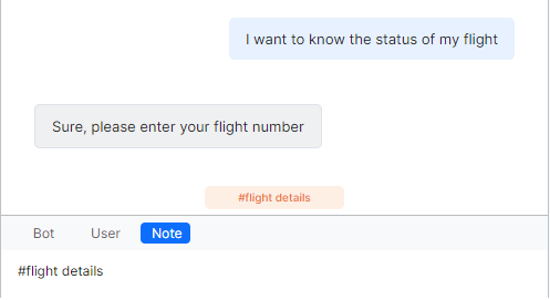
또한 노트는 해시태그를 사용하여 대화의 타임라인을 정의하는 옵션을 제공합니다. 따라서, 정의된 노트는 대화에서 중요한 상태를 나타내는 데 도움이 됩니다. 스토리 타임라인의 대화 오른쪽에 나타납니다. 타임 라인에서 태그를 클릭하여 대화에서 관련 위치로 이동할 수 있습니다. 나만의 맞춤형 태그를 정의하거나 미리 정의된 태그 중 하나를 사용할 수 있습니다. 이러한 미리 정의된 각 태그는 타임라인에서 각 용도를 나타내는 고유한 기호로 표시됩니다. 이러한 미리 정의된 태그는 다음을 포함합니다.- #Start_<intent-name>
- #Hold_<intent-name>
- #End_<intent-name>
- #Resume_<intent-name>.
태그 옵션을 사용하면, 기존 태그와 새 사용자 맞춤형 태그를 생성하여 노트를 분류할 수 있습니다. 이러한 태그는 참조를 위해 색상으로 구분됩니다.

- 경로: 경로는 봇 또는 사용자가 제공한 옵션에 따라 대화를 제공하는 서로 다른 흐름입니다. 예를 들어, 봇은 사용자의 예 또는 아니요 응답을 기대하고 경로는 사용자 응답에 따라 다릅니다. 봇 메시지를 사용하여, 템플릿은 허용된 대체 경로 수를 미리 정의합니다. 비즈니스 로직이 경로 수를 결정할 수도 있습니다. 특정 경로를 따라 장면을 계속하려면, 이전 경로 (<-) 및 다음 경로 (->)를 사용하여 경로를 선택하거나 사용자에게 주어진 옵션을 선택할 수 있습니다. 새 경로 (+) 옵션을 사용하여 경로를 추가할 수도 있습니다.

메시지 옵션
간단한 끌어서 놓기 작업으로 메시지 순서를 변경할 수 있습니다. 메시지 위로 마우스를 이동하면 다음 옵션을 확인할 수 있습니다.
- 새 경로 추가
- 의견 추가
- 메시지 삭제
- 메시지 연결: 이 옵션을 사용하여 장면의 다른 메시지와 연결하고 이미 설계된 흐름을 계속할 수 있습니다. 옵션이 선택되면, 메시지 노드를 선택할 수 있는 흐름 뷰로 전환되며 같은 것이 현재 노드에 연결됩니다. 참고 사항: 이 옵션은 흐름이 정의되지 않은 리프 노드에서만 사용 가능합니다.
- 장면 연결: 이 옵션을 사용하여 미리 정의된 장면을 스토리보드에서 연결할 수 있습니다. 이 장면은 미리 보기 중 호출됩니다. 이 옵션이 선택되면, 옵션은 선택하려는 장면 목록을 제공하며 같은 것이 동일한 노드에 연결됩니다. 아래 나열된 조치를 수행할 수도 있습니다.
- 장면 보기: 읽기 전용 창에서 열려면 장면 보기를 클릭합니다.
- 연결 해제: 장면을 연결 해제하려면 연결 해제를 클릭합니다.
- 편집: 메시지를 편집할 수 있습니다.

의견
의견은 매우 유용한 협업 도구입니다. 스토리보드를 사용하면 장면의 구성 요소인 사용자 메시지, 봇 메시지, 노트에 의견을 추가할 수 있습니다. 또한 기존 의견에 회신할 수 있으므로 설명 스레드를 유지 및 관리할 수 있습니다. 해당 메시지/노트 옆의 설명 아이콘을 사용하여 설명에 접근할 수 있습니다. 장면 수준에서 의견 아이콘을 사용하여 전체 의견 기록에 접근할 수 있습니다.

장면 옵션
장면 페이지에서, 다음 작업을 수행할 수 있습니다.

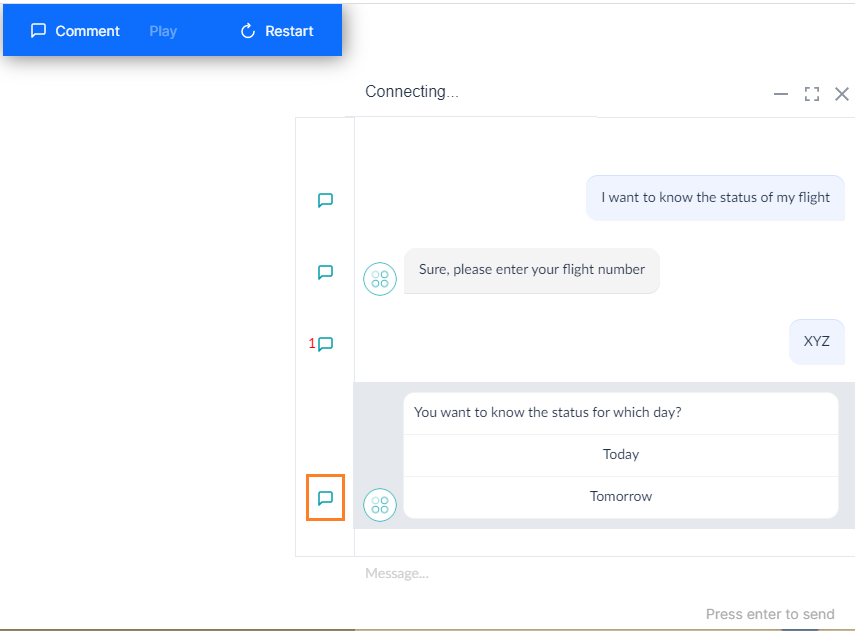
- 미리 보기: 웹 사이트에서 대화 흐름을 확인하는 데 사용됩니다. 대화 창이 있는 모의 웹 사이트에서 열립니다. 미리 보기를 재생/일시 중지, 재시작, 사용자 정의 및 종료할 수 있습니다. (옵션을 사용자 정의하려면 여기를 참조하세요)

- 공유: 이 옵션을 사용하면 다른 사람과 공유할 수 있는 URL을 제공합니다. 이 URL은 장면 미리 보기를 제공하며 다양한 이해 관계자가 기대하는 것을 잠깐 생각하도록 하여 피드백을 받을 수 있습니다. 암호를 사용하여 장면 미리 보기 URL을 보호할 수 있습니다.

- 공유 링크를 사용하면 추가 조치를 위해 개발자에게 다시 전달된 의견을 추가할 수 있습니다.
- 자세히 아이콘을 클릭하여 아래 나열된 조치를 수행합니다. 이러한 조치의 대부분은 스토리보드 페이지에서도 사용할 수 있습니다.
- 편집: 장면의 이름, 설명, 상태를 편집합니다.
- 복제: 복사본을 생성하려면 장면을 복제합니다.
- 내보내기: CSV 형식으로 장면을 내보냅니다.
- 가져오기: CSV 형식으로 기존 장면을 가져옵니다. 가져오기 장면에 현재 봇에 없는 연결된 장면이 있는 경우 가져오기는 실패합니다.
- 삭제: 장면을 삭제합니다. 모든 연결된 장면을 삭제하기 전에 연결을 해제합니다.
- 버전 기록
- 최근 20개의 장면 변경 사항 목록입니다.
- 버전은 다음과 같은 변경 사항이 있을 때마다 자동으로 생성됩니다.
- 메시지 추가됨
- 메시지 편집됨(템플릿 편집 포함)
- 메시지 삭제됨
- 메시지 순서 변경됨
- 장면 복원됨
- 노트 추가됨
- 노트 수정됨
- 노트 삭제됨
- 메시지에 연결됨
- 장면에 연결됨
- 해당 버전으로 복원하는 옵션입니다.
- CSV 형식으로 특정 버전을 다운로드할 수도 있습니다.
미리 보기 사용자 정의
장면 미리 보기에서 사용자 정의 옵션을 사용하면 위젯 뷰에서 대화를 볼 수 있습니다. 기본적으로 플랫폼은 두 가지 테마를 제공합니다.
- 밝게
- 어둡게
이러한 테마는 위젯과 텍스트의 배경을 밝게 또는 어둡게 설정합니다. 나만의 테마를 생성하고 저장한 후 스토리보드의 장면에서 사용할 수 있습니다. 사용자 정의 가능한 대화 위젯에는 네 가지 형태가 있습니다.
- 배경 이미지
- 전체 대화 위젯
- 사용자 메시지 풍선 – 텍스트 및 배경 색상입니다.
- 봇 메시지 풍선 – 다양한 구성 요소의 텍스트 및 배경 색상입니다.
배경 이미지
대화 위젯을 미리 볼 수 있는 모의 웹 사이트에 표시되는 배경 이미지를 사용자 정의할 수 있습니다. 이미지의 위치를 포함하는 유효한 URL을 입력해야 합니다. 
대화 위젯
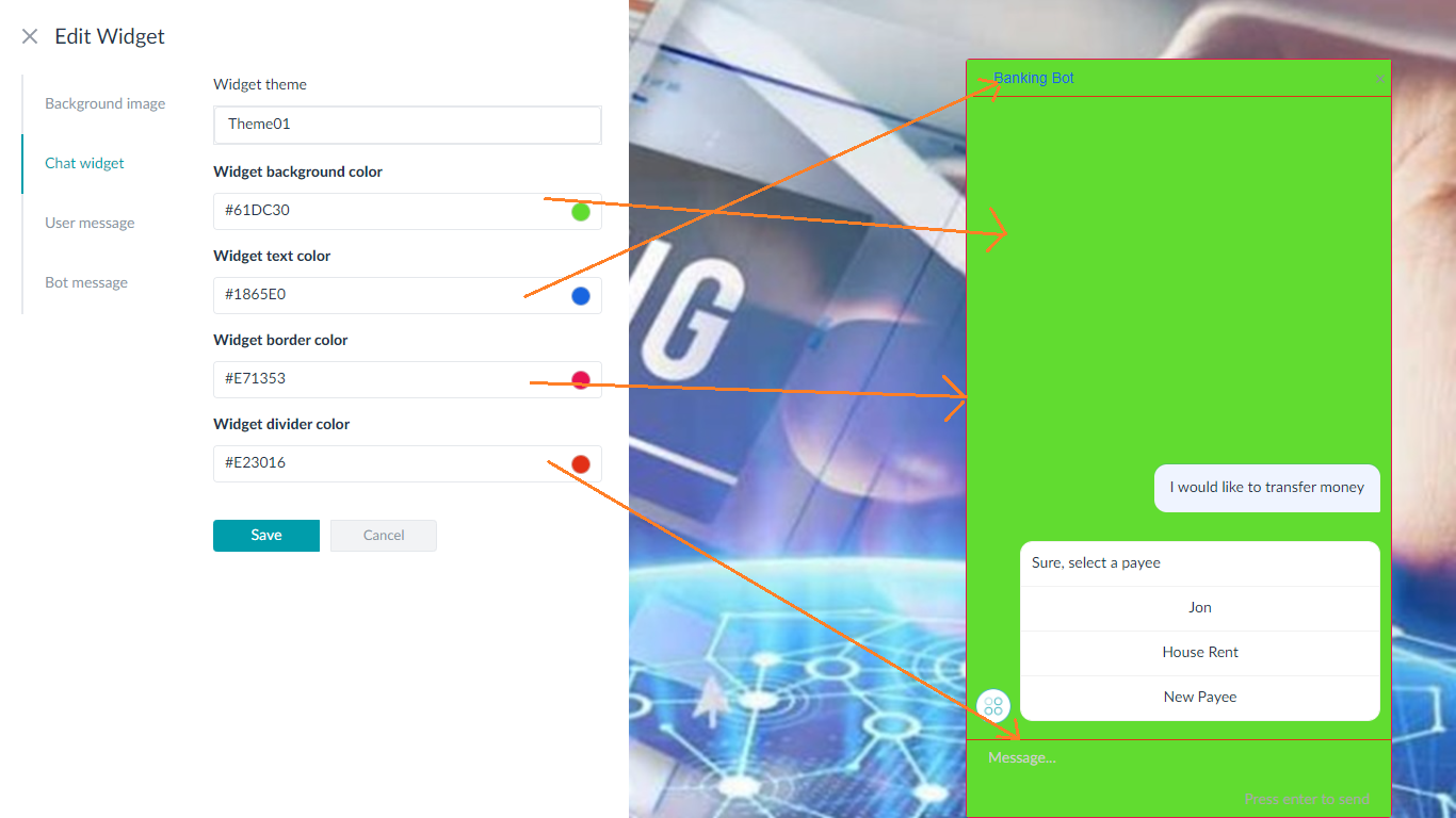
이 옵션을 사용하면 전체 대화 위젯을 사용자 정의할 수 있습니다. 이 옵션은 다음을 포함합니다.
- 위젯 배경 색상
- 위젯 텍스트 색상
- 위젯 테두리 색상
- 위젯 칸막이 색상
사용자 메시지
이 옵션은 사용자 메시지 풍선 및 텍스트의 색상을 사용자 정의하는 데 사용됩니다. 
봇 메시지
이 옵션은 봇 메시지 풍선 및 텍스트의 색상을 사용자 정의하는 데 사용됩니다. 버튼 템플릿 메시지가 사용된 경우 사용자 정의할 수도 있습니다. 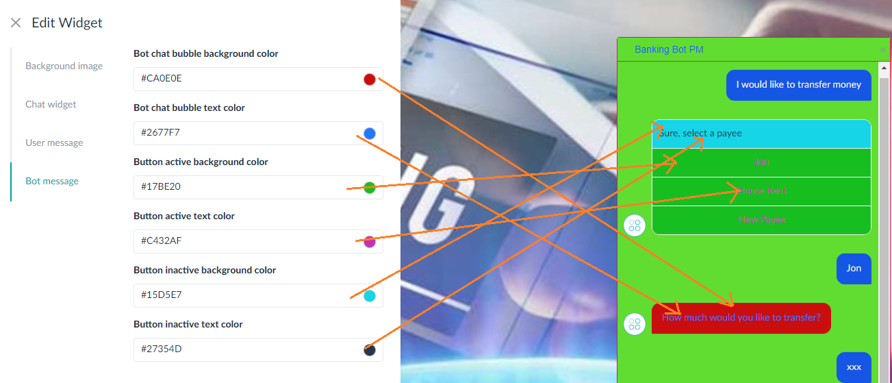
봇 메시지 템플릿
| 템플릿 유형 | 템플릿 정의 | 의견 |
| 캐러셀 |
각 캐러셀:
|
|
| 버튼 |
|
|
| 목록 |
각 항목 목록:
|
|
| 빠른 회신 |
|
|
| 첨부 |
|
|
| 이미지 |
|
흐름 뷰
설계 후, 흐름 뷰로 전환하여 순서도에서 장면을 확인하세요.  이전 섹션에서 언급한 모든 장면 옵션은 다음 예외에서 사용할 수 있습니다.
- 흐름에서 장면을 가져올 수 없습니다.
- PDF 문서로 결과를 내보냅니다.
エンドユーザーがボットとどのように対話することが期待されるかを視覚化することは、成功するボットを構築する上で非常に重要な演習です。これにより、魅力的な会話を設計できるだけでなく、ビジネスユーザー、会話デザイナー、言語エキスパート、ボット開発者の間のコミュニケーションを簡素化することができます。チャットボットの設計には、従来のWebサイトやアプリの開発とは異なる課題が出てきます。フローチャート、トラッキングツール、バージョン管理ソフトウェアなどの設計ツールは、ほとんどがアプリ開発に対応しています。Kore.aiのストーリーボード は、直感的な会話デザイナーであり、ボット開発プロセスを簡素化および効率化します。実際のエンドユーザーとボットの会話を表すようなさまざまなシーンを設計できます。シーンをチームで共有して共同開発することもできます。また、プロトタイプとしてのシーンをビジネスオーナーに提示し、フィードバックを受け取ることもできます。
機能
ストーリーボードの特徴は以下のとおりです。
- シンプルなテキストメッセージ、カルーセル、リストなどを使用して会話を設計することができます。
- パス全体にわたるリンクメッセージを使用して、会話を詳しく説明します。
- さまざまなパスにわたる会話の全体像を統合フローとして可視化します。
- さまざまな会話をリンクすることにより、総合的ユーザーフローを構築します。
- 他のデザイナーとのコラボレーションにより、会話を共同作成します。
- インタラクティブなプロトタイプをステークホルダーと共有し、レビューやフィードバックを受け取ります。
概要
ストーリーボードは複数のシーンから構成されています。各シーンでは、ボットとユーザーの一連のメッセージとして会話が描かれています。ボットメッセージは、“プレーンテキストメッセージ”または“リッチテンプレート”を使用して定義されます。シーンには以下のような特徴があります。
- シーンは、インタラクティブな“会話ビュー”または“フロービュー”のいずれかで見ることができ、追跡と理解が簡単です。
- 1つのシーンに複数のリンクされた“パス”があり、会話のさまざまな代替フローを表現することができます。
- “共同”作業が可能になります。さまざまな関係者と共有し、レビュー、承認、開発を行うことができます。
- 関係者はレビューし、“コメント”を加えることができます。
- 開発者が特定のパスやメッセージを説明するために“メモを追加”する規定があります。
- ストーリーの“タイムライン”は、事前定義のハッシュタグまたはカスタムタグを用いて、会話の重大な状態をマークするのに作成されます。
- フローを“プレビュー”して、リアルタイムの体験などが実現されます。
これらの機能をそれぞれ詳しく見ていきましょう。
ストーリーボード
ストーリーボードは、そのボットで使用できるあらゆるシーン、これらのシーンのステータス、およびこれらのシーンに関連するさまざまなオプションの完璧な概要を提示するプライマリモジュールです。Kore.aiボットビルダープラットフォームの左のメニューの中の会話スキル->ストーリーボードオプションの下のトップメニューの構築タブからアクセスできます。メモ:ここでは、ストーリーボードおよびダイアログタスク自動生成付きストーリーボードに共通する機能について説明します。会話推進型ダイアログビルダーで利用可能なその他の機能については、こちらをご参照ください。 このページでは、新規シーンを作成することができます。作成するには、次の手順に従います。
- 右上の新規シーンをクリックします。
- 新規シーンダイアログボックスで、シーン名 フィールドに名前を、説明 フィールドに説明をそれぞれ入力します。
- ステータスドロップダウンリストからステータスを選択します。使用可能なステータスは、進行中、完了、承認済みです。また、必要に応じてカスタムステータスを作成することもできます。
- ダイアログタスクを自動生成することができます。詳細はこちらをご覧ください。
- 続行をクリックします。
また、以下のようなアクションも実行できます。
- 既存のシーンをCSV形式でインポートする。
- シーンのステータスに基づいてフィルタリングする。
- シーンを名前で検索する。
- それぞれのシーンでは、以下のような選択肢があります。
- 他のユーザーやチームとシーンを共有する。
- シーンを複製して、コピーを作成する。
- シーンをCSV形式でエクスポートする。
- シーンの名前、説明、ステータスを編集する。
- シーンを削除する。
シーン
“概要”セクションで説明したように、シーンでは、ボットとユーザーの一連のメッセージとして会話が描かれます。
会話ビュー
ストーリーボードにシーンを追加した後、空の会話ビューが表示されるので、そこにユーザーボットのメッセージを入力することができます。
エディターには、会話を設計するための以下の機能があります。
- ユーザータブ:これは、ユーザーが情報を依頼したり、ボットのリクエストに応じて情報を提供したりする際に、可能なメッセージを入力するために使用されます。これらのメッセージは次のように定義されます。
- プレーンテキストメッセージ。たとえば、バンキングボットでは、“送金したい”、または“残高を知りたい”。
- 添付ファイル。たとえば、バンキングボットでは、“KYC要件を満たすための書類をアップロードすること”。
- ボット タブ:ボットメッセージの設計に使用されています。ボットメッセージとは、ボットがユーザーに対して、あいさつ、情報提供、ユーザーからの問い合わせへの回答、入力のリクエストなどとして送信するメッセージのことです。これらのメッセージは次のように定義されます。
- 太字、斜体、インデント、複数行、リスト(順序付き、順序なし)などのテキストをマークするオプション付きのプレーンテキストメッセージ。
- ボタン、リスト、クイック返信など事前定義済みのテンプレートを使用したリッチメッセージ。(サポートされているテンプレートのリストは、以下をご参照ください)。
- メモ:メッセージ間にアクションや会話の一部を説明するテキストを追加するために使用されます。
メモには、“ハッシュタグ”を使用して会話のタイムラインを定義するオプションもあります。このように定義されたメモは、会話中の重要な状態を示すのに役立ちます。それはストーリータイムラインの下の会話の左側に表示されます。タイムライン上のタグをクリックすると、会話中に関連する場所に移動することができます。独自の“カスタムタグ”を定義するか、あるいは“事前定義済みのタグ”を使用することができます。これらの事前定義済みタグはそれぞれ、目的を示す固有のシンボルでタイムラインに表示されています。これらの事前定義済みタグには、以下のものがあります。- #Start_<intent-name>
- #Hold_<intent-name>
- #End_<intent-name>
- #Resume_<intent-name>.
“タグ”オプションにより、既存のタグを使用したり、新しいカスタムタグを作成して、メモを分類することができます。これらのタグは、参照用として色分けされています。
- パス:パスとは、ボットやユーザーが提供するオプションを基にして会話から提供されるさまざまなフローのことです。たとえば、ボットはユーザーから“はい”または“いいえ”のレスポンスを想定しており、パスはユーザーのレスポンスに応じて異なります。ボットメッセージを利用して、テンプレートは許可される代替パスの数を事前定義しています。また、ビジネスロジックでパスの数を決めることもできます。特定のパスに沿ってシーンを続けるには、前のパス(<-)と次のパス(->)を使用してパスを選択するか、あるいはユーザーに与えられたオプションを選択します。また、新規パス(+)オプションを使用してパスを追加することもできます。
メッセージオプション
ドラッグアンドドロップの簡単なアクションで、メッセージの並び替えができます。メッセージをポイントすると、以下のオプションが表示されます。
- 新規パスの追加
- コメントの追加
- メッセージの削除
- メッセージをリンクする:このオプションを使用して、このシーンの別のメッセージをリンクし、既に設計済みのフローを継続することができます。このオプションを選択すると、フロービューに移行し、そこからメッセージノードを選択することができ、同じノードが現在のノードにリンクされます。メモ:このオプションは、フローが未定義のリーフノードに対してのみ有効です。
- シーンをリンクする:このオプションは、ストーリーボードに事前定義済みのシーンをリンクするために使用できます。このシーンはプレビュー中に呼び出されます。このオプションを選択する際に選択可能なシーンのリストが表示され、同じシーンが現在のノードにリンクされています。また、以下のようなアクションも実行できます。
- シーンの表示:シーンの表示をクリックすると、読み取り専用のウィンドウで開きます。
- リンク解除:リンク解除をクリックすると、シーンのリンクが解除されます。
- 編集:メッセージを編集できます。
コメント
コメントはとても便利なコラボツールです。ストーリーボードでは、ユーザーは、ユーザーメッセージ、ボットメッセージ、およびノートなど、シーンのいずれかのコンポーネントにコメントを追加することができます。また、既存のコメントに返信することで、コメントスレッドを維持できます。コメントにアクセスするには、対応するメッセージ/メモの横にある[コメント]アイコンを使用します。完全なコメント履歴は、シーンレベルの[コメント]アイコンを使用してアクセスできます。
シーンオプション
シーンページでは、以下のアクションを実行できます。
- プレビュー: これは、Webサイトでの会話の流れを確認するために使用します。「チャット」ウィンドウを備えた模擬Webサイトが開きます。プレビューでは、再生/一時停止、再起動、カスタマイズ、および終了などを実行することができます。(カスタマイズオプションはこちらをご参照ください)
- 共有:このオプションでは、他のユーザーと共有できるURLが提供されます。このURLはシーンのプレビューを提示するもので、さまざまな関係者にその様子を伝え、フィードバックを受け取ることができます。シーンプレビューのURLをパスワードで保護できます。
共有リンクでは、ビューアーがコメントを追加することができ、そのコメントは開発者に伝えられ、さらなるアクションが実行できます。
- その他アイコンをクリックすると、以下のアクションができます。これらのアクションのほとんどは、ストーリーボードページでも利用できます。
- 編集:シーンの名前、説明、ステータスを編集する。
- 複製:シーンを複製して、コピーを作成する。
- エクスポート:シーンをCSV形式でエクスポートする。
- インポート:既存のシーンをCSV形式でインポートする。インポートシーンに、現在のボットに存在しないシーンがリンクされていると、インポートは失敗します。
- 削除:シーンを削除する。リンクされたすべてのシーンを削除する前にリンクを解除します。
- バージョン履歴
- シーンに最近加えられた20件の変更リスト。
- バージョンは、以下の変更が行われるたびに自動的に作成されます。
- メッセージが追加されました
- メッセージが編集されました(テンプレート編集を含む)
- メッセージが削除されました
- メッセージが並べ替えられました
- シーンが復元されました
- メモが追加されました
- メモが修正されました
- メモが削除されました
- メッセージのリンクされました
- シーンにリンクされました
- それらのバージョンのいずれかに復元するためのオプション。
- また、特定のバージョンをCSV形式でダウンロードすることもできます。
プレビューのカスタマイズ
シーンプレビューからのカスタマイズオプションでは、ウィジェットビューで会話を表示することができます。デフォルトでは、プラットフォームは2つのテーマを提供しています。
- ライト
- ダーク
これらのテーマは、ウィジェットとテキストに従って、ライトまたはダークの背景を設定します。独自のテーマを作成し、保存し、さらにストーリーボードのシーン全体でそれを使用することができます。会話ウィジェットには、カスタマイズできる4つの側面があります。
- 背景画像
- チャットウィジェット全体
- ユーザーメッセージの吹き出し – テキストと背景色。
- ボットメッセージの吹き出し – さまざまなコンポーネントのテキストと背景色。
背景画像
会話ウィジェットがプレビューされている模擬Webサイトにおいて表示される背景画像は、カスタマイズすることができます。画像の位置を示す有効なURLを提供する必要があります。
チャット ウィジェット
このオプションでは、チャットウィジェット全体をカスタマイズできます。これには以下が含まれます。
- ウィジェットの背景色
- ウィジェットのテキスト色
- ウィジェットのボーダー色
- ウィジェットの仕切り色
ユーザーメッセージ
このオプションは、ユーザーメッセージの吹き出しとテキストの色をカスタマイズするために使用します。
ボットメッセージ
このオプションは、ボットメッセージの吹き出しとテキストの色をカスタマイズするために使用します。また、ボタンのテンプレートメッセージが使用されている場合は、それをカスタマイズすることもできます。
ボットメッセージのテンプレート
| テンプレートのタイプ | テンプレートの定義 | コメント |
| カルーセル |
各カルーセルについて:
|
|
| ボタン |
|
|
| リスト |
各リストアイテムについて:
|
|
| クイック返信 |
|
|
| 添付ファイル |
|
|
| 画像 |
|
フロービュー
設計した後、フロービューに切り替えると、シーンをフローチャートで見ることができます。 前セクションで説明したシーンオプションは、次を例外として、すべて使用可能です。
- フローからシーンをインポートすることはできません。
- 結果をPDFドキュメントにエクスポートします。
Leave a Reply
Visualizing how end-users are expected to interact with the bots is a very essential exercise in building successful bots. This helps you design engaging conversations as well as simplifies the communication between business users, conversation designers, language experts, and bot developers.
Designing chatbots comes with different challenges as compared to the development of traditional websites or apps. Most of the design tools like flow charts, tracking tools, and versioning software cater to app development.
Kore.ai’s Storyboard is an intuitive conversation designer that simplifies and streamlines the bot development process. It allows you to design various scenes that are representative of the actual end-user conversations with the bot. You can share scenes with your teams for collaborative development. You can also present scenes as prototypes to the business owners to receive feedback.
Features
The features of Storyboard are as follows:
- Design conversations using simple text messages, carousels, lists, and more.
- Elaborate the conversations with link messages across the paths.
- Visualize the complete conversation across different paths as a unified flow.
- Build a comprehensive user flow by linking various conversations.
- Co-create conversations by collaborating with other designers.
- Share interactive prototypes with stakeholders for reviews and feedback.
Overview
The Storyboard consists of multiple scenes. Each scene depicts a conversation as a series of bot and user messages. Bot messages are defined as plain text messages or using rich templates. Scenes have the following features:
- You can view the scenes either in an interactive conversation view or flow view for easy tracking and understanding.
- There can be multiple inter-linked paths in a scene to represent various alternate flows of the conversation.
- It allows for a collaborative effort. You can share with various stakeholders for review, approval, and/or development.
- Stakeholders can review and add their comments.
- There is a provision for developers to add notes to describe or explain a particular path or message.
- A story timeline is generated to mark crucial states in the conversation using either predefined hashtags or custom tags.
- Preview the flow for a real-time experience and much more.
Let us look into each of these features in detail.
Storyboard
The storyboard is the primary module that provides a complete overview of all the scenes available in that bot, the status of these scenes, and various other options associated with these scenes. You can access it from the Build tab of the top menu under the Conversation Skills -> Storyboard option on the left menu of the Kore.ai Bot Builder platform.
Note: This topic deals with features that are common for Storyboard and Storyboard with auto-generation of Dialog Task. For additional features that are available in Conversation-driven Dialog Builder refer here.
This page allows you to create a New Scene. To create, follow the below steps:
- Click New Scene on the top-right.
- On the New Scene dialog box, enter a name in the Scene Name field and a description in the Description field.
- Select a status from the Status drop-down list. Available statuses are In Progress, Completed, and Approved. You can also create a custom status if needed.
- You can Auto-generate a Dialog Task, refer here for details.
- Click Proceed.
You can also perform the below-listed actions:
- Import an existing scene in a CSV format.
- Filter scenes based upon their status.
- Search for a scene by name.
- For each scene, you have an option to:
- Share the scene with other users or teams.
- Duplicate the scene to create a copy.
- Export the scene into CSV format.
- Edit the name, description, and status of the scene.
- Delete the scene.
Scenes
As mentioned in the Overview section, a scene depicts the conversation as a series of bot and user messages.
Conversation View
After you add a scene to your Storyboard, you are presented with a blank Conversation View, where you can enter the user-bot messages.
The editor has the following features to help you design the conversation:
- User Tab: It is used to enter possible messages from users either requesting information or providing input to a request by the bot. These messages are defined as:
- Plain text messages. For example, in a Banking Bot, I want to transfer money or I want to know my account balance.
- Attachments. For example, in a Banking Bot, to upload documents to complete KYC requirements.
- Bot Tab: It is used to design bot messages. Bot Messages are messages that the bot sends to users as a greeting, information, answer to a user query, or requesting for input. These messages are defined as:
- Plain text messages with options to mark text as bold, italics, indent, multi-line, and lists – ordered and unordered.
- Rich messages using the predefined templates like buttons, list, quick reply, etc,. (see below for a list of supported templates).
- Notes: It is used to add text between messages describing an action or portion of the conversation.
Notes also provide an option to define the timeline of the conversation by using hashtags. Thus defined notes help denote an important state in the conversation. It appears on the left of the conversation under the Story Timeline. You can move to the relevant place in the conversation by clicking the tag on the timeline.You can define your own custom tags or use one of the pre-defined tags. Each of these pre-defined tags is depicted by a unique symbol in the timeline indicating its purpose. These pre-defined tags include:
- #Start_<intent-name>
- #Hold_<intent-name>
- #End_<intent-name>
- #Resume_<intent-name>.
With the tag option, you can classify notes using an existing or by creating a new custom tag. These tags are color-coded for reference.
- Paths: Paths are different flows in which the conversations provide based on the options provided by the bot or the user. For example, a bot expects a yes or no response from the user, and the path differs based upon the user response. Using the bot message, the template pre-defines the number of alternate paths allowed. The business logic can also decide the number of paths.
To continue the scene along a specific path, you can select the path either using the Previous Path (<-) and Next Path (->) or select the options given to the user. You can also add additional paths using the New Path (+) option.
Message Options
You can reorder the messages by a simple drag and drop action. When you hover over a message you can find the following options:
- Add New Path
- Add Comments
- Delete a message
- Link a Message: You can use this option to link another message in this scene and continue a flow that is already designed. When selected, this option transitions to the Flow view from where you can select the message node, and the same is linked to the current node.
Note: This option is available only for the leaf nodes with no flow defined. - Link a Scene: You can use this option to link a pre-defined scene in the storyboard. This scene is invoked during the preview. When selected, this option gives a list of scenes for you to select from and the same is linked to the current node. You can also perform the below-listed actions:
- View Scene: Click View Scene to open in a read-only window.
- Unlink: Click Unlink to unlink the scene.
- Edit: You can edit a message.
Comments
Comments are a very useful collaborative tool. Storyboard allows users to add comments to any component of the scene like user messages, bot messages, and notes. You can also reply to an existing comment thus maintaining a comments thread.
You can access comments using the comment icon next to the corresponding message/note. You can access the full comment history using the comments icon at the scene level.
Scene Options
From the Scene page, you can perform the following actions:
- Preview: It is used to see how the conversation flows on your website. This opens in a mock website with the chat window. You can Play/Pause, Restart, Customize, and Exit the preview. (See here for customizing options)
- Share: This option gives you a URL that you can share with others. This URL presents the scene preview and you can let the various stakeholders a glimpse of what to
expect and take their feedback. You can secure the scene preview URL with a password.The Share link allows the viewer to add comments that are communicated back to the developer for further action. - Click the More icon to perform the below-listed actions. Most of these actions are available on the Storyboard page also.
- Edit: Edit the name, description, and status of the scene.
- Clone: Clone the scene to create a copy.
- Export: Export the scene into CSV format.
- Import: Import an existing scene in CSV format. Import fails if the import scene has linked scenes which are not present in the current bot.
- Delete: Delete the scene. Unlink all linked scenes before deleting it.
- Version History
- A list of recent 20 changes made to a scene.
- Version is automatically created whenever the following changes are made:
- Message Added
- Message Edited (included edits to templates)
- Message Removed
- Message Reordered
- Scene Restored
- Note Added
- Note Modified
- Note Removed
- Linked to a Message
- Linked to a Scene
- An option to restore to any of those versions.
- You can also download a particular version in CSV format.
Preview Customization
The customize option from the scene preview allows you to view the conversation in the widget view. By default, the platform provides two themes:
- Light
- Dark
These themes set the light or dark background for the widget and the text accordingly.
You can create your own theme, save it, and use it across the scenes in your storyboard. There are four aspects of the conversation widget that you can customize:
- Background Image
- Overall Chat Widget
- User Message Bubbles – text and background colors.
- Bot Message Bubbles – text and background colors for various components.
Background Image
The background image that is displayed on the mock website where the conversation widget is previewed can be customized. You need to provide a valid URL with the location of the image.
Chat Widget
This option will let you customize the entire chat widget. This includes:
- Widget background-color
- Widget text color
- Widget border-color
- Widget divider color
User Message
This option is used to customize the color of the user message bubble and text.
Bot Message
This option is used to customize the color of the bot message bubble and text. You can also customize the button template messages if any are used.
Bot Messages Templates
| Template Type | Template Definition | Comments |
| Carousel |
For each Carousel:
|
|
| Buttons |
|
|
| List |
For each List Item:
|
|
| Quick Reply |
|
|
| Attachment |
|
|
| Image |
|
Flow View
After you design, switch to the Flow View to see the scene in a flowchart.
All the Scene Options mentioned in the previous section are available with the following exceptions:
- You cannot import a scene from the flow.
- Export results in a PDF document.