ダイアログビルダーは、使いやすさとユーザー体験を改良し一新されました。新しいビルダーへアップグレードされるか、または従来型ビルダーを継続されるかを選択できますが、アップグレードされることをお勧めします。
このドキュメントでは、従来型ダイアログビルダーを使用してダイアログタスクを構築する方法を説明していますが、改良型の新バージョンについてはこちらをご参照ください。
ダイアログビルダーは、使いやすさとユーザー体験を改良し一新されました。新しいビルダーへアップグレードされるか、または従来型ビルダーを継続されるかを選択できますが、アップグレードされることをお勧めします。
このトピックでは、Kore.aiボットビルダーダイアログビルダーツールを使用して、ダイアログタスクにおけるユーザーとボットの間の会話フローを作成するためのユーザーインターフェースについて説明します。
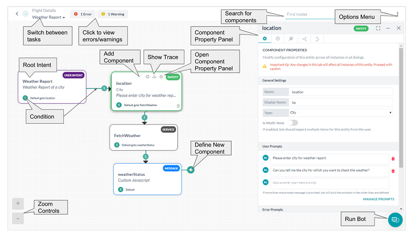
検索フィールドにおいて、「入力したとおり発見」を使用して、任意の文字や単語でコンポーネントのタイトルを検索することができます。検索の一致は、コンポーネントタイトルにおいてハイライト表示されます。
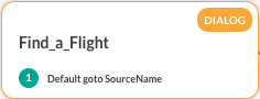
ダイアログタスクを作成したときデフォルトで最初に作成、表示されるコンポーネントは、ダイアログタスクのユーザーインテントノードまたはユーザーインテントコンポーネントです。ユーザーインテントは、ダイアログタスクがエンドユーザーによってどのように識別されるかです。たとえば、フライトの検索やチケットの作成などです。エンドユーザーが依頼したインテントを実行するためには、ダイアログタスクに追加コンポーネントを追加する必要があります。例として、 フライトの検索ダイアログでは、出発空港、到着空港、日付についてユーザーに問い合わせるためのコンポーネントを追加しなければなりません。コンポーネントを追加するには、次の図に示すように、コンポーネントの追加  アイコンのいずれかをクリックします。
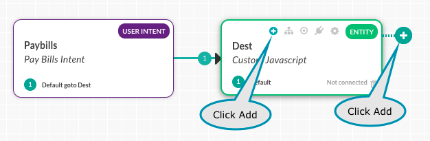 表示されたリストから コンポーネントタイプを選択し、既存のコンポーネントを選択するか、あるいは以下の新しいエンティティノードの作成例に示されるように、新しいコンポーネントを作成します。
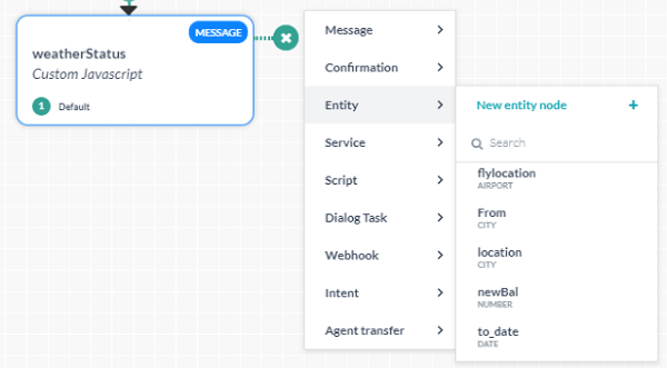 新規作成を選択すると、コンポーネントでは、 プロパティパネルから変更可能なデフォルトのプロパティがダイアログタスクに追加されます。
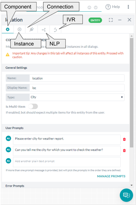 プロパティパネルでは、以下の設定ができます。
追加したコンポーネントのタイプごとに、プロパティパネルにおいてさまざまな設定を定義する必要があります。詳細は、対応するコンポーネントタイプのドキュメントをご参照ください。
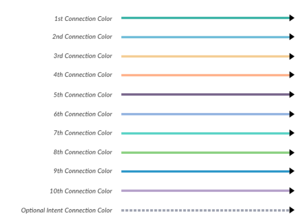
あるコンポーネントから別のコンポーネントへの条件または遷移は、定義済みの接続条件に基づいて、次のノードへのパスを示す色付きの矢印で表示されます。次のカラーチャートにおいて、接続色の割り当て順番が示されています。
複数の条件が他のコンポーネントへの複数の接続オプションによって定義される場合、次の図に示されるように、色付きの矢印でフローを可視化することができます。 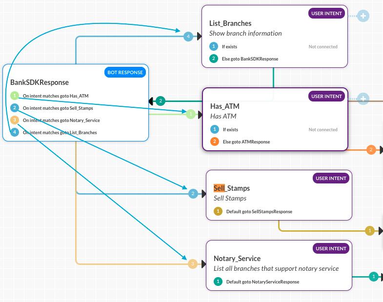
オプション メニューは、ビュー設定、ダイアログタスク設定、ダイアログのインポートおよびエクスポートなど、ダイアログビルダーのツール設定やコマンドにアクセスするためのものです。オプションメニューのコマンドにアクセスするには、下図に示されるように、ダイアログビルダーの右上にある楕円 のアイコンをクリックします。変数ネームプレースがボットで有効になっている場合は、変数ネームプレース管理の追加オプションも表示されます。

表示オプションを使用して、不要なノード情報を減らし、画面の有効スペースを向上させることができます。ダイアログビルダーに表示されるノードタイプ、ノード詳細、または接続詳細の一部または全部を表示/非表示にすることができます。例として、すべて表示の次の図にすべての詳細が表示されます。
ノードタイプの非表示をクリックすると、ノード名が削除されます。ノード詳細の非表示をクリックすると、ノード詳細が削除されます。
接続詳細の非表示をクリックすると、条件付き遷移詳細が削除されます。
すべて非表示をクリックして、色分けされた基本的なノード情報のみを表示します。
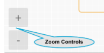
ズームオプション は以下のように使用できます。
次の図に示すように、ダイアログタスクビルダーの左下に、追加のズームオプションコントロールがあります。
ダイアログタスク設定ダイアログでは、ダイアログタスクの基本設定を変更できます。必要に応じて、ダイアログの可視性を設定して、使用できるがボットとして表示されない非表示のダイアログタスクを作成できます。
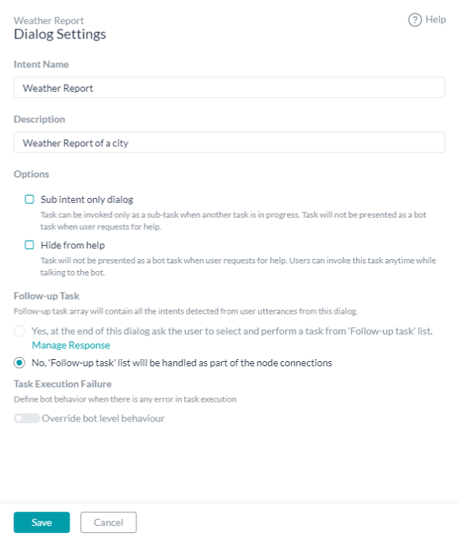
各ダイアログに以下の設定を追加または変更します。
ダイアログビルダーの右上にあるダイアログタスクを定義したように、リアルタイムでエラーと警告のセットが利用できます。情報アイコンをクリックすると、以下の図のように、エラーまたは警告が表示されます。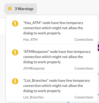 さらに、次の図に示すように、トレースの表示
  アイコンを使用して、ルートインテントの開始から選択したコンポーネントまでのダイアログタスクのフローを表示できます。
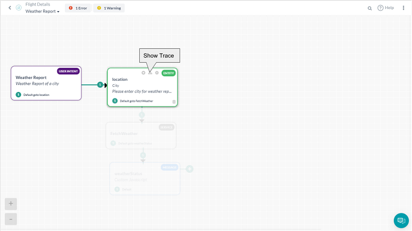
前の図では、コンポーネントの選択に関するダイアログフローに直接含まれていないダイアログタスクのコンポーネントは、グレーアウトされています。トレース機能を使用すると、壊れたフローや条件付きの遷移の問題を探すことができます。もう一度トレースの表示をクリックすると、トレースが削除されます。
사용성과 사용자 경험을 개선하기 위해 대화 빌더가 변경되었습니다. 새 빌더로 업그레이드하거나 이전 빌더를 계속 사용할지 선택할 수 있지만 업그레이드를 권장합니다.
이 항목에서는 Kore.ai 봇 빌더의 대화 빌더를 사용하여 대화 작업에서 사용자와 봇 간의 대화형 흐름을 생성하는 사용자 인터페이스를 설명합니다.
검색 필드에서 입력할 때 증분 검색 기능을 사용하여 제목 구성 요소의 문자나 단어를 검색할 수 있습니다. 검색 일치 항목이 제목 구성 요소에 강조 표시됩니다.
대화 작업을 생성할 때 기본적으로 생성되고 표시되는 첫 번째 구성 요소는 대화 작업의 사용자 의도 노드 또는 사용자 의도 구성 요소입니다. 사용자 의도는 최종 사용자가 대화 작업을 식별하는 방법입니다(예: 항공편 검색 또는 티켓 생성). 최종 사용자가 요청한 의도를 수행하려면 대화 작업에 추가 구성 요소를 추가해야 합니다. 예를 들어, 항공편 검색 대화의 경우 출발 공항, 도착 공항 및 날짜를 쿼리하기 위해 추가 구성 요소를 추가해야 합니다. 구성 요소를 추가하려면 다음 그림과 같이 구성 요소 추가 아이콘 중 하나를 클릭합니다:
표시된 목록에서 구성 요소 유형 중 하나를 선택하고 새 엔티티 노드를 생성하는 다음 예시와 같이 기존 구성 요소를 선택하거나 새 구성 요소를 생성합니다.
새로 만들기를 선택하면, 구성 요소가 대화 작업에 추가되며 속성 패널에서 기본 속성을 수정할 수 있습니다. 속성 패널에서 다음을 설정할 수 있습니다.
추가한 구성 요소의 유형에 따라 속성 패널에서 다양한 설정을 정의해야 합니다. 자세한 내용은 설명서의 해당 구성 요소를 참조하십시오.
한 구성 요소에서 다른 구성 요소로 조건 또는 전환하는 작업은 정의된 연결 조건에 따라 다음 노드로 가는 경로를 표시하는 색상이 지정된 화살표로 표시됩니다. 다음 색상 차트는 연결 색상 할당 순서를 보여줍니다.
다른 구성 요소에 대한 여러 연결 옵션으로 여러 조건을 정의한 경우, 색상이 지정된 화살표를 사용하여 다음 그림과 같이 흐름을 시각화할 수 있습니다.
옵션 메뉴를 사용하면 대화 빌더 도구 설정과 명령(예: 보기 설정, 대화 작업 설정, 대화 가져오기 및 내보내기)에 액세스할 수 있습니다. 옵션 메뉴에서 명령에 액세스하려면 다음 그림과 같이 대화 빌더의 오른쪽 위에 있는 생략 아이콘을 클릭합니다. 봇에 대해 변수 네임스페이스가 활성화된 경우 추가 변수 네임스페이스 관리 옵션도 함께 표시됩니다.
옵션 표시를 사용하여 불필요한 노드 정보를 줄이고 화면 공간을 더 잘 활용할 수 있습니다. 대화 빌더에 표시되는 노드 유형, 노드 세부 정보 또는 연결 세부 정보의 일부 또는 전체를 표시하거나 숨길 수 있습니다. 예를 들어 다음 모두 보기 그림에서 모든 세부 정보를 볼 수 있습니다.
노드 이름을 제거하려면 노드 유형 숨기기를 클릭합니다.
노드 설명을 제거하려면 노드 세부 정보 숨기기를 클릭합니다.
연결 세부 정보 숨기기를 클릭하여 조건부 전환 세부 정보를 삭제합니다.
색을 구분하여 기본 노드 정보만 표시하려면 모두 숨기기를 클릭합니다
.
줌 옵션을 사용하여 다음을 수행할 수 있습니다.
추가 줌 옵션 제어는 다음 그림과 같이 대화의 왼쪽 아래에 있는 대화 작업 빌더에서 사용할 수 있습니다.
대화 작업 설정 대화에서 대화 작업의 기본 설정을 수정할 수 있습니다. 필요한 경우, 대화 가시성을 설정하여 사용할 수 있지만 봇 작업으로 표시되지 않는 숨겨진 대화 작업을 만들 수 있습니다.
각 대화에 대해 다음 설정을 추가하거나 수정합니다.
대화 빌더의 가장 오른쪽 상단에 있는 대화 작업을 정의할 때 일련의 실시간 오류 및 경고를 사용할 수 있습니다. 정보 아이콘을 클릭하면 다음 그림과 같이 오류나 경고가 표시됩니다.
또한 다음 그림과 같이 추적 표시 아이콘을 사용하여 루트 의도의 시작부터 선택한 구성 요소까지 대화 작업의 흐름을 볼 수 있습니다.
이전 그림에서 선택한 구성 요소에 대한 대화 흐름에 직접 포함되지 않은 대화 작업의 구성 요소는 모두 회색으로 표시됩니다. 추적 기능을 사용하면 중단된 흐름 또는 조건부 전환 문제를 찾을 수 있습니다. 추적 표시를 다시 클릭하고 추적을 삭제합니다.
In a bid to improve useability and user experience, the dialog builder was given a makeover. You are given a choice to upgrade to the new builder or continue with the legacy builder, though we encourage you to go for the upgrade.
This topic describes the user interface for creating a conversational flow between a user and a Bot in a dialog task using the Dialog Builder tool in Kore.ai Bot Builder.
In the Search field, you can search component titles for any letters or words using find-as-you-type. Search matches are highlighted in the component titles.
When you create a dialog task, by default the first component created and displayed is the user intent node or user intent component of the dialog task. The user intent is how the dialog task is identified by the end-user, for example, Search for a Flight, or Create a Ticket.
Additional components in the dialog task need to be added to perform the intent requested by the end-user. For example, for the Search for a Flight dialog, you should add additional components to query the user for the departure airport, arrival airport, and date.
To add a component, click either of the Add Component icons as shown in the following illustration:
From the list displayed, select one of the component types, and then either select an existing component or create a new component as shown in the following example of creating a new entity node.
When create new is selected, the component is added to the dialog task with default properties that can be modified from the Properties Panel.
From the Properties Panel you can set:
Depending on the type of component added, you will need to define various settings in the Properties panel. For more information, see the corresponding component types of documentation.
The conditions or transitions from one component to another are labeled by a colored arrow showing the path to the next node based on the connection condition defined. In the following color chart, the order of connection color assignment is shown.
When multiple conditions are defined with multiple connection options to other components, the colored arrows help you visualize the flow as shown in the following illustration.
The Options menu is your access to Dialog Builder tool settings and commands such as view settings, dialog task settings, and dialog import and export. To access the commands on the Options menu, click the Ellipses icon located on the upper rightmost side of Dialog Builder as shown in the following illustration. If Variable Namespace is enabled for the bot, then you would see an additional Manage Variable Namespaces option too.
You can use Display Options to reduce unnecessary node information and better utilize screen real estate.
You can show or hide some or all of node type, node details, or connection details displayed in the Dialog Builder. For example, all details are shown in the following illustration for Show All.
Click Hide Node Type to removed the node name.
Click Hide Node Details to remove node descriptions.
Click Hide Connection Details to remove conditional transition details.
Click Hide All to show only basic node information with color coding.
Zoom Options can be used to:
Additional Zoom Option controls are available in the lower leftmost side of the Dialog Task builder shown in the following illustration.
The Dialog Task Settings dialog allows you to modify the dialog task basic settings, and if desired, set the visibility of a dialog to create a hidden dialog task that is available for use, but not shown as a bot task.
Add or modify the following settings for each dialog:
A real-time set of errors and warnings is available as you define your dialog task located in the upper rightmost corner of Dialog Builder. Click the information icon to display any errors or warnings as shown in the following illustration.
In addition, you can view the flow of your dialog task from the start of the root intent to a selected component by using the Show Trace icon as shown in the following illustration.
In the previous illustration, any components of the dialog task that are not directly in the dialog flow for the selected component are grayed out. Using the trace feature you can look for a broken flow or conditional transition issues. Click ShowTrace again to remove the trace.